| |
|
|
|

4 Using the DataViewer
Applications
The DataViewer provides a interactive visualization interface that can be integrated into your application in either the Visualization or Developer edition. The DataViewers will primarily be covered in the Visualization Techniques book but since they are our gateway to the data this chapter will introduce them.
- Overview of the DataViewer Applications
- Connecting to the Viewer in the Network Editor
- Understanding the AVS/Express Applications
- Using the Viewer Window Controls
- Using the Toolbar
- Using the DataViewer Editors
- The Module Editor Interface
- Using the Print Editor
- Using the View Editor
- Using the Transform Editor
- Using the Light Editor
- Using the Camera Editor
- Using the Object Editor
- Using the Datamap Editor
- Using the Graph Editor
We have already introduced the DataViewer applications in Building Networks in a DataViewer Application on page 3-13. This chapter provides more detailed user information, and an introduction to the DataViewer editors. More information about the DataViewers can be found in the Visualization Techniques book.
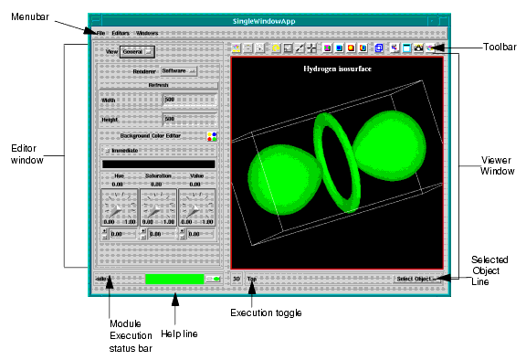
The following illustration shows the main parts of the DataViewer interface:
You use the viewer window to display and interact with your image. You use the editor window to display view editors that control the characteristics of the view window, or a Module editor that controls the modules that you add to your application workspace. When you instance modules in the Network Editor workspace, the controls for the module are displayed in the Module Editor window.
The Help Line, located at the bottom of the DataViewer, is a text line that provides descriptive text about Menubar commands and Toolbar tools. When you position the mouse over the command or tool, the help line displays a brief description of the operation.
The Help line is always located at the bottom of the UI Window.
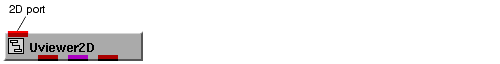
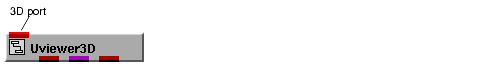
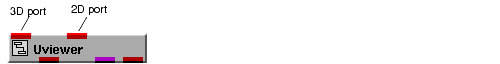
When you load SingleWindowApp or MultiWindowApp, AVS/Express instances a Uviewer module into the application workspace. To render data in the viewer window you connect to the input ports of the Uviewer objects.
AVS/Express instances a Uviewer module to support the type of viewer you have selected in the application dialog:
When you enter data into an input port, it is processed in a manner specific to its type. Once processed, the data is converted by a renderer into a form that you can view and manipulate in the DataViewer.
A DataViewer input port can accept multiple sets of input, which will be combined into one scene in the Viewer window. It will probably be necessary to edit the resulting scene with the appropriate editor(s) to make the information in the scene useful.
If you add a view using the Create option from the View editor, an input port associated with that view is added to the Uviewer object
For more information about using the Uviewer modules, see the on-line reference pages for Uviewer, Uviewer2D, and Uviewer3D.
When you connect a renderable object to Uviewer3D or the 3D port of a Uviewer, the DataViewer creates a three-dimensional stage called a scene within which you view geometries. Each scene is composed of the following:
- A world space: an unbounded three-dimensional volume. A location in world space is measured by world coordinates (also called scene coordinates), which are a single set of right-handed X, Y, and Z axes.
When the DataViewer first opens, the world coordinate origin (0,0,0) is positioned in the center of the Viewer window and world space is oriented as follows:
From a conceptual point of view, world space is immobile.
- A collection of three-dimensional objects assembled into world space. Objects have attributes, such as surface color, various light reflectance characteristics, and a rendering method. You can selectively hide objects so that they are temporarily invisible, although still part of the scene.
- A three-dimensional camera, defined in the same world coordinate space. The camera can display an object in various ways; for example, using a perspective viewing projection, clipping, depth cueing, and so forth. To manipulate the camera, you use the Camera Editor ( see See Using the Camera Editor on page 4-38.).
- Four light sources, defined in the same world coordinate space. Each light can be a different color. To manipulate the lights, you use the Light Editor (see See Using the Light Editor on page 4-36.).
With the Viewer editors, you can translate (move) objects, lights, and the camera; scale them (make them larger or smaller), and rotate them. These three operations are called transformations (see See Using the Transform Editor on page 4-34.). Objects, lights, and cameras are collectively called transformable objects, or simply transformables.
The objects in a three-dimensional scene are organized into a hierarchy. At the top of the hierarchy is a root object, Top. All the objects you connect to the 3D port in the DataViewer are children of the Top level object and peers of each other. The hierarchy is normally only these two levels-the Top level object and, beneath it, all other objects.
You can transform the Top level object, which carries all its child objects along with it, within world coordinates. You can also transform individual objects within the Top level object's coordinate system
When a object is read into the DataViewer's 3D port through a module such as read_geom, the resulting three-dimensional object is placed into the Top level object's coordinate system and automatically normalized to insure that it is visible in the viewer window. You can turn auto-normalization off or control the when it is applied by selecting Camera from the Editor's menu and General from the Camera option menu. If you turn normalization off, the object is entered into the scene at its true location and size. This may mean that the object is partially or completely outside of the viewer window.
When a data enters the DataViewer through the 2D port, the DataViewer creates a two-dimensional stage called a scene within which you view the resulting image. A 2D scene is composed of the following:
- A two-dimensional world space: an unbounded two-dimensional area. A location in world space is measured by world coordinates (also called scene coordinates), which are a single set of right-handed X and Y axes.
- When the DataViewer first opens, the world coordinate origin (0,0) is positioned in the center of the Viewer window and world space is oriented as follows:
- From a conceptual point of view, world space is immobile.
- A collection of two-dimensional objects assembled into world space. Objects have properties, such as width, height, and color. You can selectively hide objects so that they are temporarily invisible although still part of the scene (see See Selecting an Object in the Scene on page 4-12.).
- A two-dimensional camera, defined in the same world coordinate space. You cannot manipulate the camera.
- A light source, defined in the same world coordinate space. You cannot manipulate the light as there is no light model in the 2d viewer.
Within the Viewer window, you can translate (move) the objects, scale them (make them larger or smaller), and rotate them. These three operations are called transformations (see See Using the Transform Editor on page 4-34.).
In addition to providing an end-user visualization environment, the applications SingleWindowApp and MultiWindowApp, provide an example of how to build an application in AVS/Express and a user-interface mechanism that you can modify or adapt for your own applications. Even if you intend only to use these applications as an end-user environment, the information in this section will help you understand how to integrate the applications into a visualization network.
These applications define several different user interface regions: the Editors panel and menu, the Modules panel and menu, the Windows panel and menu, the toolbar, and the Info panel. When you add an object such as Uviewer to your application, this object defines user interface components that automatically attach to the user interface regions of your application.
This section describes the mechanisms that controls this process including descriptions of:
- the user interface components involved
- the user interface regions SingleWindowApp and MultiWindowApp define
- how user interface components are attached to the applications
- ways that you can change the layout of an application
The main user interface kit objects involved in this mechanism are:
- UIpanel - defines a window containing child UI components (either other UIpanels or primitive widgets such as buttons, sliders, dials, etc.)
- UIoption - defines a menu entry that contains an boolean set parameter
- UIradioList - defines a list of options where only one option in the list can be set at a time
The UIpanel and UIradioList objects are combined to form a macro object called a stack. The stack allows several child UIpanels to share the screen space defined by the parent UIpanel so that only a single child is visible at a time. Each child UIpanel has a UIoption that controls its visibility. This option is added to the UIradioList defined by the stack. The UIradioList only allows a single UIoption to be set at a time so that only a single child UIpanel is visible.
This UIradioList can then be attached to a menubar or be used to define a UIoptionMenu object. As the user selects a new option, the old option is unset and its panel made invisible, while the new option is set and its panel is made visible.
The applications SingleWindowApp and MultiWindowApp define several regions for attaching user interface components. Some of these regions are stacks that group UIpanels defined in the application's components.
This stack contains the user interface panels defined by the modules in your application. This contains the UI for all objects that contain a UImod_panel. The UImod_panel is a sub-class of UIpanel that has a UIoption subobject that controls the panel's visibility. The UImod_panel has the logic necessary to automatically connect the UIpanel and UIoption into the Modules stack.
The user interface for the Data I/O, Filters, Mappers, and Geometries objects is placed in the Modules stack object when these components are added to your application.
This stack contains the Modules stack as a member. In addition, the editors contained in the Uviewer modules are installed as members of this when the Uviewer module is added to the application.
This stack is only present in SingleWindowApp. When a Uviewer component or a Uscene component is added to your application, its graphics window is added to this stack. The stack determines which graphics window is visible.
The toolbar is a special panel with special functionality. When tool objects are dropped into the application, a new tool is added to the list of tools in the toolbar.
The info panel defines a UIpanel for status and other information that is visible at all times. The Uviewer module installs an information panel in this window that displays the name of the current object, the dimensionality of the current camera and a button to display the object selector.
When you add components such as Uviewer or isosurface to DefaultApplication (or to any object that does not define user interface regions to accept the UI for these components), you will see one of two possible results depending upon the component and the configuration of your application object:
- panels create their own shell and are made visible immediately
- panels are left without a parent and are not made visible
Any objects defined with a UImod_panel will create their own shell unless the property ui_default_shell is set to 0 on the application object. Any objects that define graphics windows have default shells created (Uscene, Uviewer) for the graphics window. All editor panels (Uview_editor, etc.) do not create a default shell.
If no default shell is created for your object, you can create a shell or panel for this object yourself and make the connection manually. If a default shell is created, you can change the connection yourself and delete the UIshell that is created. In both cases, use the Network Editor to open up the object and find the subobject that defines the UIpanel for your component. The parent parameter of the UIpanel is used to control the parent. If a default shell is created, it is placed as a subobject of the UIpanel and is called "UIshell."
As you drop components into your application, connections are made automatically from objects in the application to objects in your component and vice versa. For example a UIpanel's parent connection in your component is connected to a UIpanel in your application and a UIradioList in your application is connected to a UIoption in your component.
These connections are not displayed through the Network Editor and are not saved when you save your application. Instead, they are reconnected when you reload your application through the same process. If you change one of these connections explicitly using the Network Editor, your change is saved and the automatic connection is not made when the application is loaded.
When you instance a new component that defines a UI object such as a UImod_panel that is looking for a place to connect to, this component walks up level-by-level in the hierarchy until it finds a compatible UI object. It then makes a connection directly to the object it found. If you have more than one SingleWindowApp active at a time, components dropped into your application connect to the SingleWindowApp in which they were dropped.
There are several different ways that you can change your application's user interface:
- you can move, resize, and reparent panels in the application object
- you can add additional components to the application like menus, or additional panels
The macro containing the user interface for SingleWindowApp and MultiWindowApp is hidden by default. You can make the UI object visible by going to the Options->"Show Application UI" toggle and turning it on. You may need to close and maximize the application to get the object to show up after setting this option.
To make changes to the application's UI, maximize the UI object and you can make changes to these objects as you like. See the on-line reference pages for SingleWindowApp and MultiWindowApp for more information on the components of the UI object.
If you are an advanced user that wants to build your own set of customized modules that make different connections automatically based on the object hierarchy, you need to more information on how hierarchical connections are made by the system.
There are two different mechanisms employed to make hierarchical connections. The UImod_panel uses a mechanism that is not documented and cannot be configured. All other panels use the GMOD.hconnect module to make hierarchical connections. This module provides significant flexibility in both the types of objects that can be connected and the different classes of objects that can be defined. See the hconnect man page for more information.
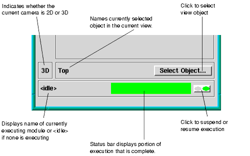
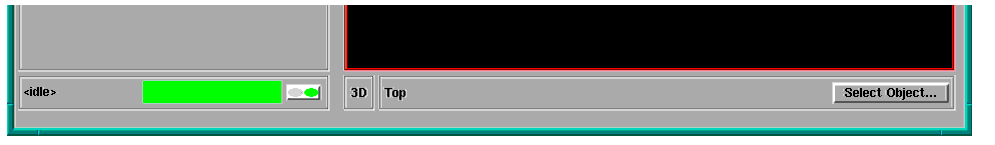
The Viewer window, located below the Menubar (and the Toolbar, if present), is a viewport in which the renderer for your system draws a scene.
In the multi-window interface, information and controls for the view window are displayed at the bottom of the editor panel window:
In the single-window interface, these controls are displayed along the bottom of the combined editor and viewer window:
The DataViewer editors always operate on the currently selected object in the view. You can select view objects in two ways
- Hold down the CTRL key on you keyboard and click on the object in the view window with your mouse pointer.
- Select the object in the Object Selector.
You display the Object Selector by clicking the DataViewer Select Object button:
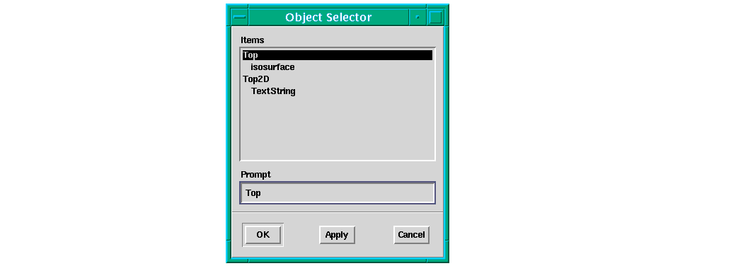
To select an object, select it in the Items list and then click OK to select the object and close the dialog, or Apply to select the object and leave the dialog open.
- Note: Selecting the object in the Items list does make the object the current object. You must click OK or Apply to complete the selection.
The object selector listing provides an outline of the view object hierarchy. Notice that Top, the 3D scene, and Top2D, the 2D scene, are listed, and are selectable objects.
The execution toggle controls whether the view window is active:

To make the viewer window inactive, click on the left button. The button turns red and all viewer window operations are turned off:

While this toggle is set, you cannot rotate, transform, or otherwise manipulate the image interactively.
To make the window active, click on the right button. The button returns to green and the viewer window operations are available again.
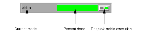
The Module Execution Status bar is located below the editor window and the Module Execution Status button is located to its immediate left:
The Module Execution Status bar displays one of the following:
- the string <idle>, which indicates that no modules are currently executing
- the name of the currently executing module
For example, the module name GDview_update is displayed when an object in the Viewer window is rotated.
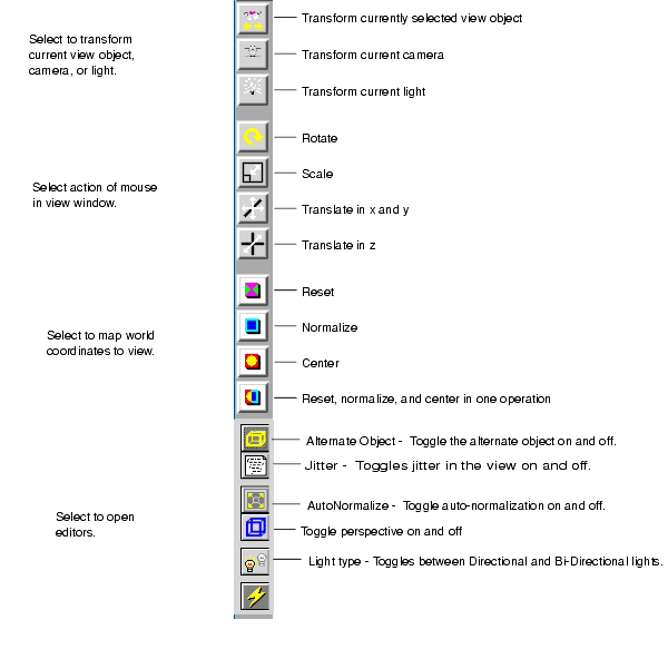
The Toolbar, located below the Menubar on the single-window DataViewer or on the left side of the multi-window DataViewer editor panel, contains a set of icons, each of which represents a tool.
The Toolbar provides a quick way to open DataViewer components and to execute some of the most commonly used DataViewer commands. The tools can be grouped as follows:
- component tools
- transform mode selection tools
- reset, normalize, and center tools
- perspective tools
- editor tools
To use a tool, select it with the mouse.
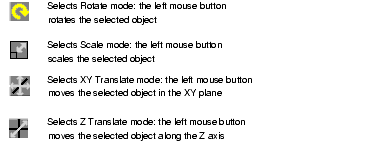
The next group of icons represents tools that select the transform mode. The transform mode determines the type of transformation that the left mouse button performs on the selected object. The following modes are available:
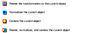
The next four icons represent tools that reset, normalize, and center tools, as follows:
Clicking the Reset icon,
, restores the current transformable object to its original position when it first entered the DataViewer. (Transformable objects include application objects, the scene, the camera, and the lights). The command maintains the color, surface properties (for 3D views), center point, and rendering mode of the object.
Clicking the Normalize icon,
, scales the current object so that it fills the Viewer window.
Clicking the Center icon,
, centers the current object within the Viewer window. If the current object contains subobjects in the view object hierarchy, the center of the object is determined by the maximum extents of the subobjects.
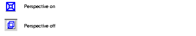
The next icon toggles perspective on and off, as follows:
The perspective icon toggles between perspective and parallel viewing projections for the 3D camera. When the Perspective button is selected (depressed), the perspective viewing projection is used. When the button is not selected, the parallel viewing projection is used.
In the perspective viewing projection, the portions of objects in front of the XY-plane are uniformly exaggerated in size as they approach the camera, and are uniformly diminished behind the plane. Perspective projection attempts to approximate how the human eye views an object, and therefore gives a more "real-world" rendering of the object.
In the parallel viewing projection (the default), the object size is consistent overall. A parallel viewing projection is also called an orthogonal projection.
For more information on perspective, see See Using the View Editor on page 4-32..
The remaining icons represent tools that open editors:
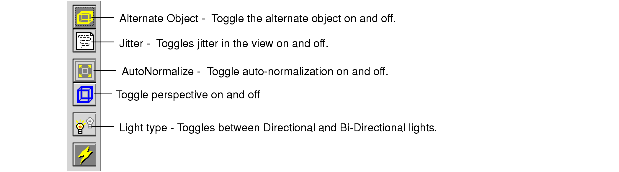
You use the Alternate Object toggle to enable or disable an alternate object that can be used in place of the selected object during transformation. This property is also set in the View Object Editor.
Using a simpler object for transformations can speed-up rendering. By default, the alternate object is disabled. When the alternate object is enabled and view is redrawn, AVS/Express displays the alternate object in place of the object. You can use the alternate object to transform the view to the position you want. When you release the mouse to end the transform, AVS/Express removes the alternate object and re-displays the view objects in their new position.
The Jitter toggle turns the jitter property on and off. The level of jitter is controlled in the View Object Editor
You use the Jitter slider to specify an offset in the object's depth position in the view. Positive jitter values bring the object forward in the view, and negative jitter values moves the object to the back. Jitter is useful when you want to offset an object in relation to other objects in the view in order to resolve ambiguity in rendering the depth of objects that occupy the same plane.
The AutoNormalize toggle controls whether auto-normalization is enabled.
You can specify the properties for auto-normalization on the Camera Editor's General panel. You can use the Auto Normalize option menu to choose when the object is normalized:
- When the data extents of the selected object changes.
- When a new object is attached to the camera.
- When either the data or the objects in the view change.
You can also specify a normalize scale to control how large the object appears in the camera.
The Light Type icon toggles the default lighting in the view between directional (the default) and bi-directional.
A directional light (the default type) is a light source whose rays all point in the same direction; that is, they are parallel. The sun is the canonical directional light source. A bi-directional light is a pair of directional light sources that point in exactly opposite directions.
For more information about an editor, see See Using the DataViewer Editors on page 4-21..
When you start the Visualization Edition of AVS/Express or instance the DataViewer module in the Developer's Edition, the DataViewer object icon appears in the Network Editor, and AVS/Express displays the following window:
The DataViewer editors allow you to interactively transform and modify objects in the view and the view's camera and lights. You display an editor by selecting it from the Editor pull-down menu on the DataViewer menu bar.
The following editors are available:
- View - You can use the View editor to control the display characteristics of the Dataviewer display window, and to add additional scenes to the DataViewer application.
- For information about the View editor, see See Using the View Editor on page 4-32..
- Transform - You can transform objects in the DataViewer view window interactively by using your mouse in the window, or you can specify a transform by setting explicit values. You can use the Transform editor both to define the transform you want to perform with your mouse and to set precise transformation values.
- For information about the Transform editor, see See Using the Transform Editor on page 4-34.
- Light - You can use the Light Editor to manipulate the lighting in the viewer window including setting general light attributes for the view, specifying multiple positional lights, and specifying ambient light.
- For information about the Light editor, see See Using the Light Editor on page 4-36.
- Camera - You view the images in the viewer window through a camera. You can use the Camera editor to control such things as the point of view, perspective rendering, clipping planes, and depth cueing.
- For more information about the Camera editor, see See Using the Camera Editor on page 4-38..
- Object - You can use the Object Editor to control the basic properties of one or more of the objects in the view. The properties you can edit depend on the type of object you have selected. For example, you can control such properties as field conversion properties; rendering modes; primary, secondary, and tertiary colors; and textures characteristics for interpolation, tiling, blending, and rendering.
- For more information about the Object editor, see See Using the Object Editor on page 4-39..
- Datamap - You can use the Datamap editor to control how data values in the input data are converted into the color values that are rendered in the view.
- For more information about the Datamap editor, see See Using the Datamap Editor on page 4-40..
- Graph - You can use the Graph editor to edit the layout and appearance of AG graph objects connected to the 2D port of a UViewer or UViewer2D object.
- For more information about the Graph editor, see See Using the Graph Editor on page 4-42..
- Print - You can use the Print Editor to specify various print options and print the current contents of the Viewer window.
- For more information about the Print editor, see See Using the Print Editor on page 4-28..
You can open only one editor at a time; if you select another, the current editor is replaced in the editor window by the new editor. Note that the effects produced by using a succession of editors is cumulative; that is, each editor works on the most recent version of the Viewer window contents, rather than on a fresh copy of the Viewer window contents as they appeared when the DataViewer first opened or when that editor was last used.
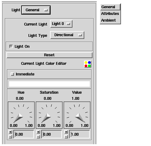
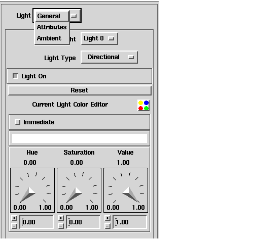
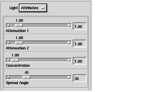
When an editor first opens, the editor displays the default editor page. Each editor include an option menu at the top of the panel which you can use to select other sets of editor controls. For example, when you open the Light Editor the General option is selected and the editor window looks like this:
Selecting any of the other commands replaces the user interface in the panel with the user interface associated with the command. Using this interface, you can edit a specific aspect of the contents of the Viewer window. For example, when you select the Light Editor's Attributes command, the appearance of the Light Editor changes as follows:
Only the controls for the type of the current light are active.
Using the color dials and fields and the Immediate button, you can edit the color of the current light in the Viewer window.
The remaining sections of this chapter give a high-level introduction to the various Editors. For more details on any of them go to the Visualization Techniques manual.
The Module Editor is an interactive tool with which you can access the user interface controls of other modules in your application. It opens in the standard editor location (the editor window to the right of the Viewer window) and its general appearance is very similar to other editors. However, there are two differences:
- The upper portion of the Module Editor contains a list of the modules in the current application whose user interfaces you can control, rather than a specific list of tasks you can perform. This list of modules is dynamic, and varies depending on the application from which the DataViewer is running.
- When the Module Editor first opens, the lower portion contains a product banner rather than being empty.
Like the other editors, when you select an item in the upper portion, a user interface for the selected item appears in the lower portion of the editor.
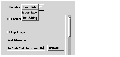
As noted previously, the content of the Module Editor is specific to the application from which it runs. In order to better describe the Module Editor interface, the figures in the remainder of this section are derived from the DataViewer in the following simple application:
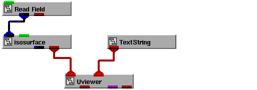
When the DataViewer is first opened in the sample application, the Module Editor looks like this:
The upper portion of the Module Editor contains a list of the modules whose interfaces you can control; in this case: Read_Field, isosurface, and TextString. Selecting a module from the list opens its user interface in the lower portion of the editor.
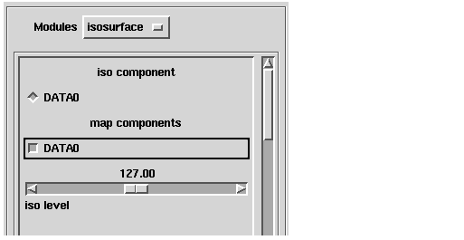
For example, if you select isosurface, the Module Editor changes as follows:
- The type of user interface that appears is specific to the module that you selected. You use an interface that appears in the Module Editor in the same way you would use it in any other context.
- You can select only one module at a time, and the interface for only that module appears in the lower portion of the Module Editor. Selecting several modules in sequence does not cause their interfaces to accumulate in the lower portion of the Module Editor.
- If a module's user interface is too large for the lower portion of the Module Editor, a scroll bar will be provided so that you can access the part of the interface that is scrolled out of view.
The Print Editor is an interactive tool with which you can print the current contents of the Viewer window. Before printing, you can use this editor to specify various print options.
Using the Print Editor to print a file creates a file on your machine that contains a rendition of the contents of the Viewer window (by default, this is a Postscript file). On a UNIX-based workstation, you must go to a shell window and execute the appropriate system command to print the file. On a PC, however, the DataViewer submits a print job for the file in the queue for the default printer.
In either case, if you want to retain this file, you must specify a non-default file name (see See Specifying an Output File on page 4-31.). In UNIX, the default file will be overwritten by subsequent executions of the Print command or by a File->Print command that uses the default file name. On a PC, the default file is temporary and is deleted after the print job is complete.
It is possible to pull down the Main.Viewers.OutputVPS object and utilize it to generate a print file but it is more common to use the Print Editor.
There is a distinct look to the UNIX and the PC interfaces of the Print Editor. The PC interface is much simpler. It allows you to set the X- and Y-resolution, and allows you to set the background as the UNIX version does. All other functions in the PC version of the Print Editor are handled by the standard Windows print dialogs. For more information see Microsoft Windows documentation.
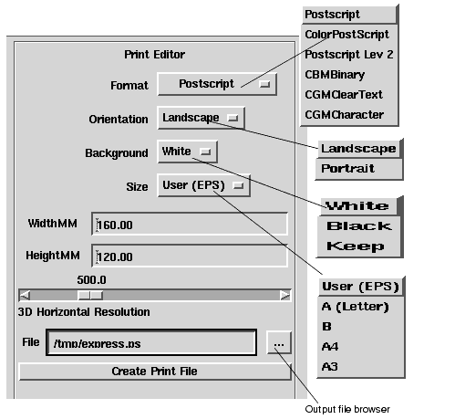
When the Print Editor is first opened in UNIX, it looks like this:
The Output File Format buttons provide the following format choices:
You use the Page Orientation buttons to specify the orientation of the image on the page. The standard choices of Landscape and Portrait are available.
You use this interface to specify the background and resolution of the output file.
You use the Background buttons to specify the background color of the image in the file. This is the background against which the objects in the image are displayed. The following choices are available:
If you choose Use Actual Background, the background color in the Viewer window is used. You should choose this option only if your printer is a color printer; color backgrounds will be gray-scaled on black-and-white printers.
You use the Page Size buttons to specify the page size for the output file. The following standard choices are available:
Be sure that your printer is loaded with the correct size paper for the page size you specify.
You use the Width field to specify the width in millimeters. The default is 160.00 mm. On the PC this is handled by the scale function in the Windows Print dialog.
You use Resolution slider bar to specify the resolution in dots-per-inch of the image in the file. The range of values allowed is 100.0 to 2000.0 dots-per-inch; the default is 500.0 dots-per-inch. On the PC this is handled in the set resolution field under Postscript Options in the Windows Printer Setup Dialog.
Selecting the Set Output File and Print button provides the following user interface:
You use this interface to specify the name of an output file and create the file.
You use the File field to specify the absolute or relative pathname of the output file. The default is /tmp/express.ps.
Pressing the Create Output File bar creates a file containing a rendition of the current contents of the Viewer window. The file has the name and location specified by File and other characteristics (format, layout, background, and resolution) as specified by other Print Editor commands.
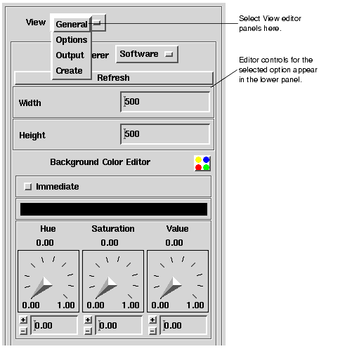
You can use the View editor to control the display characteristics of the Dataviewer display window, and to add additional scenes to the DataViewer application. When it is first opened, the View Editor looks like this:
You can select the following options from the View option menu:
For more detail on the View Editor see the View Editor chapter in the Visualization Techniques manual.
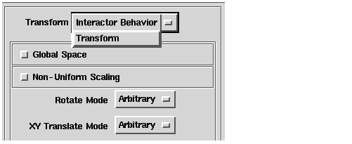
When you select Transform from the Editors menu, AVS/Express displays the following editor panel:
You can transform objects in the DataViewer view window interactively by using your mouse in the window, or you can specify a transform by setting explicit values. The Transform editor options support both methods:
- Select Interactor Behavior to control how mouse interactions in the viewer window transform the selected object.
- Select Transform to display a set of controls that you can use to transform the selected object by setting explicit values, instead of using the mouse.
The transformation performed depends on two other settings in the DataViewer:
- The transform object selected. You can choose to transform the current view object, camera, or light.
- The transform mode selected. You can choose four different types of transforms: rotate, scale, XY-translate, or Z translate.
You select which type of object to transform by choosing the appropriate icon from the DataViewer toolbar:
You can perform four different types of transforms with the mouse. You specify a transform mode to determine which type of transform the left mouse button performs on the selected object. To set the current transformation mode, click on the appropriate icon in the viewer window tool bar:
- The left mouse button rotates the selected object.
- The left mouse button scales the selected object.
- The left mouse button moves the selected object in the XY plane.
- The left mouse button moves the selected object in the Z direction.
For more detail see the Transform Editor chapter of the Visualization Techniques manual.
When the Light Editor is first opened, it looks like this:
You can use this dialog to perform the following tasks:
- Specifying the current light
- Specifying a light type
- Turning a light on and off
- Resetting the attributes of a light
- Specifying the color of a light
Two types of lighting illuminate the objects in the viewer window:
- Lights emanating from a specific location. The DataViewer provides four lights of this type, called Light 0, Light 1, Light 2, and Light 3. By default, only Light 0 is on, and it is a white directional light; that is, the direction of the light is parallel to your line of sight, as if a white sun were directly behind you. You also set these lights to be point, spot, or bi-directional lights.
- Ambient light, which does not have a location. An ambient light lights all object throughout the view equally. By default, a white ambient light is on in the viewer window.
By default, both types of lighting are white in color. You can set the color of each light, including the ambient light, independently.
Lights emanating from a specific location are transformable; that is, you can change their location in the same way that you change the location of any object in the viewer window. The distance of a light from an object does not affect its intensity; there is no inverse square law at work. To make a scene brighter, you turn on more lights.
In discussing the Light Editor, the term "light" means a light emanating from a specific source. References to ambient light are always explicit.
For more detail see the Light Editor chapter of the Visualization Techniques manual.
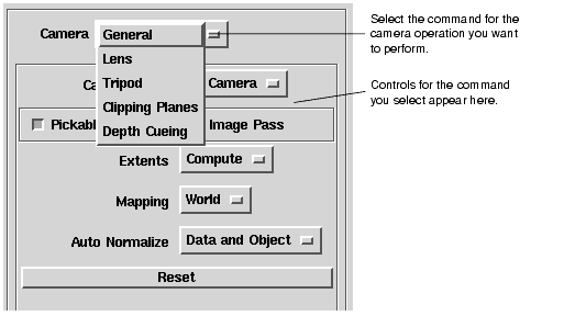
When you select the Camera option from the Editors menu, AVS/Express loads the following editor panel:
You can use this panel to select the following options from Camera option menu:
- General - Select 2D or 3D camera and specify additional options: pickable, image pass, extents, mapping, and auto normalize.
- Lens - Specify the camera lens: Toggle between parallel and perspective viewing projections and set the characteristics of the selected projection.
- Tripod - Specify the position of the camera's tripod, which defines the position of the camera in world space.
- Clipping Planes - Turn clipping on or off and set the position of the clipping planes.
- Depth Cueing - Turn depth cueing on and off, and set the depth cueing planes and scaling.
For more detail see the Camera Editor chapter of the Visualization Techniques manual.
When you select Object from the Editors menu in the DataViewer menu bar, AVS/Express displays the following interface:
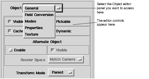
You use this dialog box to set properties for the currently selected object. For information on the view object hierarchy, and how to select objects, see the Visualization Techniques manual.
You can choose the following options from the Object option menu:
- General - Set basic object properties including, visible, pickable, cached, and dynamic. Enable and control an alternate object. Set the transform mode to Parent, Normal or Alternate.
- Field Conversion - Set conversion properties for field data for lines and surfaces, images, or textures.
- Modes - Set rendering modes for points, lines, surfaces, volumes, bounds, and normals
- Properties - Set the object's primary, secondary, and tertiary colors. Set rendering characteristics for points and lines, surfaces, and volumes.
- Texture - Set textures characteristics for interpolation, tiling, blending, and rendering type (single level or mip-map).
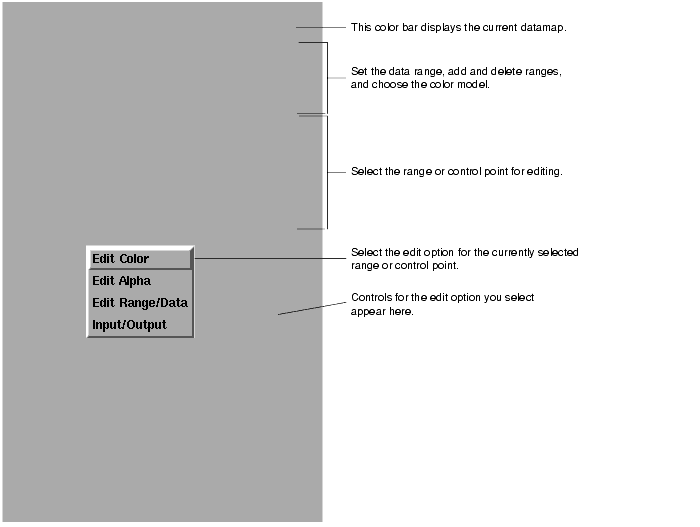
When you first open the Datamap editor it looks like this:
You use this interface to perform the following tasks
- Specify a data range
- Defining the color mapping
- Defining the current Alpha map
- Reading datamap files
For more details see the Datamap Editor chapter of the Visualization Techniques manual.
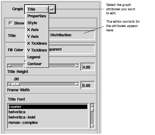
The Graph option on the Editors menu is available when a graph object is connected into the current scene. A graph object is an object that contains the data and formatting to render a graph. For Visualization Edition user's this means either Accessories.Graphics.Graphing.AGGraphFieldObj and AGContourFieldObj. For Developer's Edition users it can also include other AG objects.
When you select Graph from the menu, AVS/Express displays the following interface:
Selecting an option from the Graph option menu displays the editor controls for those graph characteristics. For more detail see the Graph Editor chapter of the Visualization Techniques manual.
| |
|
|
|
 Transform the current view object.
 Transform the current camera.
 Transform the current light.
 Rotate:
 Scale:
 XY Translate