This is an archival copy of the Visualization Group's web page 1998 to 2017. For current information, please vist our group's new web page.
Detecting Distributed Scans Using High Performance Query-Driven Visualization
E. Wes Bethel (CRD/LBNL), Scott Campbell (NERSC/LBNL), Eli Dart
(ESnet/LBNL), Kurt Stockinger (CRD/LBNL), Kesheng (John) Wu (CRD/LBNL)
May 2006
Introduction and Background
Modern forensic analysis in cybersecurity discovery applications relies on the ability to quickly perform hypothesis testing, knowledge discovery and data mining on large collections of network traffic data. The same is true for all data-intensive knowledge discovery applications in science, engineering, finance, security and biomedicine. To facilitate these objectives, we present new capabilities in scientific data management and visual analytics within the context of a case study aimed at detecting and characterizing distributed scans in 42-week's worth of network connection data. Our approach relies on new family of parallel-capable algorithms for answering multidimensional queries on index data that produce one- and two-dimensional histograms as output. The visual analytics application for performing the forensic network connection data analysis relies on these new algorithms to aid in iterative data mining, hypothesis testing and knowledge discovery. The case study presents results that offer a significant performance and capability improvement over traditional approaches to network connection analysis.
A typical day's worth of network traffic at an "average" government research laboratory might involve tens of millions of connections comprising multiple gigabytes' worth of connection records. These connection records can be considered as "conversations" between two hosts on a network. They are generated by routers, traffic analyzers or security systems and contain information such as source and destination IP address, source and destination ports, duration of the connection, number of bytes exchanged, date/time of the connection, and so forth. A year's worth of such data currently requires on the order of tens of terabytes or more of storage. According to Burrescia, traffic volume of ESnet, a production network servicing the U. S. Department of Energy's research laboratories, has been increasing by an order of magnitude every 46 months since 1990. This trend is expected to continue into the foreseeable future.
The steady increase in network traffic volume increases the difficulty of forensic cybersecurity or network performance analysis. Current network traffic analysis toolsets rely on simple utilities like grep, awk, sed and gnuplot. While sufficient for analyzing hours' worth of network traffic data, these utilities do not scale nor perform to the level needed for analyzing current and future levels of network traffic.
To address the need for rapid forensic analysis capabilities, the work we present here presents a case study showing the combination of two complementary technologies. The first is the use of state-of-the-art scientific data management technologies for data indexing and querying. After all, data mining and knowledge discovery is built upon finding and analyzing "interesting" data — our objective is to achieve maximum possible performance in data mining, so we use the best possible technology for finding interesting data. Second, we use a query-driven visualization and analytics application for formulating queries, obtaining and displaying multidimensional histograms. A key concept is that we are computing and displaying data histograms and need not access the raw data directly as any part of the case study we present here.
The example we present here illustrates how emerging QDV technologies are applied to discover and characterize a distributed scanning attack. We begin with 42 weeks' worth of network connection data consuming a total of 281GB of storage. Attempting to perform analysis on such a large dataset qualifies as a "hero-sized" problem: traditional network data analysis tools — awk, grep, sed — are suitable for use only on a few hours' or days' worth of data; previous work in network cybersecurity visualization show examples on datasets consisting of a few hours' or days' worth of data.
Our application consists of a custom GUI built on top of the the Fast Light Toolkit, rendering and visualization capabilities provided by OpenRM Scene Graph, and scientific data management index/query capability by FastBit. The general application use pattern is to first load some index summary information that indicates the number of variables, the name of each variable and so forth. Next, the user begins data mining and visual analytics operations by posing queries using one of several different query-formulation mechanisms. The query results in this application consist of n-dimensional histograms. The application supports a variety of histogram visualization operations including histogram transformations, colorization strategies, visualization methods and so forth.
The FastBit software provides the ability to produce histograms without the need to ever access the raw data: FastBit uses a patented compression algorithm and "bitmap indexing." This combination lends itself well to quickly generating histograms directly from the bitmap indices. In the case of this case study, we use statistics of data rather than individual data values in our data mining, knowledge discovery and analytics algorithms. FastBit provides the ability to quickly generate a one- or two-dimensional histogram by allowing the application to specify bin boundaries over one or two variables along with a predicate expression. An example of such a query would be: produce a histogram where the bins are each destination C address octet, the destination port is 5554, the connection was unsuccessful, and the range of time is the month of December 2004. The visualization application then takes the return values and generates a viewable histogram. This one-dimensional histogram example can be generalized into n- dimensions, which is exactly what we do in this case study.
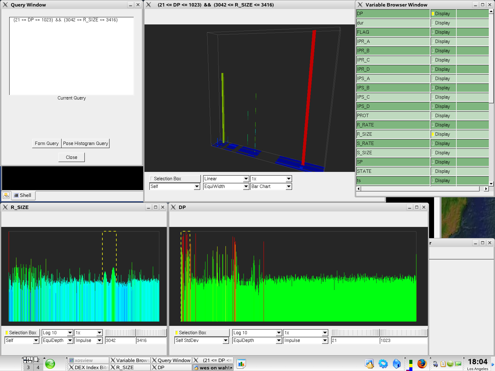 |
| Our visual analytics application helps a user to formulate and view n-dimensional histograms of large and complex datasets. A one-dimensional histogram for each of the source variables is viewed by clicking on any one of the data variables in the variable browser interface (upper right). This example shows how a histogram range selection widget is used to select a range of variable values from two variables – in this case, we are selecting a range of destination ports from the variable DP, and a range of connection records where the amount of traffic in the network connection lies within a specified range from the variable R_SIZE. The resulting query, which the application automatically formulates on behalf of the user based upon the selection widget settings in each active variable, is the "cross product" of the specified subsets of two one-dimensional histograms. The resulting two-dimensional histogram appears as a new variable in the variable browser window, and is visualized and rendered in the window visible in the upper central portion of the image. In this example, the histogram bars for the one-dimensional histograms are color coded according to the statistical moments of the dataset — red bars represent bins where the count of connection records in that bin is three standard deviations or greater from the mean number of counts in all histogram bins. This type of colorization helps to quickly identify statistically significant features in large datasets. |
Network Traffic Analysis Case Study
It is common for attackers to use sets of previously compromised hosts to collectively scan a target network. This form of attack, known as a "distributed scan," is typically accomplished by dividing the target address space up amongst a group of "zombie" machines and directing each zombie to each scan its portion of the target network. The term "zombie" refers to a computer system that has been enslaved for the purpose of carrying out some action, typically malicious. The scan results from each zombie are then aggregated at a master host thereby creating a complete picture for the attacker. An example attack is a search for unsecured network services on a given port or port range. Identifying sets of hostile hosts under common control is helpful in that the group of hosts can be blocked from access to critical infrastructure, and the group can be reported to the larger community for further analysis or action.
The initial indication of a security incident typically comes from a source other than data mining, e.g. an email alert, an IDS alert, or a phone call from a colleague at another institution. For example, we might receive an email indicating that a new vulnerability has been publicized, affecting a network service that listens on a particular TCP port. Historical data can then be examined to see if we can find evidence of malicious activity targeting this port — this activity could well be an indication of an attacker with pre-publication knowledge of the vulnerability.
In the discussion that follows, we implement a sequence of data mining steps aimed at detecting a distributed scan and identifying the set of remote hosts participating in the scan. In our analysis, we first determine the temporal characteristics of the distributed scan, then identify the set of remote hosts participating in the scan. We begin with the assumption that some type of suspicious activity is occurring on destination port 5554. Such an assumption is based upon an IDS alert.
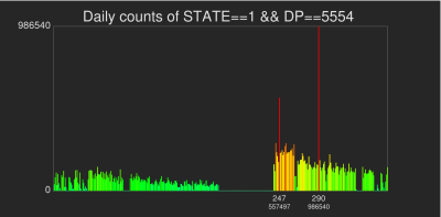
We begin by first obtaining a "global view" — how many unsuccessful attempts are occurring over a 42-week period on port 5554? Answering this question helps us to begin to understand the characteristics of a potential distributed scan attack.
|
| Unsuccessful connection attempts to port 5554 over a 42-week period are shown here as a one-dimensional histogram. While the source data is sampled at per-second resolution, we created this histogram by requesting the number of connection attempts on a per-day basis: each histogram bin is one day wide. While the is a largest spike occurs on day 290, the range of elevated activity around day 247 is "more interesting" as it indicates what may be temporally coordinated activity. Each histogram bar is color-coded according to the number of standard deviations from the mean. Green bars are "close to" the mean number of unsuccessful connection attempts, while red bars indicate bins that have a count that are three or more standard deviations from the mean number of per-bin counts. |
Note the large counts on days 247 and 290 visible as tall red spikes. Note also that around 247 there is a consistent increase in daily connection counts. The activity on day 290 appears different, since there appears to be a large increase in scanning activity — possible indicating a new scanning tool or technique. The activity surrounding day 247 appears at first glance to be careful work over time by a set of hosts, whereas the day 290 activity could easily be a single host scanning at a very high rate with the intent to "get in and get out" before its presence can be detected and its access blocked. Such high speed scans are quite common and are often the "reconnaissance phase" of a larger attack mechanism, or a combined scan and attack tool.
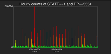
Next, we drill into the data by computing a histogram containing the number of unsuccessful connection attempts over a four-week period at one-hour resolution. There is no need to increase resolution at the global level since we are interested only in those events within a smaller time window. Here is where the power of query-driven visualization and analytics comes into play — we are focusing visualization and analysis only on interesting data.
|
| This image shows a histogram of unsuccessful connection attempts at one-hour resolution over a four-week period. This histogram shows that the suspicious activity is temporally periodic, with a period of approximately one day and repeating over a twenty-one day window. |
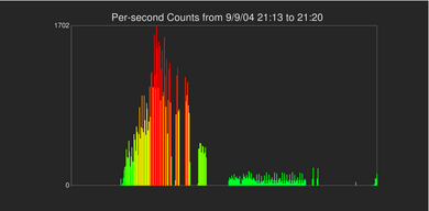
We next drill into the data at a finer temporal resolution by posing a query that requests the counts of per-minute unsuccessful connection attempts over a five-day period within the four-week window. The purpose of this query is to further refine our understanding of the temporal characteristics of the potential attack.

|
| This histogram shows the number of unsuccessful connection attempts to port 5554 over a five-day period of time sampled at one-minute granularity. The histogram indicates a repeating pattern of unsuccessful connection attempts that occur on a regular twenty-four hour interval. Each primary spike is followed by a secondary, smaller spike fifty minutes later. |
With the one-minute view, we see a distinct pattern of of increased unsuccessful connection attempts on precise 24-hour intervals. Decoding the Unix timestamp, we see the event occurs daily at 21:15 local time. Each such spike is followed by a secondary spike that occurs about 50 minutes later.
Drilling yet deeper into the data, we construct a histogram showing the number of connection attempts over a seven minute window at one-second temporal resolution. The seven minute window is chosen to completely contain the primary daily activity spike that occurs on one day within the overall temporal region of interest.
|
| This histogram shows the number of unsuccessful connection attempts that occur at one-second temporal resolution within a seven-minute time window. This seven-minute window corresponds to a primary daily activity spike within the four-week period of interest. We see a ramp-up in activity that then declines and drops off. |
At this point, we conclude that an organized scanning event is occurring daily at 21:15 local time within a four-week window of our 42-week dataset. While there also appears to be a secondary event that occurs 50 minutes later within the same four-week period, for the rest of this analysis, we will focus only on the daily event occurring at 21:15 to simplify the rest of the analysis. This conclusion is the first of two questions we strive to answer with our analysis: what are the temporal characteristics of the suspicious activity?
So far, our analysis has focused on understanding the temporal characteristics of the attack. Next, we wish to establish that the attack is a scan, and then identify all the hosts that are perpetrating the attack to determine if the attack is from a single host or from multiple hosts that are coordinating their effort. The next steps in our analysis will be to look at destination addresses covered by the attack.
We next construct a three-dimensional histogram to understand the extent of coverage in the destination address space. Two of the axes represent the destination C and D address octets, while the third axis represents time. The time axis represents a two-hour window sampled at one-minute granularity.
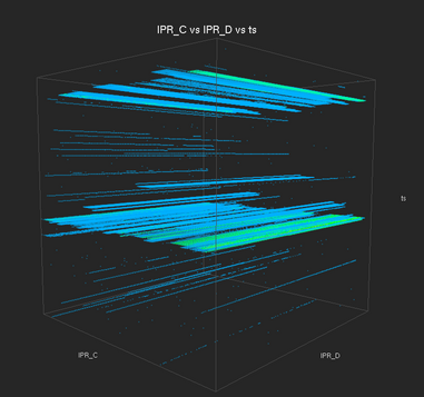
|
| This three dimensional histogram shows coverage of the potential attack in the destination network. Two of the axes are the destination C and D address octets, and the third (vertical) axis is time. Here we see two "sheet-like" structures that correspond to the primary and secondary daily spikes in suspicious activity. The "sheet" structure indicates that the suspicious activity is occurring across the entire range of destination C and D addresses — such behavior is indicative of a scanning attack. |
At this point, we have answered the second of the three analysis questions — the suspicious activity appears to be a scanning attack as all C and D address octets within destination network are being probed. The next step in the analysis process is to discover the set of remote hosts that are perpetrating the attack. To do so, we will perform a series of analysis steps that involve identifying the A, B, C, then D address octets of the attacking hosts.
To identify the A address octet of the attacking hosts, we construct a pair of histograms. The first is a three dimensional histogram where two of the axes are the destination C and D addresses and the third is time. The time axis encompasses a seven minute window at one-second resolution; the seven-minute window encompasses one of the daily primary activity spikes.
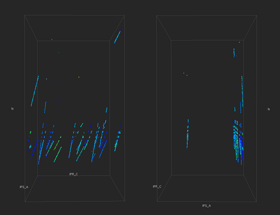
|
|
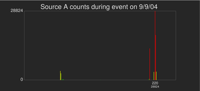
| The top pair of images are different views of a three-dimensional histogram. The three-dimensional histogram shows the number of unsuccessful connection attempts to all destination C addresses from all source A addresses within a seven-minute window at one-second temporal resolution. The bottom image shows a one-dimensional histogram of unsuccessful connection attempts from each of the 255 addresses within the source A address octet within the same seven-minute window of time. |
The 3D histogram shows structures that are indicative of scanning activity: the slanted lines in the top-left image show that different destination C addresses are being scanned over a relatively narrow range of time. The upper right image shows such activity is confined to a fairly narrow range of source A addresses. The bottom one-dimensional histogram shows exactly the source A addresses participating in the attack, with the source A address of 220 showing the greatest level of activity. Our visual analytics application tells us precisely (not shown here) the top N bins in a histogram. In this case, we identify a total of seven unique source A addresses that are participating in the scan. We assume that because all hosts in the seven A addresses are engaging in probing activity at about the same time that they are part of a coordinated distributed scan.
We next repeat the analysis but looking at source B addresses. When we construct the one- and three-dimensional histograms, our query iterates over the seven source A addresses identified in the previous step of the analysis. The results are a one- and three-dimensional field consisting of seven different variables.
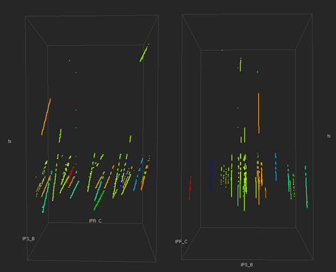
|
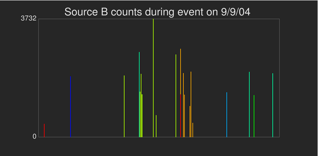
|
| The top pair of images are different views of a three-dimensional histogram showing the number of connection attempts to all destination C addresses from all source B addresses within a seven-minute window sampled at one-second temporal resolution. The bars and dots are color-coded according to the source A address value of the attacking host. These images show that different hosts are attacking different portions of the destination addresses. This type of behavior is indicative of a distributed scan where the destination address space is divided amongst a group of zombie hosts. |
This analysis step is repeated to identify the unique C and D addresses of the attacking hosts. The four analysis steps reveal a total of twenty different hosts are participating in the distributed scan.
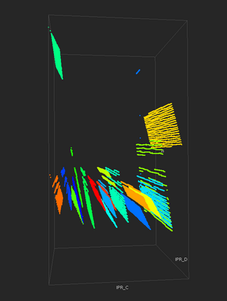
|
| This three dimensional histogram shows coverage in the destination C and D addresses by all twenty hosts participating in the distributed scan over a seven-minute window sampled at one-second granularity. The visualization is color-coded by unique source address to show how each source host is attacking a different part of the destination address space. |
Performance Notes
The data mining example we show above would not have been possible without the ability to quickly interrogate data to produce histograms. A complete discussion of performance issues is beyond the scope of this article — the interested reader is directed to the Further Reading section later in this document. Generally speaking, the amount of time required to perform the queries used in our analysis varies according to the size of the source data (the size of the data indices, to be more precise), the complexity of the query and the number of items returned by the query. The average time to perform the queries used in the analysis we present here is on the order of a few minutes using an iterative approach implemented in serial fashion on a davinci.nersc.gov, which is an SGI Altix equipped with 32 1.4Ghz Itanium 2 processors and 192GB of RAM. The elapsed time for performing some queries — particularly those that produce the three-dimensional histograms — could have been reduced through the use of parallelism: processors would have been assigned groups of two-dimensional queries to execute in parallel; FastBit is thread-safe and supports such a form of parallel use. The performance and scalability performance of FastBit is explored more fully in the references shown below.
Conclusion
As data size and complexity continues to grow, there are corresponding increases in the level of difficulty in managing, mining, and understanding data. We believe that a technique called "query-driven visualization" represents a promising approach for gaining traction on the data mining and knowledge discovery challenges facing science, engineering, finance, security and medical applications. Our approach to query-driven visualization combines state-of-the-art scientific data management technology for indexing and querying data with visual analytics applications to support rapid drill-down and hypothesis testing.
This article describes application of these principles to a "hero-sized" network data analysis problem — we use these technologies to discover and characterize a distributed network scan attack and to identify the set of hosts that perpetrate the attack. Our approach leverages the ability of the FastBit software to rapidly generate histograms, the ability to quickly inspect histograms with rich-featured visualization capability that take into account the statistical characteristics of data, and to pose new queries based upon previous discoveries. This iterative approach is an implementation of "visual analytics."
The work we present here is novel in several respects. First, it shows that it is possible to quickly analyze a large collection of network connection data to discover and characterize a complex attack. Previous works in network analysis focus on a few hours' or days' worth of data — we process 42 weeks' worth of data in our case study. Second, we show how a visual analytics application that combines state-of-the-art scientific data management technology with full-featured and straightforward visualization techniques can be brought to bear on a challenging data analysis problem. Third, the application shows how complex queries are formulated through an iterative, guided process that relies on statistics, rapid data access and interactive visualization.
Acknowledgment
This work was supported by the Director, Office of Science, Office of Advanced Scientific Computing Research, of the U.S. Department of Energy under Contract No. DE-AC02-05CH11231, and by the Department of Homeland Security National Visualization and Analytics Center.
Further Reading
- E. Wes Bethel, Scott Campbell, Eli Dart, Kurt Stockinger and Kesheng Wu. "Accelerating Network Traffic Analysis Using Query-Driven Visualization." To appear in 2006 IEEE Symposium on Visual Analytics Science and Technology. LBNL-59891.
- E. Wes Bethel, Scott Campbell, Eli Dart, Jason Lee, Steven A. Smith, Kurt Stockinger, Brian Tierney, Kesheng (John) Wu. "Interactive Analysis of Large Network Data Collections Using Query-Driven Visualization."
- Joe Burrescia and William Johnston. ESnet status update. Internet2 International Meeting, 2005. (PDF)
- Kurt Stockinger, E. Wes Bethel, Scott Campbell, Eli Dart, Kesheng Wu. "Detecting Distributed Scans Using High-Performance Query-Driven Visualization". To appear in Supercomputing 2006. LBNL-60053.
- Kurt Stockinger, John Shalf, Kesheng (John) Wu, E. Wes Bethel. "Query-Driven Visualization of Large Data Sets." In Proceedings of IEEE Visualization 2005, pp. 167-174. Minneapolis, MN., October 23-28, 2005.
- Kurt Stockinger, John Shalf, E. Wes Bethel, K. Wu. "DEX: Increasing the Capability of Scientific Data Analysis Pipelines by Using Efficient Bitmap Indices to Accelerate Scientific Visualization." 2005 Scientific and Statistical Database Management Conference (SSDBM-2005), Santa Barbara, California, June 27-29, 2005. (LBNL-57023)