2 Using AG Networks and Objects
This chapter describes how to construct networks that create and annotate graphs using the Annotation and Graphing (AG) Kit.
- Introduction
- Creating a Simple Graph
- Common Annotation and Graphing Characteristics
- Controlling Graph Type and Visibility
- Displaying Your Own Data
- Creating Logarithmic Axes
- Creating Contour Maps
2.1 Introduction
This chapter contains a number of examples that show you various features of the AG Kit. The chapter begins with an example that uses default data and describes how you add a title, add a legend, and annotate the axes. Other examples demonstrate how you change characteristics of the objects, select graph types, display your own data, and create contour maps.
Before Running the Examples
This chapter assumes that you read the AVS/Express Getting Started manual and you can create networks and change values of the objects in a network. You also must understand the concept of hierarchical data structures and the notion of inheritance.
For detailed information about the objects in the AG Kit, refer to the on-line reference pages.
Accessing the Example Networks and AG Kit Objects
You load the examples in this chapter by selecting Annotation_Graphing from the Examples page in the Network Editor and selecting the appropriate example file. For example, to load the simpleGraph network, open Annotation_Graphing from the Examples page and select the simpleGraph object.
Once you load the file, you can follow the example (labeled "Try this") and learn more about the AG Kit's features by experimenting on your own. To work with other AG objects, you access the AG Kit functionality via the Annotation_Graphing page in the Network Editor.
2.2 Creating a Simple Graph
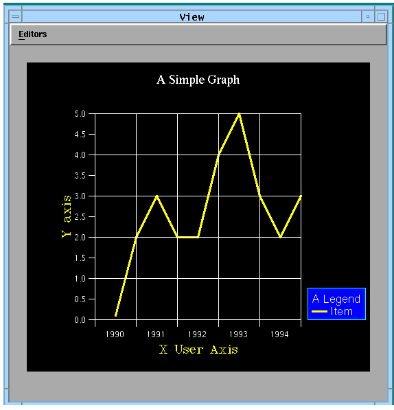
This section shows an example of creating a simple graph using default data. It uses the example, Examples.Annotation_Graphing.simpleGraph. The following figure shows the graph that the example creates in the viewer.
The graph contains a title, legend, axes, and ticklines. The Y axis has default values and the X axis has user-defined values.
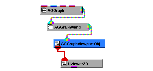
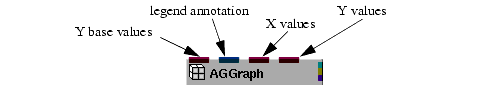
In its simplest form, an AG network connects an AGGraph object to an AGGraphWorld object, then to an AGGraphViewportObj object, and finally, to a 2D viewer.
AGGraph creates a graph. It has default data that the preceding configuration uses to display a curve in the viewer.
The graph appears in a rectangular area with a coordinate space. AGGraphWorld defines the world coordinate space. AGGraphViewportObj provides the rectangular area, known as a viewport, with a coordinate space for the graph. A 2D viewer constructs the screen image.
You can place several other elements in the viewport, for example, ticklines, axes, a legend, and a title. The example in this section shows you how to include these objects in the view.
Please note that AG objects must be connected to 2D viewers, or to the 2D input port of combined 2D and 3D viewers.
Adding Axes and Ticklines in the World Coordinate Space
Each AGGraphWorld object has its own world coordinate space that by default depends on all objects connected to its input port. The limits of the world coordinate space depend on the minimum and maximum X and Y values. The Y limits also depend on the baseValuesY and referenceValue parameters.
See also Y Base Values and Parameters that Determine World Coordinate Limits.
X and Y Axes
The X and Y axes show you the limits of the world coordinate space. The objects that create an X axis are AGXAxis and AGXUserAxis; the objects that create a Y axis are AGYAxis and AGYUserAxis.
- The AGYAxis object creates labels for the Y axis. The range of the Y axis depends on AGGraphWorld's world coordinate space. In this example, the labels begin at 0.0 and range to 5.0 because the default AGGraph data ranges from 0.0 to 5.0.
- If you disconnect AGGraph from AGGraphWorld, the labels reflect the range of the default world coordinate system, which ranges from -5 to 5.
Reference Ticklines
AGXAxis and AGYAxis objects lay out labels for the axes based on a reference value and a step size. By default, the reference and step size are based on the range of the data.
- Note that the value of majorReferenceY in the AGYAxis object sets a reference point for the Y tickmarks; whereas, the value of majorReferenceY in the AGYTicklines object sets a reference point for the major ticklines. The tickmarks and ticklines propagate on either side of the reference mark in steps determined by majorStepY.
- In this example, majorReferenceY in AGYAxis is unchanged, so the tickmarks use a default step size of 1; majorStepY in AGYAxis is 0.5, so the labels use the step size 0.5.
- To change the tickmark's step size, set majorStepY in AGYTicklines. Alternatively, you can set majorStepY in AGGraphWorld, which affects the unset majorStepY object in AGYTicklines.
User Defined Labels
You create unique labels by instancing AGXUserAxis or AGYUserAxis. Both these objects have a labelStrings parameter that defines the text for the axes labels.
- The AGXUserAxis object's labelStrings parameter sets the X axis labels to the years 1990 through 1994. You change the label text by changing this parameter.
- AGGraphWorld controls the limits and positions of the tickmarks. Only labels that fall within the intervals of these limits appear in the viewer. In this example, three parameters align the ticklines with the tickmarks and label positions. AGGraphWorld's majorReferenceX parameter is set to 0, the majorStepX parameter is set to 2, and the limitsX parameter is set to {0,10}.
- The labels appear between the tickmark intervals because AGXUserAxis's default labelPosition is set to "intervals". You position the labels at the tickmarks by setting labelPosition to "ticks".
Adding a Title
You can create a title on a graph using AGTextObj. AGTextObj's position is relative to another object, for example, relative to a viewer or a viewport. To display a title positioned at the top center of the viewer, you connect the object directly to a viewer. In this case, the AGTextObj's position changes whenever the viewer's transformation matrix changes.
- Open the AGTextObj macro, which has two subobjects. The text subobject's geometry parameter positions the title in the center and at the top of the viewport. The text subobject's text and font parameters define the string "A Simple Graph" using the Roman-Complex font. Try changing the values of the text and font.
- See Font Parameters for available font names.
- AGTextObj connects to Uviewer2D. You can reposition the title by picking it in the viewer and placing it in a new location. Note that this transformation is not saved when you save the network.
- The title moves independently of the graph because AGTextObj connects to Uviewer2D. If you disconnect AGTextObj from Uviewer2D and reconnect AGTextObj to AGGraphViewportObj, the entire graph moves with the title because the title's position is dependent on transformations in AGGraphViewportObj.
Adding a Legend
AGGraphLegendObj is similar to AGTextObj in that its position and size depend on the object that references it. You set a legend's position by changing the geometry parameter in the graphLegend subobject. The position is relative to the limits set in the AGGraphViewportObj or a viewer, depending on which object references AGGraphLegendObj.
Before a legend appears in a viewer, you must supply data to the legend object's input port. This is done by connecting AGGraph's output to the input port of AGGraphLegendObj.
- The viewport coordinate space is in the range from -5 to 5. The legend inherits the viewer's limits because AGGraphLegendObj connects to the Uviewer2D.
- AGGraphLegendObj has two subobjects. Open AGGraphLegendObj and open its subobject graphLegend. Notice that the geometry was changed from the default value {0,0} to the value {3.2,-3}.
- Try changing the values assigned to graphLegend's geometry parameter. The AGGraphLegendObj's position changes accordingly. (Remember to press the control and return keys to enter array data.)
- You can also modify the color, size, and title of the legend by changing the appropriate parameters in graphLegend.
- Disconnect AGGraphLegendObj from Uviewer2D and connect AGGraphLegendObj's second output port to AGGraphViewportObj. Now, the legend's position depends on the object AGGraphViewportObj.
See also Setting Legend Text Strings, and Displaying a Contour Legend.
2.3 Common Annotation and Graphing Characteristics
A number of parameters in the AG Kit retrieve their values from other objects in the network hierarchy. Generally, these parameters describe the appearance and behavior of objects in which they are defined.
For more information on parameters, see Chapter 3, AG Structures and Concepts.
The example used in this section is Examples.Annotation_Graphing.graphChar.
Unset Parameters
Whenever AVS/Express needs a parameter's value, it traverses the network until it finds a setting for the parameter. This provides a mechanism to control parameter settings by setting only one occurrence of the parameter. With this in mind, you set the parameter in the appropriate place in the network.
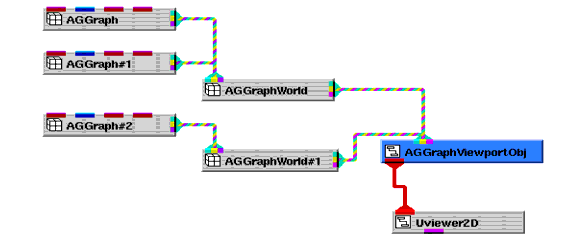
Given the network in the following figure, you control the effect of a parameter for all instances of AGGraph by setting the parameter in AGGraphViewportObj. For example, to control the type of graph for all instances of AGGraph, you set graphType in AGGraphViewportObj.
Alternatively, you can set the individual graphType parameters for each instance of an AGGraph object or for an instance of an AGGraphWorld object. The setting is not recursive at set time. To have the described effect, all children must have the graphType parameter unset, which is the default value.
Setting Color
All objects in the AG Kit have a variety of color parameters that set colors for different graphical objects. For example, you can set the color of the axes labels, axes text, or tickmarks.
Color of the Axes Labels
The textColor parameter determines the color of the text for the X axis and the Y axis. Independently setting this parameter in AGXAxis and AGYAxis controls the color of the X axis text and the Y axis text. Setting the textColor parameter in the object that references AGXAxis and AGYAxis controls the color of the text for both axes.
- Notice that the textColor parameters in AGXAxis and AGYAxis are set to "yellow"; whereas, the textColor parameter in AGGraphWorld is set to "cyan".
- If you unset textColor in AGXAxis, AGXAxis obtains its textColor from AGGraphWorld. Unset the textColor parameter in AGXAxis and notice that the text's color becomes cyan.
Color of a Graph
The AGGraph object's color parameter determines the color of the plotted graph. The graphColors parameter in AGGraphViewport sets the default colors of all AGGraph's connected to AGGraphViewport.
- Unset the color parameter in the AGGraph object. The curve obtains the default color red from AGGraphViewport.
- Now, open AGGraphViewport. The graphColors parameter defines default colors for all graphs connected to AGGraphViewport. Change the first default color and notice that the color of the curve in the graph changes.
- Set the color parameter in the AGGraph object to "blue". This color overrides the color setting in AGGraphViewport's graphColors parameter.
Changing the Size of Labels and Text Strings
A number of objects specify a distance, such as a height of a label or text object. The values of these parameters are measured as a percentage of the shortest side of a viewport or window size, whichever object references the object containing the parameter.
See the description for AGDistance on page
- If you connect the AGText object to AGGraphViewport, a large "T" appears in the center of the viewport.
- Open AGText and notice that the value of the height parameter is 50. This indicates that the size of the character is 50% of the viewport size.
- If you change the height parameter to 20, the character size becomes 20% of the size of the axis.
- If you change the height parameter to -30, the character size becomes 30% of the size of the axis but the text is now of a fixed height. Resize the viewport and notice that the text size remains constant.
- The font of AGText is a software font, as indicated by the characters "sw:" preceding the font name. This prevents characters from being completely clipped. Hardware fonts clip the entire character if any part extends beyond the viewport boundary and clipping is on.
Setting the Drawing Order Using the Priority Parameter
All AG objects have a priority parameter that determines the drawing order. The priority has an effect only when an object references more than one other object. The settings of the priority parameters determine the order in which object's are drawn.
The AG Kit draws objects with higher priority values last, so these objects appear in front of graphics drawn in the same location. The priority parameter is initially 0, and if unchanged, the drawing order depends on the order in which you connected the objects-objects connected first are drawn first.
You increase the priority value if you want the object drawn after other objects, and decrease the priority if you want an object drawn before other objects. Negative values are acceptable.
- Set AGGraph's color parameter to red and AGGraph#1's color parameter to blue. Also set the graphType parameter in AGGraphViewport to "area".
- AGGraph has a priority of 0. AGGraph#1 has a priority of 5. Therefore, the red area plot is drawn before the blue area plot and is beneath the blue area plot.
- To draw an object in front of another object, you assign a higher priority to the object you want in front. For example, change the priority of AGGraph to 6. Now the red area plot is drawn after the blue plot, so it obscures much of the blue plot. Also note that the red area plot is drawn after the ticklines.
2.4 Controlling Graph Type and Visibility
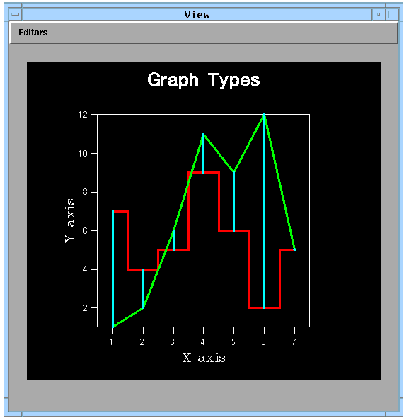
This section shows you how to set the graphType and the visibility parameters. The example used in this section (Examples.Annotation_Graphing.graphUI) generates the graph shown in the following figure.
AG objects have a number of parameters that you may find easier to set from a user interface control panel. The graphType and visibility parameters fall into this category. This manual does not attempt to describe how you construct user interfaces. Please refer to Chapter 1, The User Interface ("UI") Toolkit for information on building user interfaces.
Selecting Graph Types and Setting Y Values
The AG Kit allows you to display your data using different graph types. These types are curve, bars, barlines, scatter, area, staircase, and stairarea.
- Notice that three types of graphs appear in the view. One is a staircase plot, another a curve, and the third a series of barlines.
- The first seven buttons in the Graph Controls panel send one of seven strings to the AGGraph object's graphType parameter. Select a radio button to change the red staircase graph to another graph type.
Y Base Values
When you instance AGGraph, its first input port defines a Y base value. This value determines the minimum Y coordinate for bars, barlines, area, and stairarea graph types. Please note that in the example, an input port was added to the object named AGGraph, so the second input port connects to baseValuesY.
- The Base Values object supplies Y data values to the curve graph and Y base values to the barlines graph. Disconnect the Base Values object from the first input port of the AGGraph Barlines object. Notice that the base value used is the default value, which is the lower limit of the Y axis.
- To specify a single base value for all Y data values, you set the AGGraph referenceValue parameter. While the Base Values object is disconnected from the AGGraph Barlines object, open AGGraph Barlines and change the referenceValue parameter to -1. All the barlines terminate at Y = -1.
Y Reference Values
The referenceValue parameter has two functions. It provides a Y base value for the data when values are not supplied to baseValuesY. It also provides a value used to determine negative colors.
- While the Base Values object is disconnected from the AGGraph Barlines object, open AGGraph Barlines and change the referenceValue parameter to 4.
- Set AGGraph Barline's negativeColor parameter to magenta. This helps you distinguish the lines below the value set in the referenceValue parameter.
- If you reconnect Base Values to AGGraph Barline's baseValuesY parameter, the portion of a line below the referenceValue is the color specified by the negativeColor parameter. Note that the negativeColor parameter has no effect on area or stairarea plots.
- AGGraphWorld uses the referenceValue to determine the limits of the world coordinate space. If you set the referenceValue to -2, the minimum value on the Y axis becomes -2 after the world coordinate space is recalculated.
See also Adding Axes and Ticklines in the World Coordinate Space.
Positioning Bars and Staircase Plots
The AG Kit has default values that center bars, barlines, and staircase graphs. For bars and barlines, the center is set by the barOffsets parameter in the object AGGraphViewport or the object AGGraphViewportObj. For staircase graphs, the center is set by the shiftPosition parameter in an AGGraphViewport or AGGraphViewportObj. You can also set the center position in an AGGraph or AGGraphWorld object.
Bar Offsets
The default bar offsets were chosen so that when you display multiple bar graphs, the bars appear beside one another-rather than being drawn over one another. The default offsets are {0.4, 0.2, 0.0, -0.2, -0.4}. These values represent a relative offset between adjacent bars.
- Turn on the X ticklines and select barlines from the Graphs Control panel. The barlines do not meet because the cyan barlines have the offset set to 0 and the red barlines use the default offset value of 0.4.
- If you disconnect the Base Values object from the AGGraph Barlines object, the cyan barlines drop beside the red barlines.
- Open the barOffset parameter in AGGraph Barlines. Notice that it was explicitly set to 0. Change this barOffset parameter to -0.4 so that the red and the cyan barlines straddle the X ticklines by an equal distance.
Staircase Position
By default, the centers of each plateau in a staircase graph align with the X values. Setting the shiftPosition parameter in AGGraph changes the center alignment.
- Push the staircase button in the Graph Controls panel to display a staircase graph, and turn on the X ticklines from the Graph Controls panel.
- Open the shiftPosition parameter in the AGGraph. Try setting the value to -0.5 and 0.5 to see the staircase shift position.
Controlling Visibility
Each AG object has a visibility parameter. This parameter determines whether to render the AG object. A nonzero value makes the object visible; 0 makes the object invisible. The visibility parameter is initially set to 1, so an AG object is by default visible.
You can control the visibility parameter from a UI object, such as a menu item.
- The Graph Controls panel has two toggle buttons for setting the visibility of the X ticklines and Y ticklines. Press these buttons to see the ticklines appear and disappear in the graph.
- Try changing the visibility of other AG objects in the network.
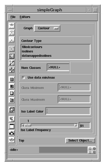
The Graph Editor
The Graph Editor is shown below. It includes two new options for contour plots: Iso Label Color and Iso Label Frequency. These new options allow you to change the isoline label color and to change the frequency of major isolines.
Properties Page
The Properties page of the Graph Editor was updated to include two new toggles: Uniform Scale and Nice Limits.
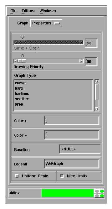
Both toggles are associated with subobjects that were part of the AGWorldParams template and the AGGraphWorld object in earlier AVS/Express releases.
2.5 Displaying Your Own Data
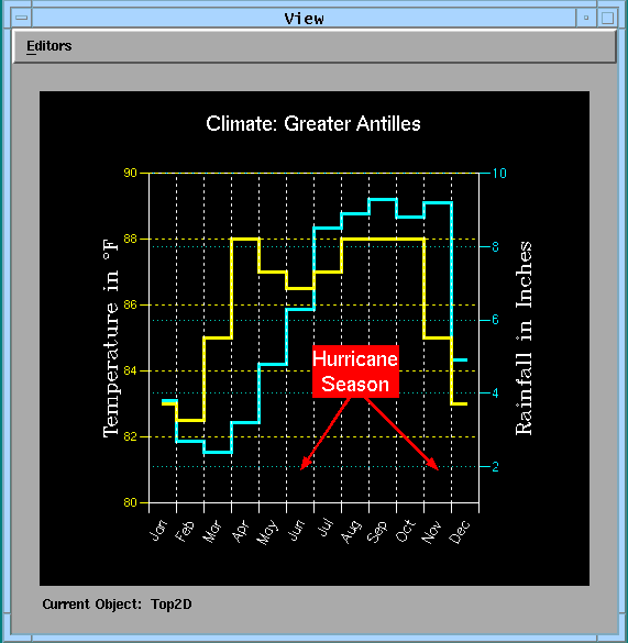
Each instance of AGGraph contains the same default data, so you see a graph regardless of whether another module generates data for the graph. The example for this section (Examples.Annotation_Graphing.rainfall) overrides the default data by sending one of two datasets to separate instances of AGGraph. This example uses sample data and displays the following figure.
AGGraph's Input Ports
To display your own data, you must provide Y data values and send these values to AGGraph's right-most input port. If you do not send data to the X data input port (in other words, the input port that is second from the right), AGGraph automatically generates X data from 1 to the number of Y values in steps of 1. For example, for five Y values, AGGraph generates the five X values {1, 2, 3, 4, 5}.
The remaining input ports are for Y base values and the legend text. The left-most input port expects Y base values, as described on page . The second input port from the left expects a text string for annotating the data in a legend.
The following figure shows the AGGraph object and describes its input ports.
World Coordinate Systems
The AG Kit allows you to have different world coordinate systems displayed in the same viewport. This enables you to display datasets having widely differing ranges of data within the same viewport. The names of the two AGWorld objects in this section's example are TempWorld and RainWorld.
- Two float array objects, named Temperature and Rainfall, define the sample data for this example network. Each object defines twelve datapoints used by AGGraph and AGGraph#1, respectively.
- Each AGGraph object is sent to a separate AGWorld object because the temperature values range from 82 to 88, whereas, the rainfall values range from 2.4 to 9.3.
- Separate AGYAxis and AGYTicklines objects connect to each AGWorld. This reflects the separate Y coordinate systems for temperature and rainfall. The rainfall axis appears on the right side of the graph because the labelMode parameter for AGYAxis#1 is set to "reversed".
- Open AGYAxis#1 and unset the value of the labelMode parameter (in other words ,"reversed"). Notice that the two Y axes are superimposed.
- Change the positionX parameter in AGYAxis#1 to 15. This changes the default position of the rainfall axis and re-positions it 15 units to the right.
Axes References
The axes labels and tickmarks are automatically positioned to represent the world coordinate space. The X limits for the world coordinate space are increased to compensate for the width of bars in a bar graph and generates a nicer appearance when displaying a bar graph. For example, when data ranges from 1 to n, the default world limits are 0.5 to n+0.5.
- Open the TempWorld object and notice that majorReferenceX is set to 0.5. This makes the values appear in the center of the monthly intervals. The reason that majorReferenceX was set to 0.5 is because the data values in this example reflect a monthly average.
- Set majorReferenceX to 2.0 and notice that the tickmarks and ticklines shift by 0.5 units. Now, the ticklines run through the center of the stairsteps rather than along the vertical edges of the stairsteps.
- Set majorReferenceX to 1.5 and notice that this has the same effect as setting it to 0.5. The reason is that once you establish a reference value, the tickmarks or ticklines propagate on either side of the reference value.
- Connect the Rainfall object to the fourth input port of AGGraph#2, then connect AGGraph#2 to Rainworld. Notice that the symbols representing the data values appear in the center of the monthly intervals.
- Also notice that the labelPosition parameter in AGXUserAxis is set to "intervals", which is the default setting for user axes. If you change the labelPosition to "ticks", the labels appear beneath the tickmarks.
Parameter Settings
Parameters that have the same name can have different default values. If you want them to have the same value, you set the value in an object that is downstream in the network.
- AGXTicklines and AGXUserAxis have their own defaults for the parameter majorReferenceX. In this example, the different defaults cause a misalignment between the tickmarks below the X axis and the X ticklines that extend through the viewport. To see this alignment mismatch, unset the majorReferenceX parameter in TempWorld.
- Rather than setting majorReferenceX in the AGXTicklines object and the AGXUserAxis object, it is changed once in the TempWorld object. Change the value of TempWorld's majorReferenceX to 1, then back to 0.5. Notice how the X ticklines shift.
Using Special Characters In Text Objects
The AG Kit provides special characters that you can use in text strings.
See String Parameters and the on-line reference for the Character and Font Tables. The PDF versions of the Character and Font Tables can also be viewed.
- The Y axis on the left side of the viewport contains a degree character. This is the character 2218 in the Character Table. The text string for this axis is set by the text object in AGYAxis. Notice that the superscript character "\r" precedes the index "2218".
- You can also superscript an "o" to denote degrees. Replace "\r2218" with "\ao" in the text parameter for the AGYAxis object.
- The hurricane alert message appears on two lines. This text string contains the newline character "\n". Open the Hurricane Alert object and notice that the text object visually contains a newline. The "\n" newline character was converted into a visual newline when this network was saved.
Positioning Text
When you position text inside the axes boundaries, you should consider the range of the world coordinate system. This makes text alignment easier to adjust because you can align a text object to the ticklines.
- This example positions the Hurricane Alert object within TempWorld. The geometry object specifies where to center the text. Here, it is centered at {8,84}. Note that the X reference for the ticklines is 0.5 and August is the eighth month, so {8,84} falls in the center of the August interval.
- Try adding your own AGText object with respect to RainWorld.
Annotating a Graph Using Arrows
Arrow objects are useful for drawing attention to specific parts of a graph. This example uses arrows to show you when the hurricane season begins and ends.
- The arrows are within the TempWorld coordinate system because they connect to TempWorld. Open the LeftArrow object. Four values define the geometry of an arrow. The first two values specify the base of the arrow; the second two values specify the position of the arrow head. Change the geometry to understand how to position these objects.
- Notice the drawing priority of the RightArrow, LeftArrow, and Hurricane Alert objects. The arrows have a lower value for their visibility objects than the Hurricane Alert does. This prevents the arrows from obscuring the text.
2.6 Creating Logarithmic Axes
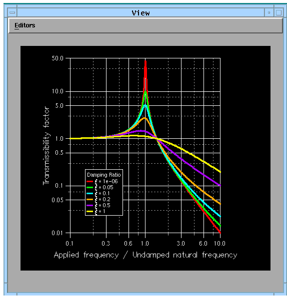
The example in this section (Examples.Annotation_Graphing.logex2) draws the axes using a logarithmic scale. The data is a set of curves showing the absolute transmissibility of a simple spring-mass system as a function of the frequency ratio for various damping ratios. The following figure shows the View after you load the example file.
Calculating X Data
AVS/Express can calculate values that you use as input data to a graph. In this example, AVS/Express calculates a series of floating-point values.
- Open the float objects y0 and y1. Use the lower scollbars or resize the objects to read the equations that generate the values for the objects.
The following lines of code are in the V language. The code shows you the calculations produced by various objects in this example.
double ratios[] = {1e-06,0.05,0.1,0.2,0.5,1};
float ratios2[] => (2.0*ratios)*(2.0*ratios);
int numValues = 200;
float x[] => pow(10,init_array(numValues,-1,1));
float x2[] => x * x;
float x3[] => (1 - x2) * (1 - x2);
float y0[] => sqrt(1 + (ratios2[0] * x2)) / sqrt(x3 + (ratios2[0] * x2));
float y1[] => sqrt(1 + (ratios2[1] * x2)) / sqrt(x3 + (ratios2[1] * x2));
float y2[] => sqrt(1 + (ratios2[2] * x2)) / sqrt(x3 + (ratios2[2] * x2));
float y3[] => sqrt(1 + (ratios2[3] * x2)) / sqrt(x3 + (ratios2[3] * x2));
float y4[] => sqrt(1 + (ratios2[4] * x2)) / sqrt(x3 + (ratios2[4] * x2));
float y5[] => sqrt(1 + (ratios2[5] * x2)) / sqrt(x3 + (ratios2[5] * x2));
For more information on the V language, see Chapter 8, The V Command Processor, and the V Language in the Using AVS/Express manual.
Setting the Logarithmic Axis
The X and Y axes can have one of three scale types applied. By default, the axes have a linear scale. You can also change the scale of an axis to a logarithmic scale or a power scale.
- AGGraphWorld's scaleTypeX and scaleTypeY parameters determine the scale of the X axis and Y axis. Both are equal to the string "log10".
- By default, scaleTypeX and scaleTypeY are set to "linear". Change the scaleTypeX and scaleTypeY to "linear" to see the graphs drawn using the default axis scale types.
Reversing the Axes Direction
The limitsX and limitsY parameters control the directions of the X and Y axes. By default, the origin of the axes are in the lower-left corner of the graph. Assigning the upper limit to the first element of the limitsX or limitsY array and the lower limit to the second element of the limitsX or limitsY array reverses the direction of the respective axis.
- The limitsY parameter in AGGraphWorld is {0.01, 50} to force the limits of the Y axis to 0.01 and 50.
- Open the AGGraphWorld object and change limitsY to {50, 0.01}. The direction of the Y axis reverses and the graph flips to correspond to the Y axis values.
Setting Legend Text Strings
The legend in this example has six unique text strings that describe the individual curves. These strings are set in the AGGraph objects.
- Open the legendText parameter in AGGraph0. Notice that the text has the special epsilon character defined as "\r2140". The legend string also uses an element in the ratios object.
For a list of the meaning of characters preceded by "\", see String Parameters. For a list of special characters, see the on-line reference for Character and Font Tables.
2.7 Creating Contour Maps
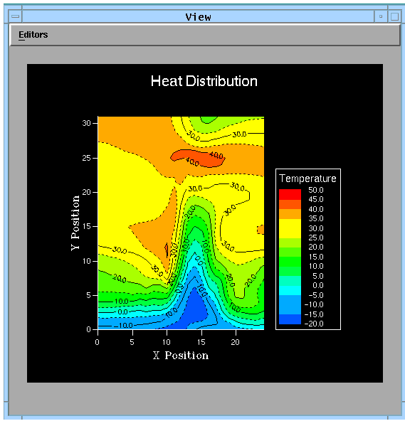
The AG Kit allows you to display three types of contours-filled contours, isolines, and datamapped isolines. This section uses two contour examples (Examples.Annotation_Graphing.contour1 and contour2) to show you basic contour features. The following figure shows you the viewer displayed by the first contour example (contour1).
Supplying Data to a Contour Plot
Contour objects do not have default data. Therefore, before you see a contour, you must send an appropriate dataset to the first input port. AGContour's and AGContourObj's first input ports accept a 2D scalar uniform, rectilinear, or structured field.
- To see a contour you must select a dataset from the using the Read Field module. Select "Read Field" in the module editor window and choose the wind.fld dataset via the file browser. (wind.fld is located in the field directory within the data directory in your installation area.)
- Major and minor isolines, and their labels, default to the complement of the background color, which is white. This example sets them to black.
- Open the AGContourObj and its contour subobject. The isoLineLabelColor and the majorIsoLineColor parameters are "black" to provide a greater contrast than the default "antibackground" color, which in this case is white.
Selecting a Contour Type
You specify a contour type by setting the contourType parameter in the contour object. Acceptable strings are "filled contours", "isolines", and "datamapped isolines". The default type is "filled contours".
- Open the object AGContourObj and its subobject contour. Change the contourType parameter to "isolines". You must set majorIsoLineColor and the isoLineLabelColor to a color that contrasts with black (for example, "white"), before you see the isolines and their labels.
- If you change contourType to "datamapped isolines", the minor isolines appear. Although the minor isolines are set to black, data mapping determines the isoline colors when the contour type is set to "datamapped isolines".
- Note that the AG Kit automatically removes the space in the string "datamapped isolines", as it does with any enumerated parameters.
Specifying the Number of Contour Levels
Each contour level is depicted as an isoline. By default, the AG Kit calculates the number of contour levels by finding the minimum and maximum values, then dividing the range of values into ten equal classes.
- One way of controlling the number of contour levels is by specifying a range of contour classes and the number of classes in that range. If you open the contour subobject in AGContourObj, you will see that maxClass is set to 50, minClass is set to -20, and numClasses is set to 15.
- Changing the number of classes changes the number of contour levels. To decrease or increase the number of contour levels displayed, change the numClasses to a value less than 15 or a value greater than 15.
- Any values that fall outside the minimum and maximum class range are shown in the background color. If you change maxClass to 40 and minClass to 0, the contours outside the range do not appear in the contour map.
- The second mechanism for specifying contour classes is to provide an array of class values.
See Setting Class Values.
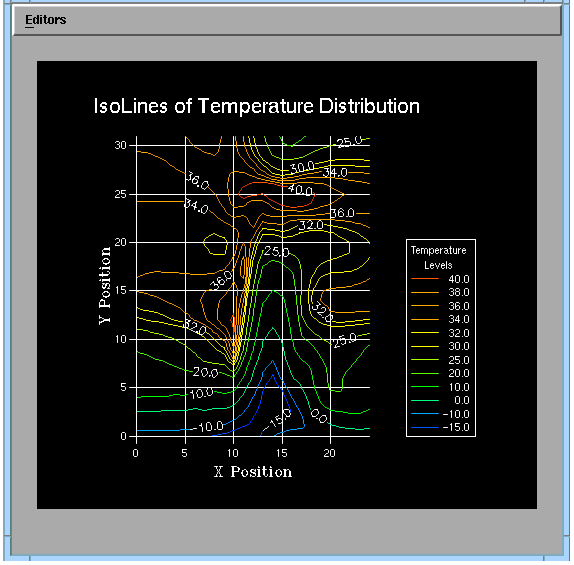
Viewing Data as Datamapped Isolines
The second contouring example (Example.Annotation_Graphing.contour2) displays datamapped isolines. After you load the second contouring network, you must select a dataset because AGContour does not contain default data for generating contour plots. You must supply the network with a 2D scalar uniform, rectilinear, or structured AVS/Express field.
For sample data in this example, select "Read Field" in the module editor window and choose the dataset wind.fld. (wind.fld is located in the field directory within the data directory in your installation area.)
The following figure shows the view displayed by the second contouring example.
Determining the Contour Colors
By default, each contour level maps to a color in the range from 0 to 255. You can adjust the color range to match the range of your data by sending the same data to AGContour and the second input port of AGDataObject. Once data arrives at the second input port, the datamapper object (see the Visualization Techniques manual) retains the data range.
- Disconnect the orthoslice object from AGDataObject, then select "Read Field" in the module editor window and choose hydrogen.fld. (hydrogen.fld is located in the field directory within the data directory in your installation area.)
- Reconnect the orthoslice object to AGDataObject and notice that the range of colors corresponds to the data range.
- Once again, disconnect the orthoslice object from AGDataObject. Read the wind.fld data and notice that the contour levels map to the lower range of color values because the data values range from -15 to 40.
- Reconnect the orthoslice object to AGDataObject and the contour levels map to the entire range of color values.
Displaying a Contour Legend
The AGContourLegend creates a legend for a contour plot. The legend automatically lists the values of the contour levels and displays the color of the contour levels. Legends for filled contours show the colors as filled rectangles. Legends for isoline contours show the colors as color lines. You can only have one legend per contour object.
- The AGContourLegend object controls the appearance of the legend. Open AGContourLegend so you can change the appearance of the legend.
- To increase the size of the legend and the legend title, change the labelHeight and titleHeight parameters to 4.
See also Adding a Legend and Setting Legend Text Strings.
Setting Class Values
By default, the AG Kit displays contour levels in equal intervals. It calculates the number of contours by finding the minimum and maximum values, then divides the range of values into ten equal classes.
Unequal intervals can show finer detail in specific areas of your plot while grouping less interesting data into areas having a wider variation of values. To override the default behavior and group contour levels into unequal intervals, you specify an array of class values. Setting classValues overrides any values for maxClass, minClass, and numClasses.
- This example added another input port to AGContour that accepts an array for classValues. The number of contours depends on the number of elements in the array.
- Included in this example is a second float object named ChangeClasses. It is part of the network file so you can modify the array of class values without changing the original data source of classValues.
- ChangeClasses defines an array of values. Open the ChangeClasses object and look at the values. Disconnect the Classes object and connect the ChangeClasses object to view the effect that the ChangeClasses definition has on the contour plot.
- Try providing your own array of class values. For example, show the contour details in the lower range of the data.
Positioning the Contour Labels
Only major isolines have labels. The position of the labels depends on the distance between the isolines and the angle at which they are displayed. The AG Kit never allows labels to overlap.
- By default, contour labels are displayed at any angle from -90× to 90×. Open isoLineLabelAngleInterval in the AGContourViewport object. The default angle for isoline labels is set by this object.
- This example overrides the default angle range for isoline labels. To display the labels at a more upright angle, isoLineLabelAngleInterval in the object AGContour is set to {-45,45}.
- Change isoLineLabelAngleInterval in the object AGContour to {0,0}. This value displays all contour angles upright, so no labels follow the angle of its respective contour line.
- The isoLineLabelDistance parameter controls the distance between labels. Distance is measured as a percentage of the shortest viewport distance. This contouring example set isoLineLabelDistance to 50, which overrides the default value of 25.
Choosing the Frequency Of Major Isolines
By default, all isolines are major isolines. However, you can control the frequency of major isolines by setting the majorIsoLineFrequency parameter.