1 Introduction
This chapter introduces the principles and benefits of data visualization, describes some fundamental visualization techniques, and then tells you how AVS/Express makes it easy to create sophisticated visualization applications yourself.
- Why visualization?
- Visualization techniques
- From data to picture - how it works in AVS/Express
- The next step - where to go from here
In the most general terms, data visualization is the process of representing your data as a graphic display on a computer screen. In practice, data visualization gives you insight into your data by allowing you to view the structure and changes in the data graphically. Generally speaking, there are two things people want to do with data:
In either case an effective visualization is an important tool.
AVS/Express extends the obvious advantages of simple visualizations by making it easy to develop sophisticated three-dimensional representations of data. It is clearly much easier to look at a car than to read a detailed description of its design. It is more accurate to model 3D objects in a 3D view. Actual manipulation of 3D objects, for example rotating an automobile model is clearly more intuitively performed in 3D space.
It is also more effective for a radiologist to look at images generated from a CAT scan than to read through pages of data describing density values at particular points on the skull. But it is even more effective if he or she can view a 3D model of the patient's head assembled from the sequence of images and manipulate the model in three dimensions.
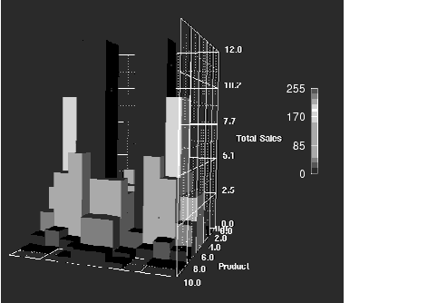
Using 3D tools, business analysts can view their sales, production, or financial data in three-dimensional graphs and scatter plots that relate 3, 4, or more variables at once. This enables them to see relationships and trends in the data as a whole that would never have been drawn from analyzing the raw figures. Consider the following 3D bar chart:
From this one graphic, you can see four variables: x, y, height, and color - four different pieces of information conveyed concisely and effectively.
Such a chart could be used to represent sales information. The values along the x axis might represent 10 different territories in your sales region; the values along the y axis, the 10 products in your product line. The height of the bars could represent the total sales for each product in each area and the color of each bar any additional piece of information of interest (the average income of buyers of the product, for instance).
AVS/Express provides you with the ability to easily view your data in 3-dimensional space. But there are many different kinds of data and many different ways to look at it.
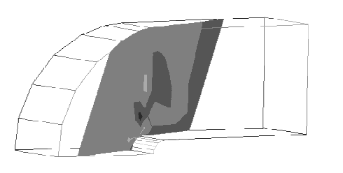
For example, an aerospace engineer with a large collection of data describing air flow over an airplane wing might want to look at values such as density and momentum for different slices of the data set. In this manner, values could be observed at different locations within the volume. A visualization technique supported by AVS/Express called slice allows you to examine slices of a volume of data in this manner. Using slice on air flow data produces the following picture:
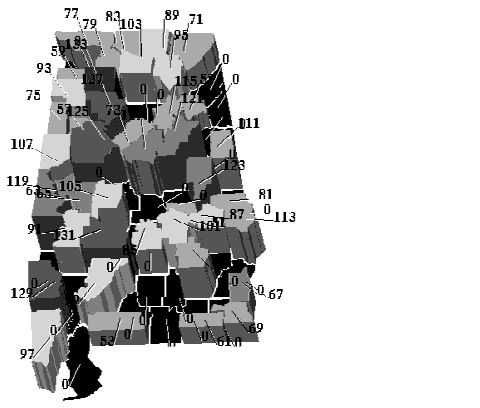
The head of the mortgage division of a large bank that has information on all loans stored in a database may want to analyze loan data by region in order to anticipate which markets will be hottest in the near future.
Using AVS/Express, it is possible to draw a map of the area with boundaries by county and "pop-up" (or extrude) the different areas to different heights depending on the number of loans made in the area in the last six weeks. In the following example, the regions are colored with the same data used to produce the heights (number of loans). However, color could be used to represent another variable, such as the average amount of the loan. For example, red could correspond to loans of a million dollars or more, blue to loans of $100,000 or less and colors in between to loans in between those amounts. For loans in Alabama, the resulting picture might look like this:
While viewing this picture, the variables can easily be changed in order to look for different trends. For example, instead of looking at the total number of loans in each area, loans made to people in a certain age or income bracket, the total number of homes sold, or the average length of ownership could be targeted for visual study. Also, remember that in AVS/Express this image could be rotated in 3 dimensions and scaled in order to study it more easily.
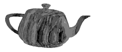
Finally, consider a highway engineer who wants to display digital terrain elevation data (DTED) and then map highways and rivers and other geological features captured in a satellite image onto the terrain. This can be achieved using a visualization technique called texture mapping which is the process of applying a 2D image to a piece of 3D geometry. It is often used to model different types of surfaces such as wood grains or tile patterns on an object.
Texture mapping can be likened to draping an image painted on a flexible canvas over a surface. There are different texture mapping algorithms which specify how to drape the image over the surface. The AVS/Express module texture_mesh provides one such algorithm. Using it, you can map textures onto objects, such as the satellite image onto an object created from DTED data, or, as shown below, a marble texture onto the teapot object:
The techniques described above are just a very small sampling of the dozens of visualization techniques supported by AVS/Express. Many more of these techniques are discussed in Chapter 5, Catalog of Visualization Techniques, which is therefore an excellent place to find out which technique should be used to look at your data most effectively. Chapter 3, Example scenarios, also shows how a number of these techniques can be used, and provides a comprehensive resource for those wishing to become familiar with the different ways in which you can look at data.
The Examples library page in the AVS/Express product itself also contains many examples that demonstrate these techniques. These are examples that show you both the final result (that is, the picture) and the AVS/Express network used to construct the picture. These examples are a good place to start if you are new to visualization.
If you are reading this book, you probably have data in a file, in a database, or perhaps available through access to a live data source and want to visualize this data and generate a picture, perhaps like one of those shown earlier in this chapter. How do you go from the data to the picture using AVS/Express? In general, you must follow these steps:
The simplest way to read your data into AVS/Express is to use one of the built-in readers. However, if your data cannot be handled in this manner (because it cannot be converted into a file format supported by those readers), you may need to write your own custom reader. There are a number of ways in which you can create a reader in AVS/Express. Some techniques involve writing source code to read the data; other techniques do not require that you write code, instead you create AVS/Express objects that read the data. All of these techniques are described in Chapter 4, Importing Data.
Sometimes it is desirable to process your data before you visualize it. For example, if you are working with a very large data set, you may want to downsize (or subsample) the data set before carrying out the visualization. This can greatly improve execution time. Of course you will lose some precision in your results as well, but the trade-off may be worth it in many cases. (You typically downsize data to increase interactivity while experimenting with various visualization techniques. You usually remove the downsize module once an appropriate technique is selected.)
For some applications, it may be necessary to perform calculations on the coordinates of the data set before visualizing it. This is often the case with cartographic data. The latitude and longitude values in a cartographic data set are spherical coordinates. To plot them as x, y cartesian coordinates, you apply a map projection. This is one example of where processing is necessary. Processing data is discussed further in Chapter 5, Catalog of Visualization Techniques.
Chapter 5 also describes and explains a number of visualization techniques, such as slicing, displaying exterior surfaces, and probing. AVS/Express provides modules which implement these techniques such as slice, orthoslice, external_faces, and probe. You can use more than one visualization module on a given data set, for example if you want to slice a volume and then crop the resulting slice.
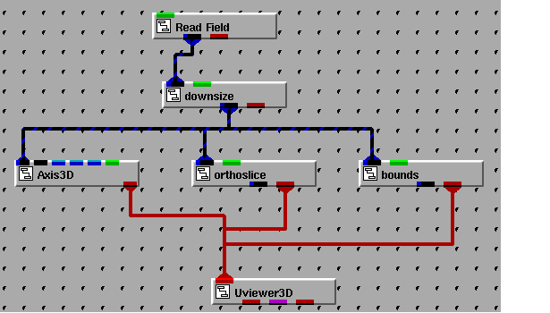
The network displayed below shows a typical visualization network in AVS/Express. Each of the modules in this network are described in the following paragraphs.
The Read_Field module reads data into AVS/Express. In the network above, the Read_Field module reads data stored in a file in AVS Field file format. The output of Read_Field (the data read in from file) is then passed into the downsize module which subsamples the data.
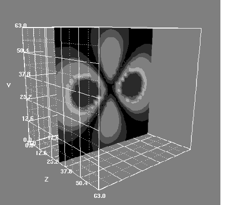
The downsized data is then connected to three other AVS/Express modules. The bounds module provides a bounding box around the extents of the data. The orthoslice module creates a slice through the volume of data; the slice is orthogonal to one of its axes. The Axis3D module provides 3-dimensional axes (x, y, and z axes) that are labeled with values from the data. By connecting all three modules to the Uviewer3D, you can view the slice in the context of the whole volume; in other words, you can see where the chosen slice is located within the complete data set. The resultant image of this sample network is shown below:
If you are new to AVS/Express, you should read Chapter 2, The Field: The AVS/Express Data Model and Chapter 4, Importing Data. These chapters describes the AVS/Express Field data structure and explains how to import your data into a field.
If you are already an AVS/Express user and you are familiar with the Field data structure, you can probably skip Chapter 2 since you should already be familiar with AVS/Express' data model.
Once you understand the general approach to importing your data into AVS/Express, you are ready to think about how to visualize the data. Chapter 5, Catalog of Visualization Techniques, introduces you to a number of visualization techniques, and Chapter 3, Example scenarios, contains example networks using these techniques. You should read both of these chapters.
Finally, Troubleshooting Tips4-28 contains some useful information on troubleshooting visualization networks.