3
Example scenarios
This chapter describes visualization applications in AVS/Express for many different types of data. These examples provide an introduction to the different types of visualizations that are most common for different types of data. You can review the examples of the types of data you use to find techniques that may apply to your application and useful ideas as to how you should visualize your data.
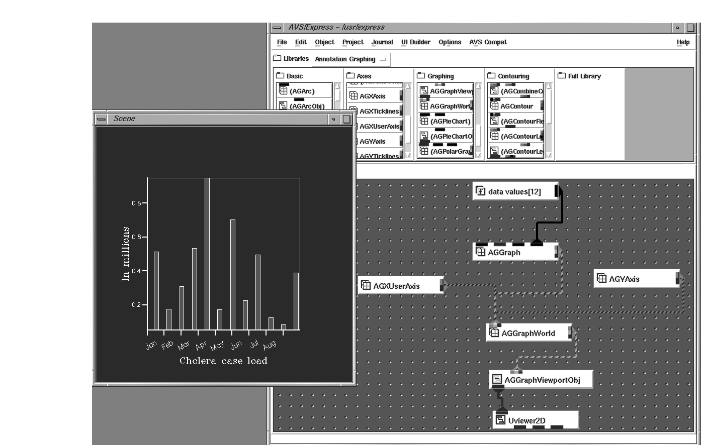
This chapter begins with the simplest form of data - unstructured data, which is 1-dimensional and represented by a simple series of numbers. These numbers can be discrete data values that represent many possible items such as total product sales, revenue per passenger, or number of cases of cholera on a monthly basis. These numbers can easily be displayed as graphs or glyphs where the discrete data value is depicted as the height of the bar graph/glyph, the color of the bar graph/glyph, or both.
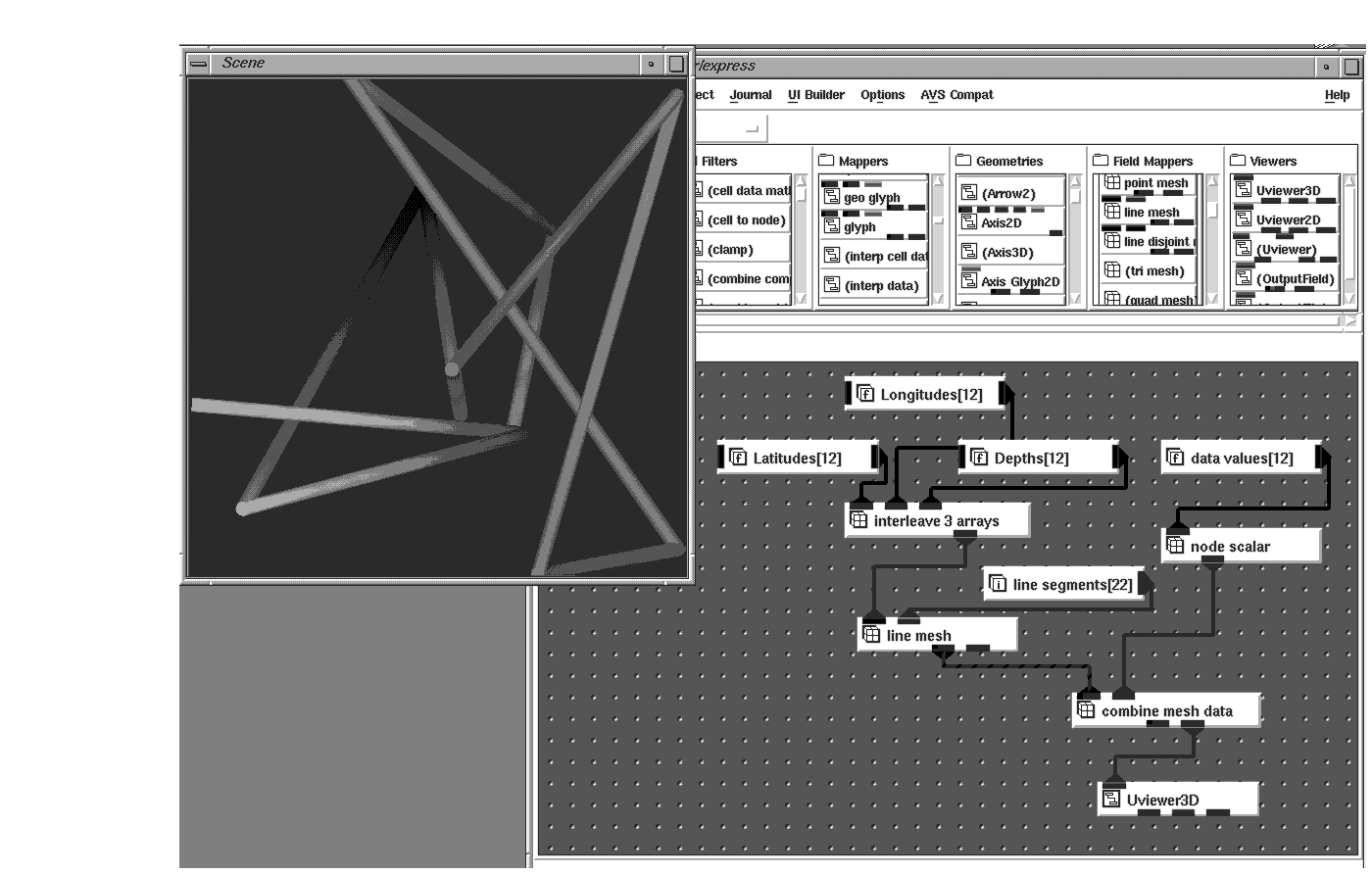
Unstructured data can also be represented by a set of coordinates that position the point in a 2D or 3D world. These points can be connected into a series of lines or line segments, or they can simply stand alone as points in space.
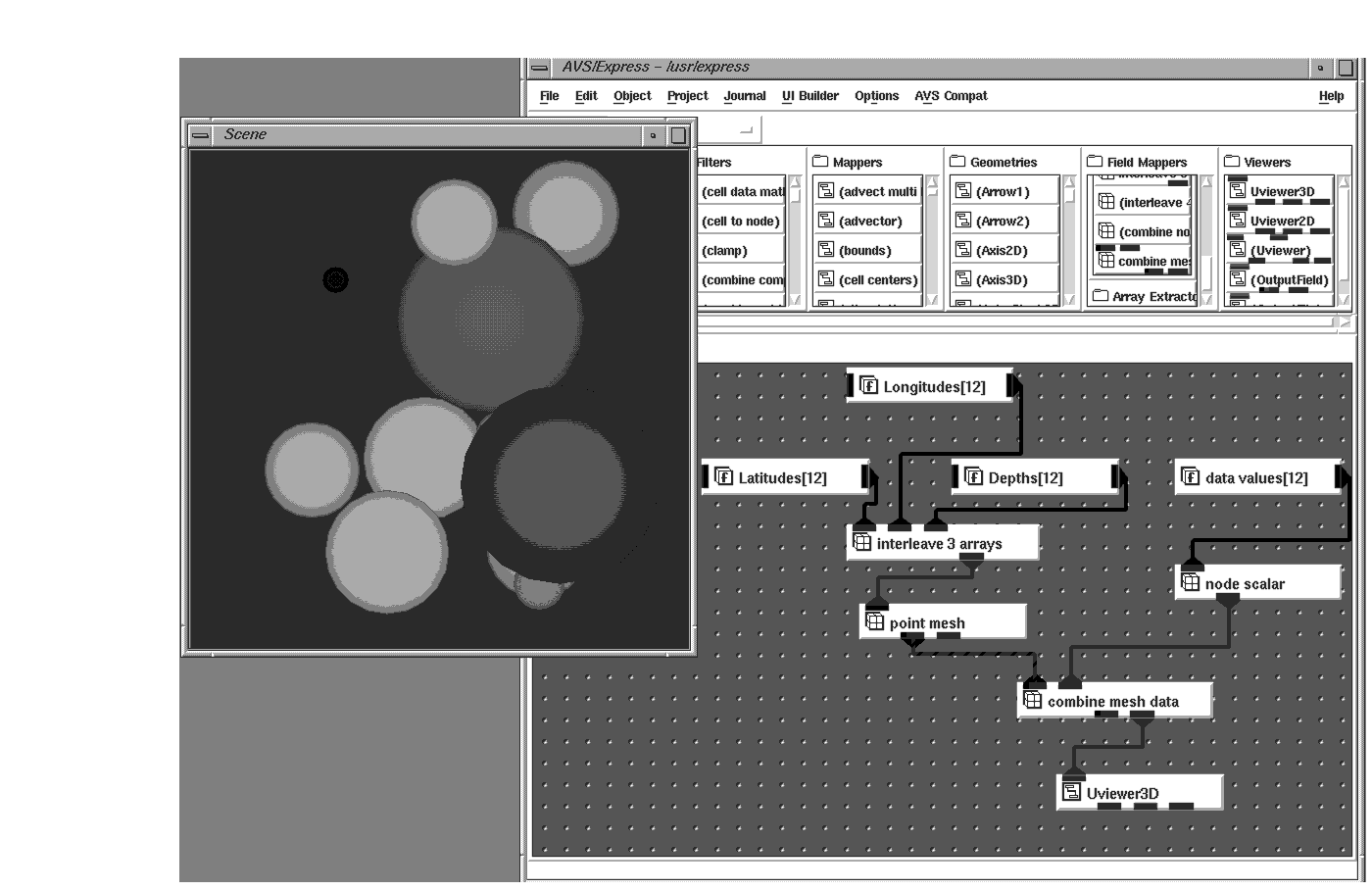
Unstructured point data is usually obtained by some form of data acquisition. Examples could include a marine-biologist who takes water samples at different points in the ocean or a geologist who takes core samples at different latitude/longitude positions. At each of these points, many variables may be recorded, for example, the density of different mineral deposits or salinity concentration.
The position of a point is represented by an xy pair (2D) or perhaps an xyz triplet (3D). These coordinates are used to map into AVS/Express field coordinates. The variables at each coordinate provide a field's node data. xyz coordinates can be put into a field using a Point Mesh field mapper. Variables can be put into a field using either Node Scalar or Node Radius data mappers.
The two components can then be merged using the Combine Mesh Data combiner. Either of these can be rendered in an AVS/Express viewer.
If more than one data value exists at each point, then the data is said to have a vector length (veclen) greater than one. Sometimes the vector length is three and indicates trajectory/direction. This data can be used to move a glyph in a 3D world.
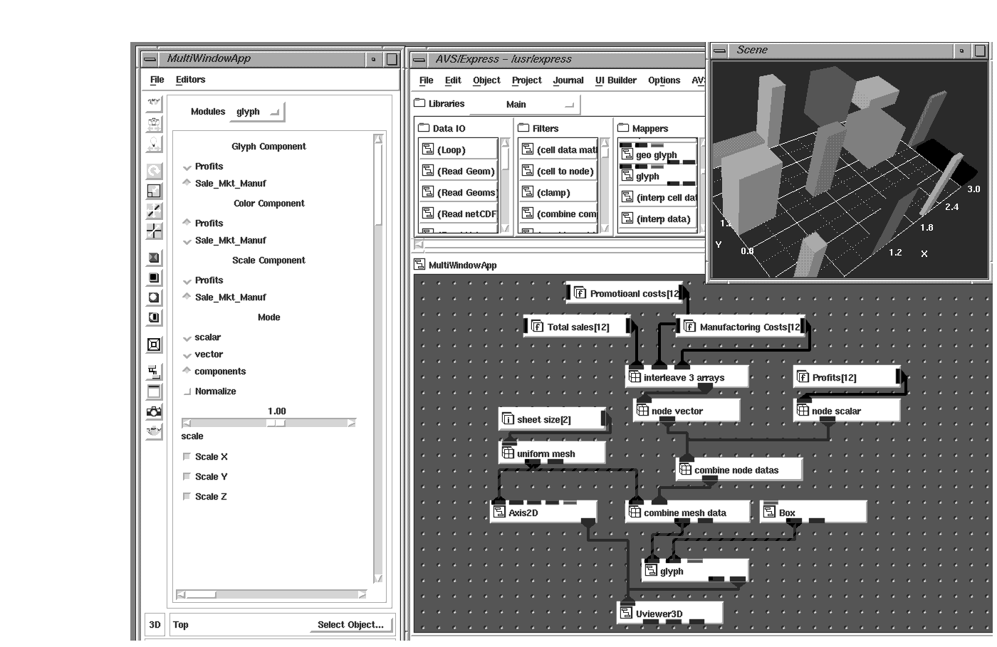
The data can also be a collection of individual values where veclen equals the number of items collected. In these cases the individual values can be mapped to different attributes of a graphical object (glyph). For example, height might represent total sales of a product, width the promotional costs to market the product, depth the manufacturing costs of the product, and color may represent total profit. If you use a datamap where red is mapped to the highest value and blue to the lowest value (the default mapping), then a product manager using this visualization would be happy with tall red thin glyphs (highest sales, with most profit and low promotional and manufacturing costs), and disappointed with short blue wide glyphs (least amount of sales, with low profits and high costs to market and manufacture).
Individual points can also represent line segments, perhaps roadways or rivers. Using Line Mesh mappers, these points can be rendered as an AVS/Express object. The variables can be mapped into the node data component of the AVS/Express Field to generate colored line segments.
Although these techniques will display your data and give you an idea of spatial relationships between individual points or perhaps clusters, unstructured data doesn't lend itself to all the wide variety of powerful visualization techniques provided by AVS/Express.
To help make your data available to other methods, you can grid or interpolate your data to fit a grid. This process samples the input unstructured field and maps it to a uniform field. Using the Scat_To_Unif object, you choose the dimensions and size of your grid, and the coarseness of the interpolation method. Having mapped your unstructured data into a uniform field in this manner, techniques such as isolines and contours are available to help you understand the distribution of different data values throughout your data.
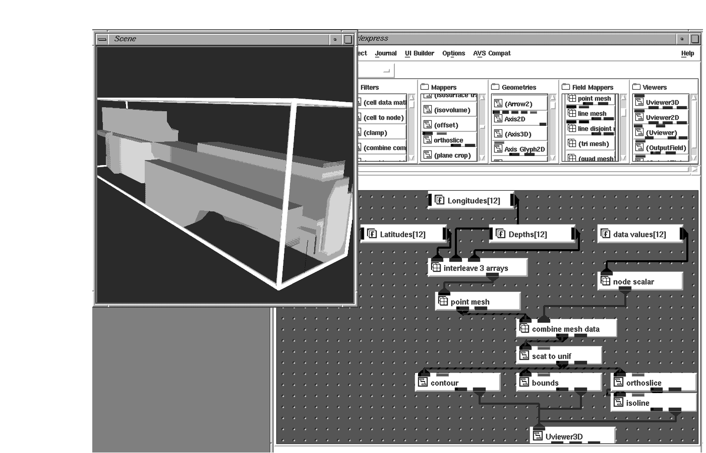
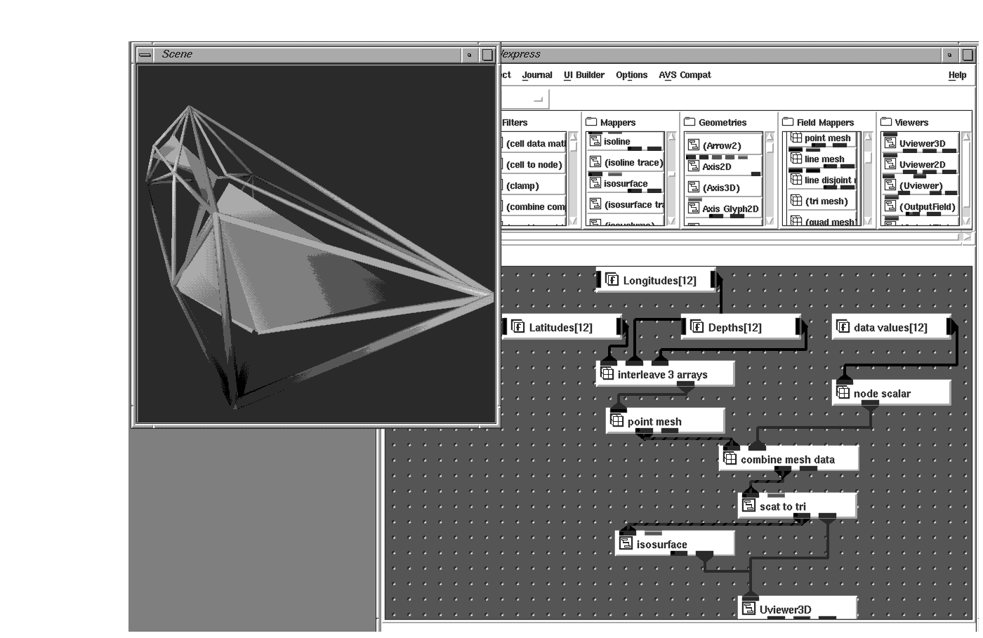
Another gridding technique, Delauney triangulation (implemented in the scat_to_tri object), connects a convex hull around your data points and interpolates the data points across the triangles it generates.
Whichever gridding technique you use, the result is a data set which can be visualized using many different techniques such as isosurface which will show concentrations of a single value.
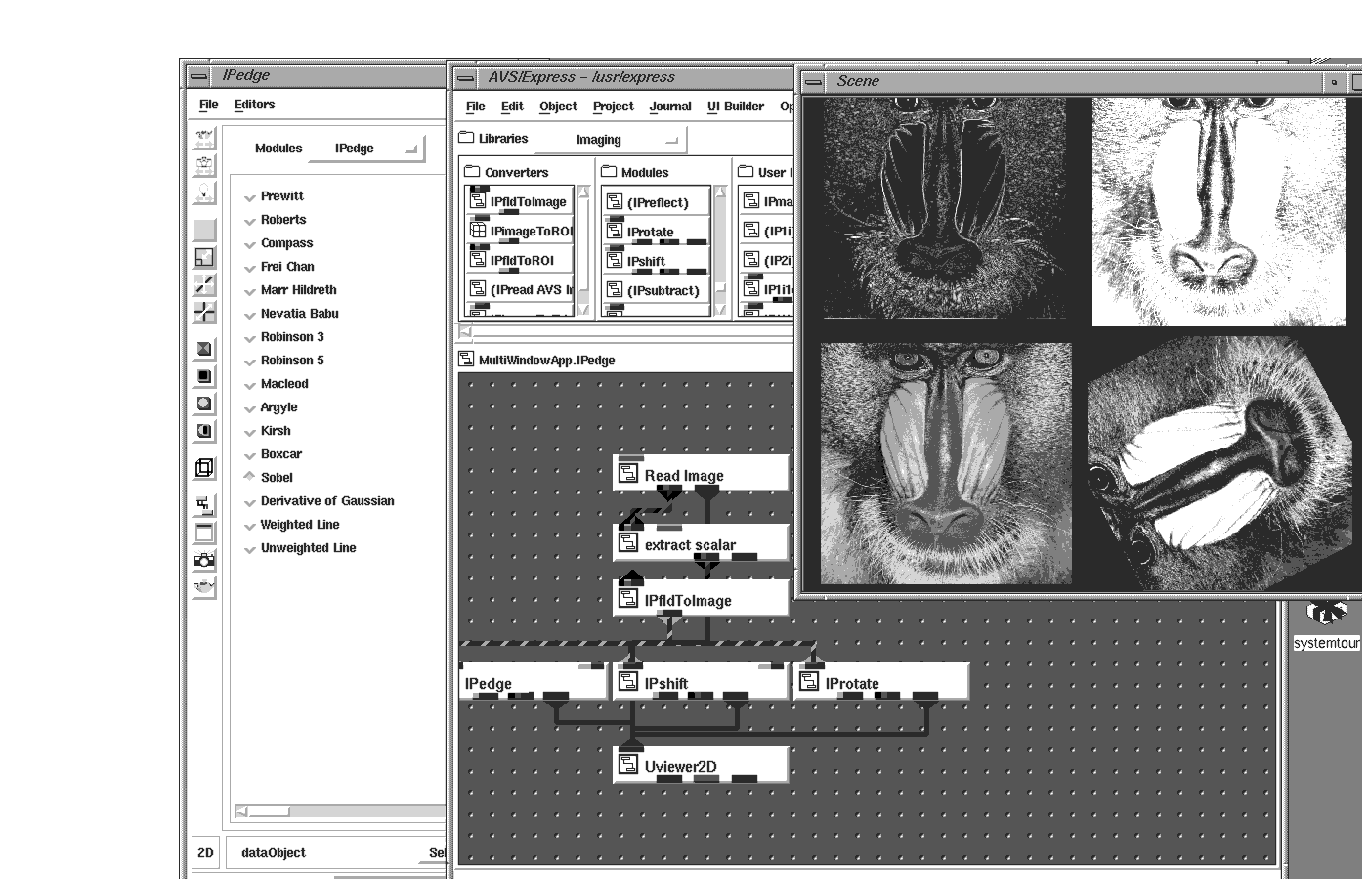
Images, maps, and spreadsheets are the most common forms of 2D data. The data values held in the 2D form usually represent discrete values that can be mapped to different colors. In imaging, the 2D data could be an X-ray where each discrete value represents a bone density that, in turn, becomes a gray-scale pixel. Image Processing techniques allow users to enhance and analyze the contents of the image.
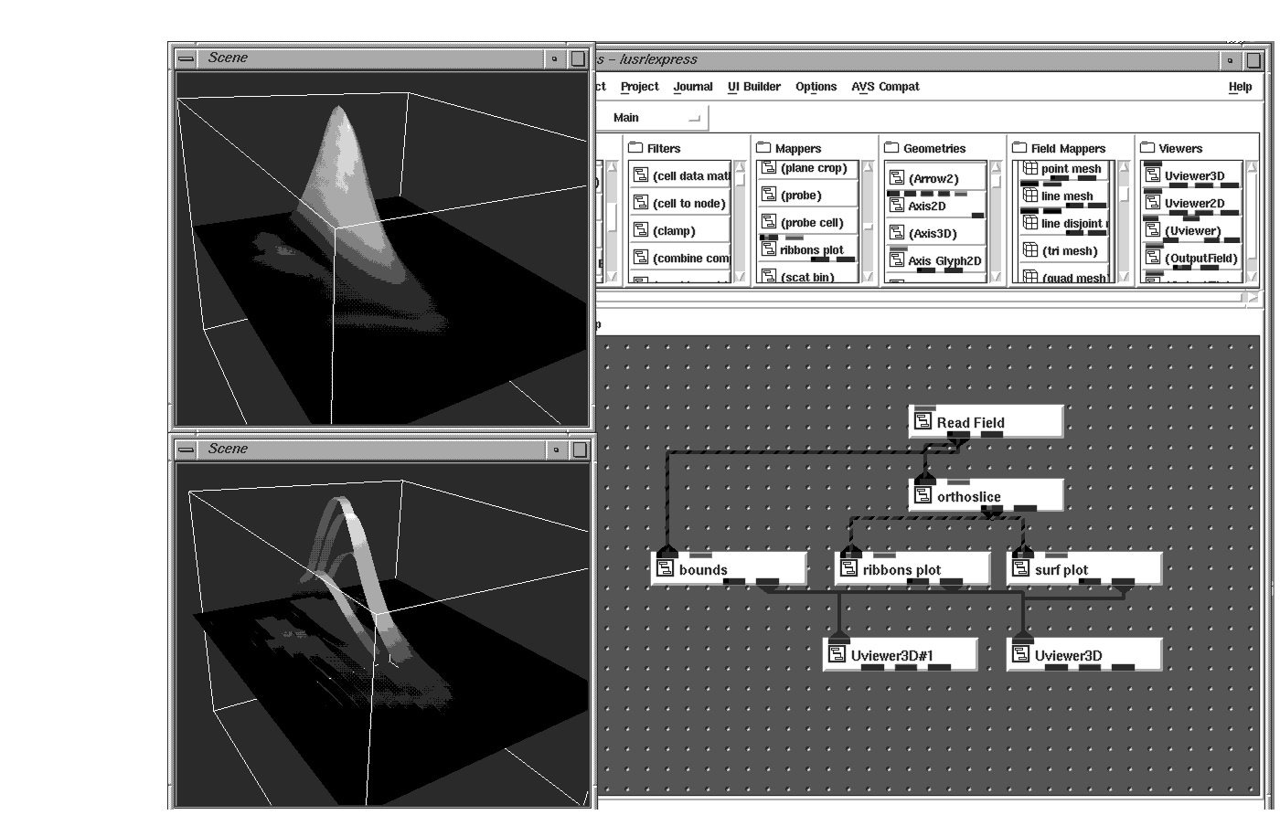
Sometimes the discrete values are used to represent height as well as color. Spreadsheet data can easily be viewed as a 3D ribbon plot, which consists of 3D ribbons that map array values to the height and color of the ribbons. A map made up of Digital Terrain Elevation Data (DTED) could be represented as a 3D colored surface where the data value is used for the z-value as well as color. It is possible to map one data value to the height and another to the color. Using these techniques, anomalies in numbers are readily apparent to you.
It's interesting to note that although you can get 3D representations from 2D data, you do not start out with coordinate information - the AVS/Express visualization modules create the necessary coordinates for you. For example, the Uniform_Mesh mapper can convert a 2D array of numbers to an AVS/Express Field.
Sometimes there is more than one discrete value at each cell in the 2D array. Widely known as multivariate data, this 2D data is commonly seen in the Remote Sensing market. 2D images coming back from satellites contain many channels, each representing different bandwidths of frequency. Each of the channels can be viewed individually, but sometimes it is necessary to produce a composite of two or more channels together.
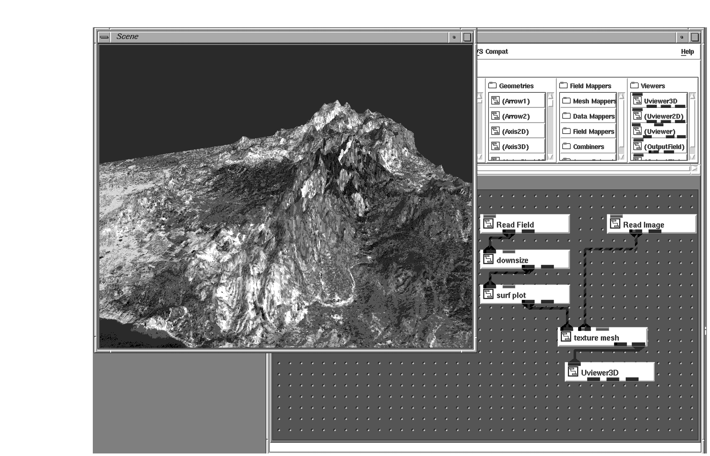
Images can also be draped over a 3D surface to produce a photorealistic presentation of the data. This technique, texture mapping, is used a lot in visual simulation, where aerial photographs are texture-mapped to DTED data to generate a 3D mesh.
2D images can come in many formats. AVS/Express can read the traditional image file formats such as PICT, TIFF, GIF, BMP, and so on and from these create an appropriate AVS/Express Field.
There are many types of 3D data. This section covers some of the most common of these types of data. In the general case, a 3D data set is one which has data along the three Cartesian axes (x, y, z).
Data types covered in this section are:
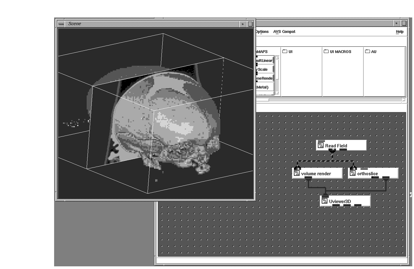
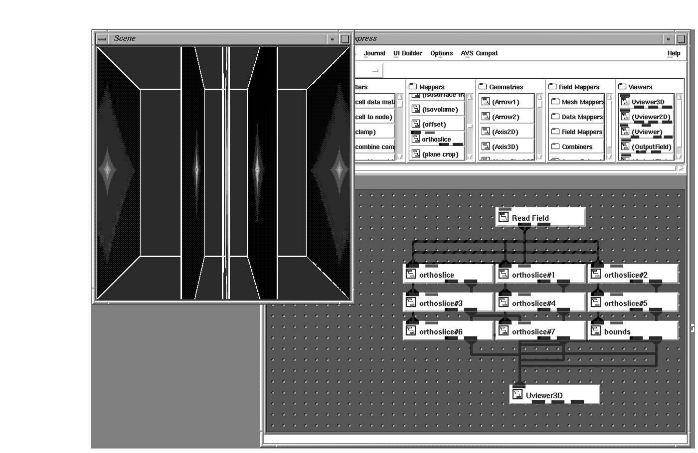
CT, MRI, and PET scans are all examples of 3D data sets in which sequential series of individual scans comprise a volume. This volume can be rendered via ray-tracing, a volume rendering technique, to create a 3D reconstruction of the patient which can be further analyzed, segmented, measured, and probed. Individual 2D cross-sections can be viewed from the volumes created using the orthoslice module.
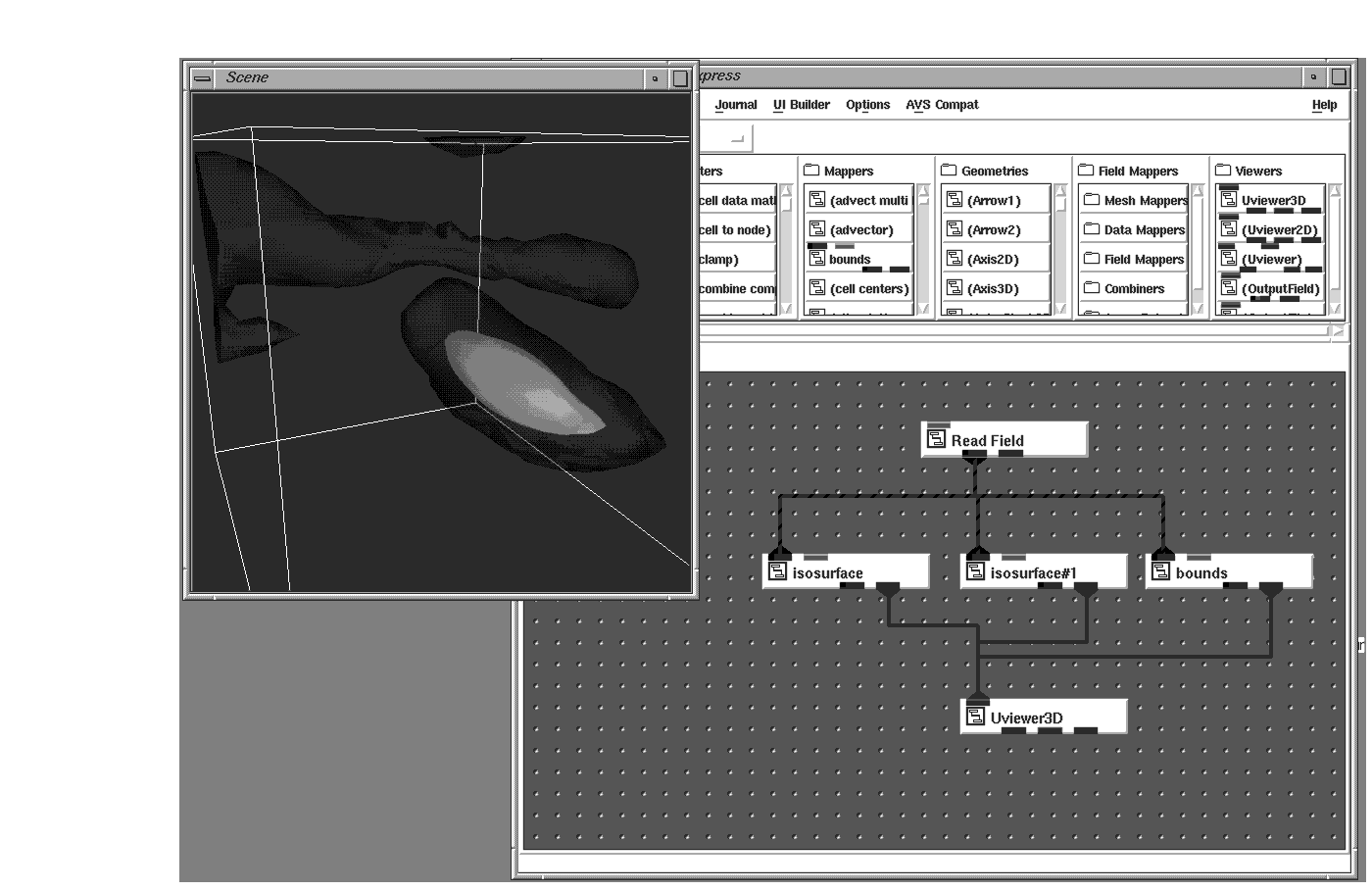
Creating displays from two or more data sets can be very useful. For example, you could execute an isosurface on the CT data set with a lot of transparency in order to see a more opaque isosurfacing of the MRI data set inside, or you could fuse together MRI and PET data to see active PET information mapped onto the anatomical structure of the brain shown by the MRI series.
Some data is acquired while other data sets are computed. Consider, for instance, a ground water model which predicts the concentration of a particular toxin after taking ground samples as input. Using isosurfaces and contours, an environmentalist could see where the largest volumes reside or where the heaviest concentration lives. This may help in the cost estimation for the removal of the toxin.
The uniform data discussed previously is nicely arranged in each dimension such that every data sample is one unit of measure away from the next data sample. Such orderliness is not always the case.
Take, for example, an MRI series. Here it is more realistic to assume that the radiologist knows where the area of interest lies and will sample more data at that location than at others. Such an MRI series could be set up to have 4mm slices (meaning each scan is taken at 4mm intervals), but more than likely, this will change when the scanner approaches the region of interest, to perhaps 2mm slices, and then back to 4mm when the region has been passed. The same number of slices are acquired, but the spacing is more compressed at the region of interest. This spacing is denoted by the points array in an AVS/Express field.
Computed data can show the same prejudice with respect to the region of interest. In the earlier case of calculated ground water contaminants, more of the computed data points will result in the regions near ground water. If the ground samples are not near water and are therefore not posing a drinking water danger, fewer computer cycles will be used to compute the effects of these samples. This will result in a 3D volume whose data values are not uniformly spaced.
Two application areas typically use unstructured data:
In the former, structures are analyzed to understand the physical properties of the mechanical part being made. Most stress and thermal testing can be done by computers, and the results can be visualized by rendering mesh primitives such as hexahedron and tetrahedrons in 3-dimensions. The colors of these mesh primitives come from the test results. The size, shapes, and positions of these objects typically come from the input file. Using the external edges and probes modules, you can visualize and analyze the results of the tests.
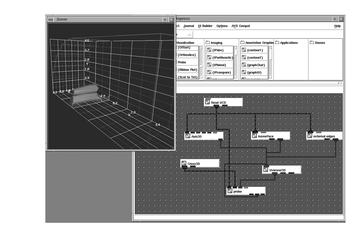
Such data sets are called unstructured because, unlike in uniform and rectilinear fields where coordinates are implied, unstructured coordinates must be explicitly provided in the mesh. These coordinates help make up the cell set of an unstructured field. At each node (or corner) of the mesh primitive there is typically a data value (or a null data value like -999 denoting a lack of data). This makes up the node data array of the field.
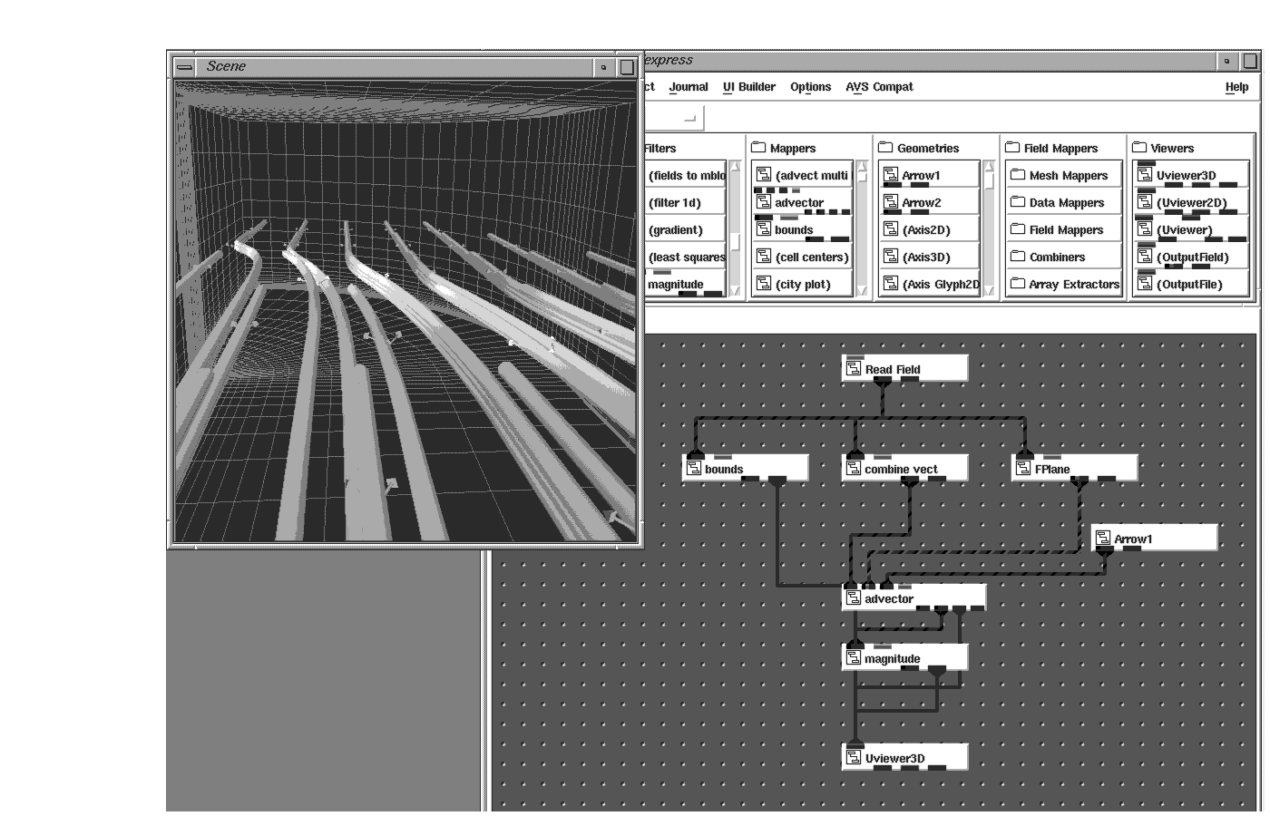
3D data sets can contain many variables at each element in the 3D array. In the case of the calculated ground water model (see page 3-13), values could indicate amounts of chlorine, iodine, sulfur and phosphorus. Each of these could be rendered individually or in combination. Three components could also make up a vector as momentum in a storm simulation, or represent velocity, which could be rendered as streamlines or particle advections.
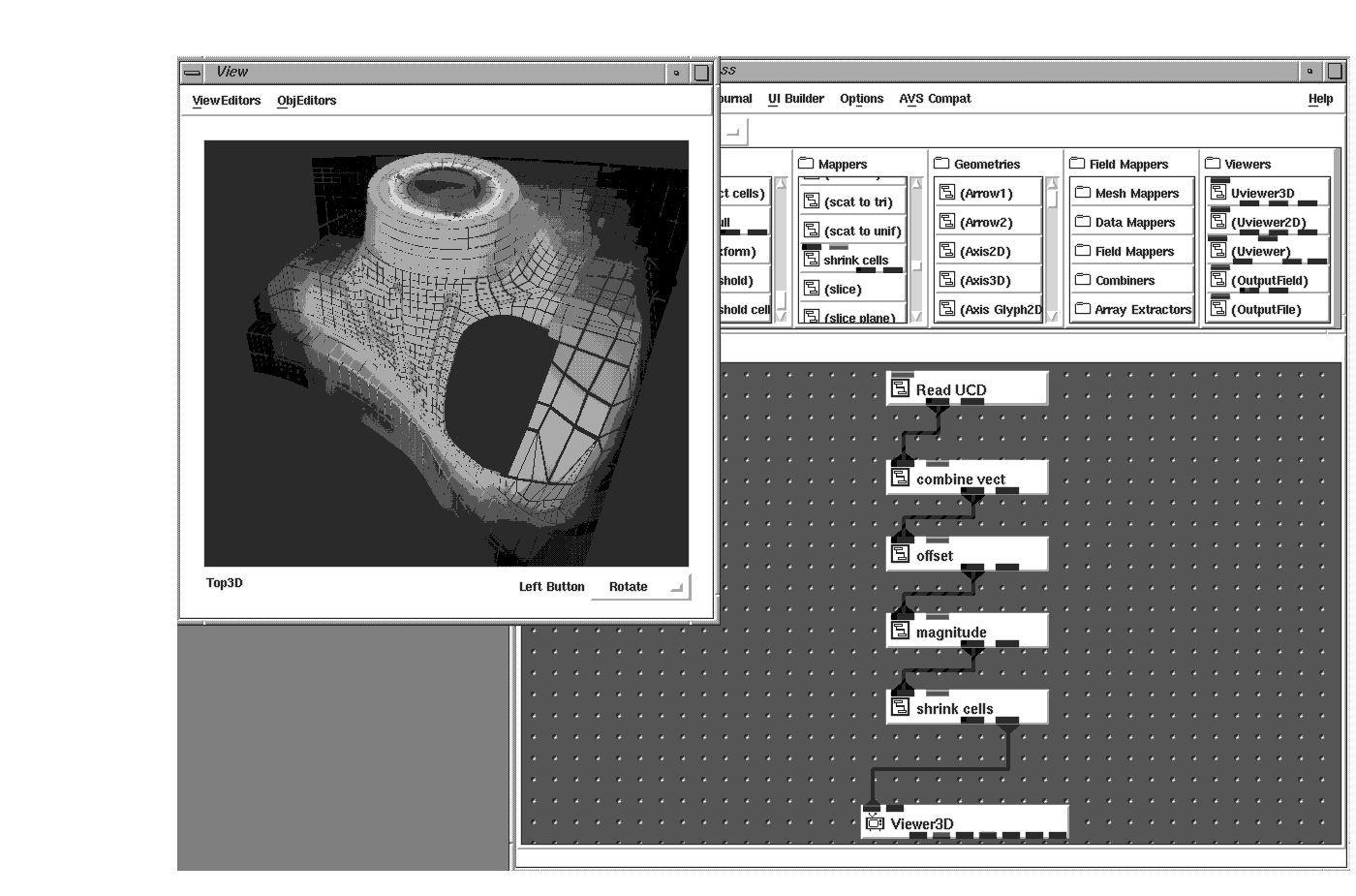
Three variables at each node could also be used to show displacement from simulating the placing of a load on a part. Using the external_faces object, you could animate the displacement values to witness how the part performs over time.
Some 3D data represent models, such as parts from a CAD/CAM system. Such parts are made up of cells, or primitives such as points, lines, triangles, quads, and polygonal meshes. AVS/Express lets you map these into AVS/Express fields using the mesh mapper modules. If there are colors associated with these parts they need to be stored at the nodes of the primitives or stored in the cell_data array associated with the aforementioned cell_sets.
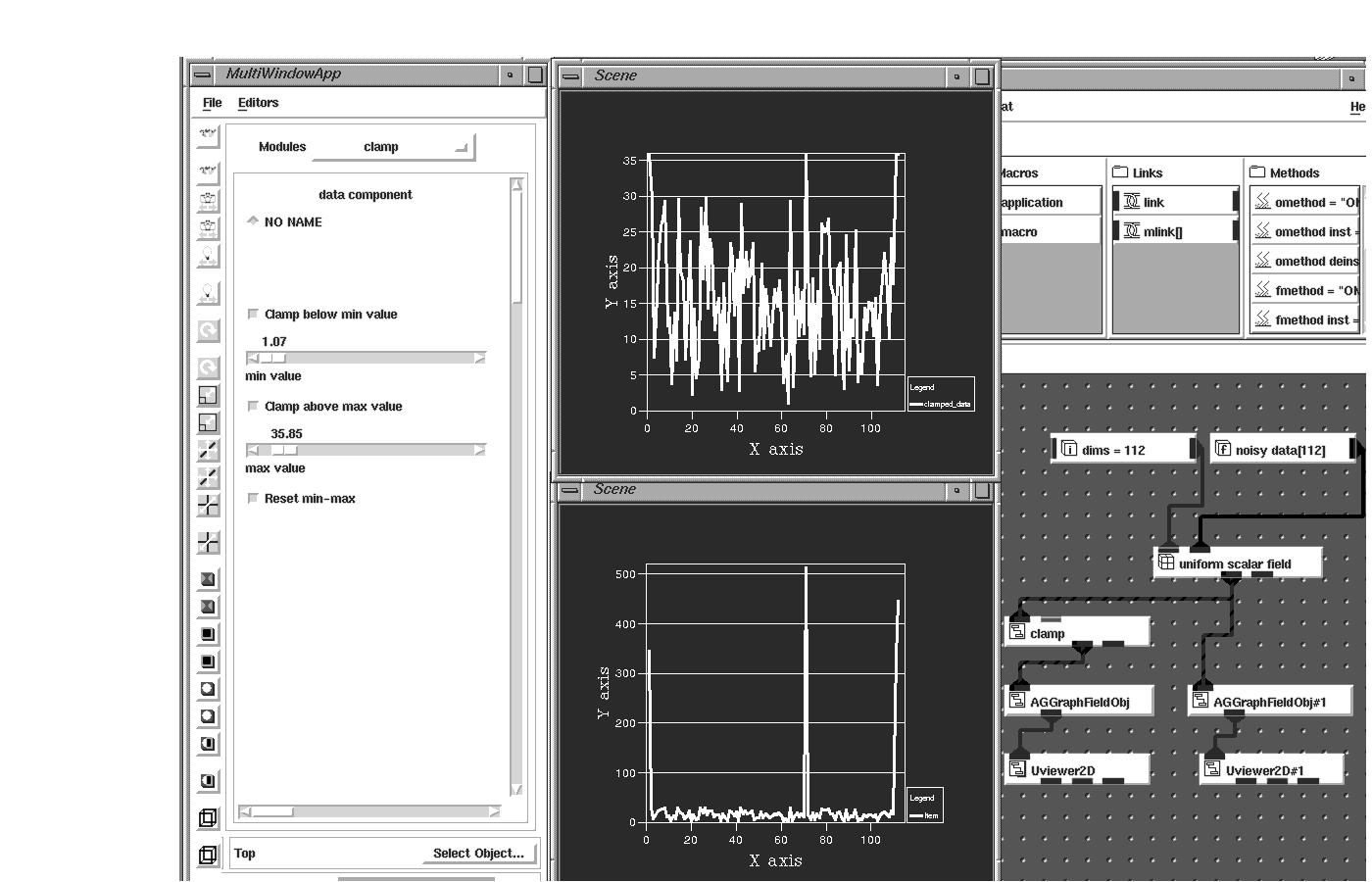
In many cases, data that is computed or acquired may contain erroneous data values, perhaps because the sensors gathering the data introduce noise that results in spikes in the data. Unless handled in some manner, these bad data values can obscure the meaning of the visualization.
The minimum and maximum values of every data set are stored in the AVS/Express field and are used to apply a datamap to the data. You can use the clamp module (which allows you to set minimum and maximum valid values) to clamp any data values outside a specified and thus eliminate unwanted spikes in your data.
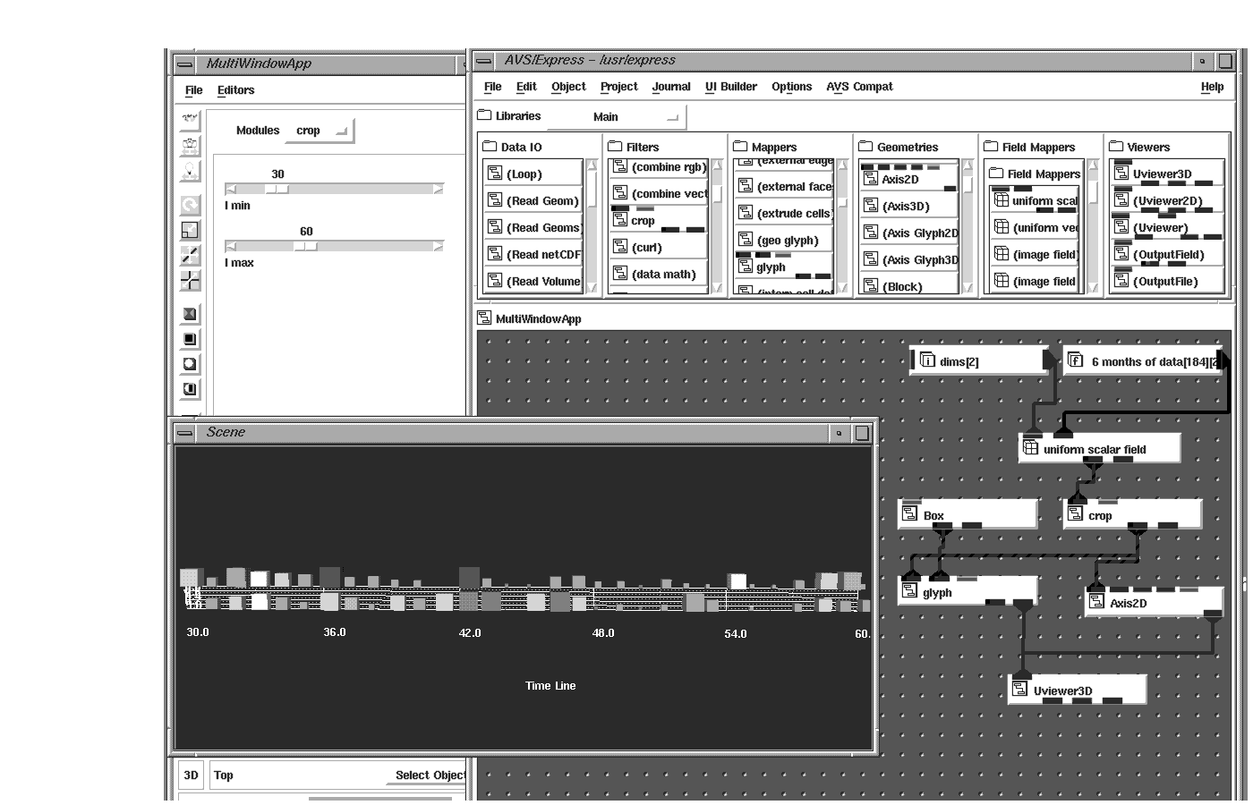
Sometimes only a quadrant of the data set is wanted for visualization or perhaps you want the whole data set but at a lower resolution. The crop and downsize modules are used to segment regions of the data or sub-sample the data, respectively. This is especially important if the data set is large and the computer system you are working on has limited memory.
By looking at a downsized visualization of the whole data set, you can choose the area of your data set you are interested in and view only that region at full resolution. The crop module also allows you to set up a moving window into your data. Perhaps a stock analyst would like to see a moving 30 day window of a particular stock or portfolio's performance. Crop can be set up to allow an interactive screening of this historical data.