This is an archival copy of the Visualization Group's web page 1998 to 2017. For current information, please vist our group's new web page.
Using VisIt to Visualize and Analyze AMR data of Turbulent Reactive Chemistry Simulations
Table of Contents
Introduction
Based on the work of Carlos Bazan, a summer student working on his Ph.D. at San Diego State University, the LBNL/NERSC visualization group decided to put together a set of web pages showing the capabilities of VisIt to visualize and analyze AMR data sets.
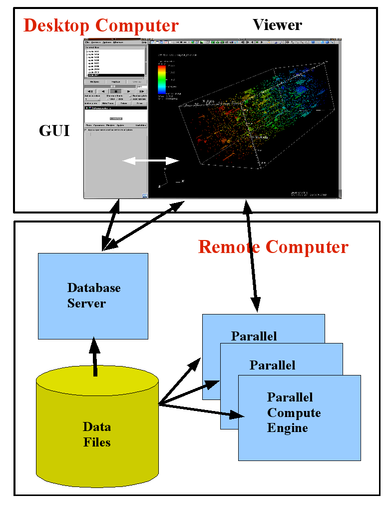
VisIt[1] is an open source point-and-click 3D scientific visualization and analysis application that supports most of the standard visualization techniques on structured and unstructured grids and provides operators to perform comparative visualization and analysis for different datasets. One of its advantages is that it employs a distributed and parallel architecture in order to handle extremely large data sets interactively. VisIt's rendering and data processing capabilities are split into viewer and engine components that may be distributed across multiple machines. See Figure 1 for a typical VisIt distributed and parallel running scheme.
|
VisIt provides a variety of built-in data readers for common data formats. Among them it supports Boxlib2D, Boxlib3D and Chombo AMR formats.
Visualizing Large Data Sets
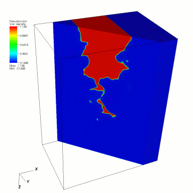
In the paper titled "Numerical simulation of a laboratory-scale turbulent V-flame", published by John Bell et al in PNAS, July 19, 2005, vol. 102, no. 29 they present a three-dimensional, time-dependent simulation of a laboratory-scale rod-stabilized premixed turbulent V-flame. The data sets produced by this simulation are extremely large (for visualization standards) Boxlib3D files, 19Gigabytes per time step. VisIt allows the direct visualization and analysis of these data sets with out the need to "flatten" it to the highest resolution.
|
|
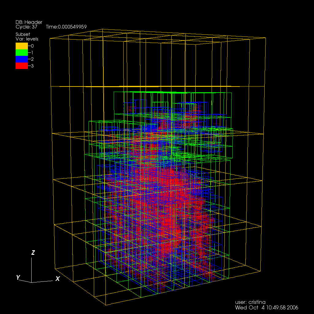
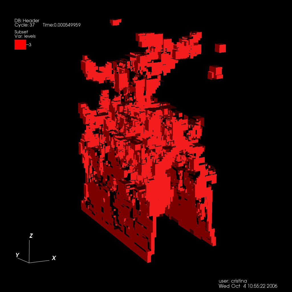
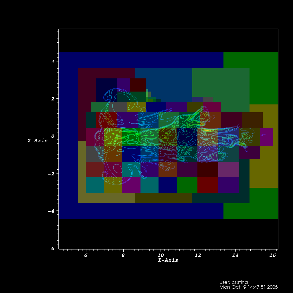
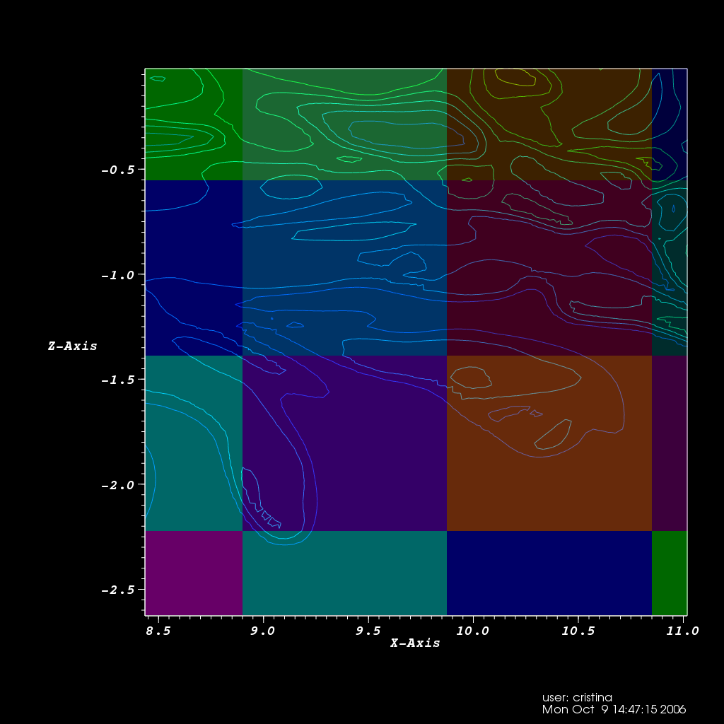
| A. AMR hierarchy consisting of 3 levels. | B. AMR Level 3 subset |

|
|
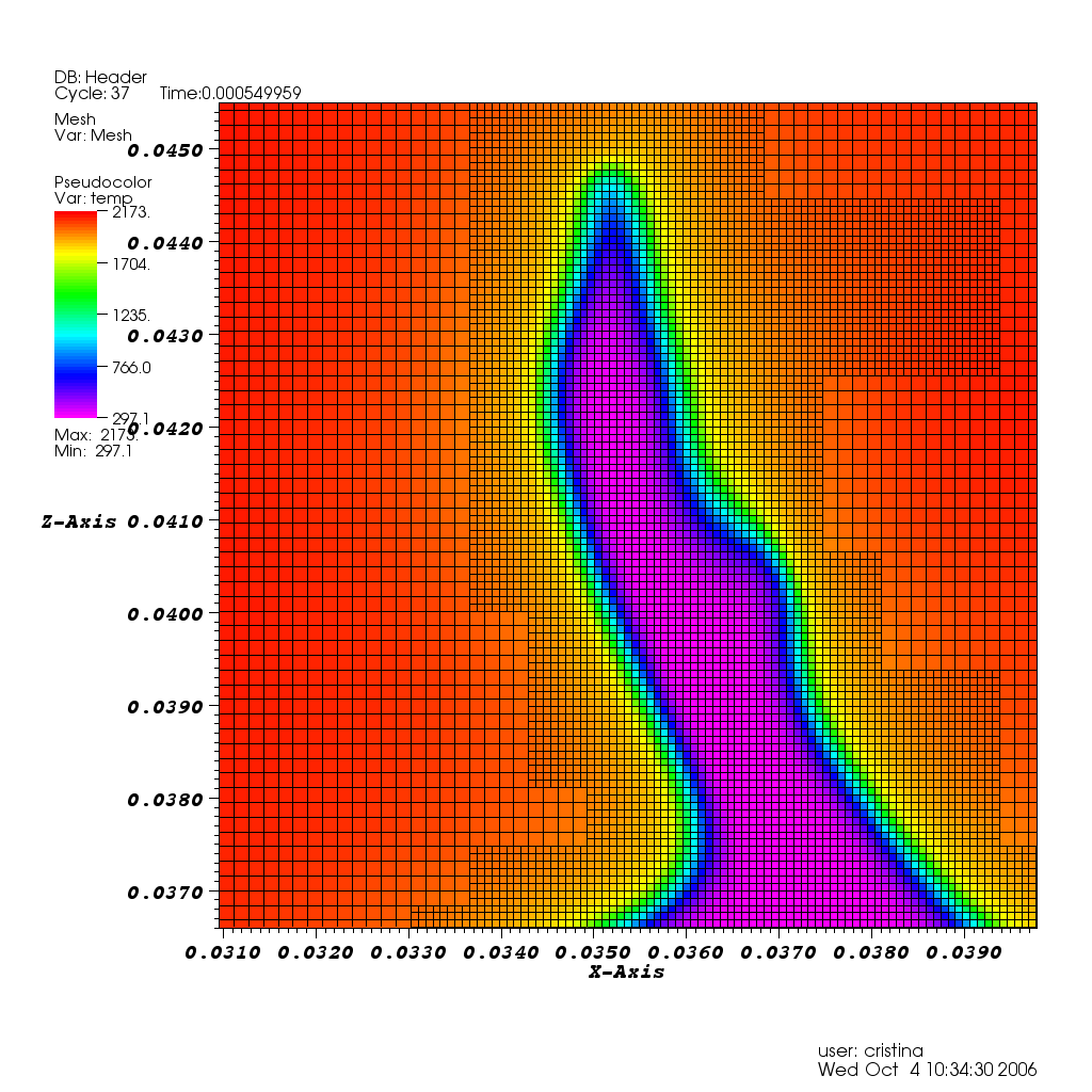
| C. Temperature values. | D. Detail of Temperature values. |
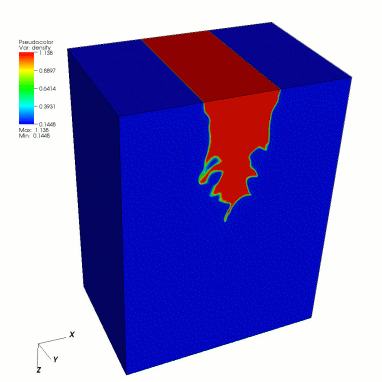
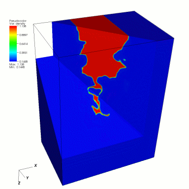
Another dataset used in tests is a physics simulation that models the effects of a shock wave passing through an Argon Bubble suspended in air (data courtesy of John Bell and Vince Beckner, LNBL's Center for Computational Sciences and Engineering. The Argon Bubble dataset is defined over a domain of 256 x 256 x 640 cells. Without AMR, a PDE solver would have to compute on 41.9 million grid cells; using AMR, the number is reduced to about 2.9 million (depending on the time step) by building a three-level hierarchy. See Figure 3 for a rendering of this data set and its grid structure.
|
|
| A. | B. |
Subsetting Areas of Interest
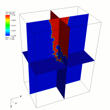
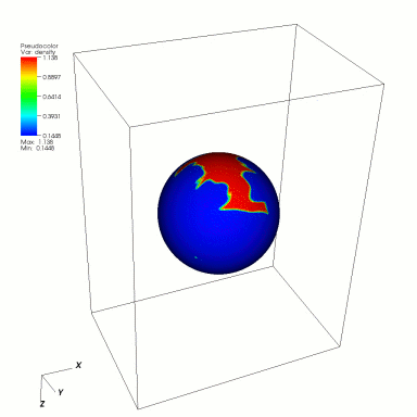
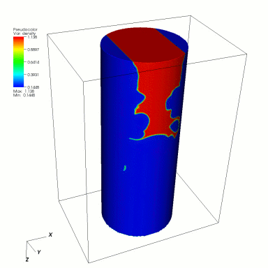
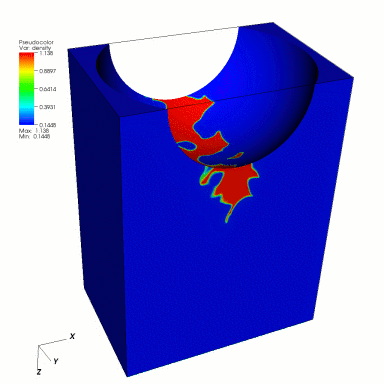
VisIt provides several subsetting tools. Figure 4. shows a pseudocolor plot and subsets using different tools or a combination of them.
|
|||
| A. Density. | B. Three ortogonal slices. | C. Sphere tool. | D. Cylinder tool. |

|
|
||
| E. Cone tool. | F. Sphere tool. | E. Plane tool. | F. Plane tool. |
Using Queries and Expressions
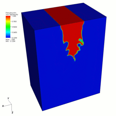
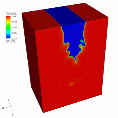
As an example, we combined two variables: temperature and density. In order to better compare these two variables first we normalize them on the range (0, 1) with respect to their maximum values. The query 'Max' gives us these values which are used to compute two new variables: MyTemp and MyDensity through the expressions temp/max_temp and density/max_density. Where max_temp and max_density are the values obtained through the query 'Max' . Figure 5. shows plots of these two variables.
|
|
| A. Normalized Density. | B. Normalized Temperature. |
Using the lineout mode
To learn more about the temperature and density distributions in these areas we use a 1D plot of these variables along a line that passes though areas of high gradients. Figure 6. shows a 1D plot that corresponds to the temperature and density distributions along the white line show on the 2D temperature plot.

|
|
| A. Temperature slice with reference line. | B. Plot of temperature and density along this line. |

Problems across patches
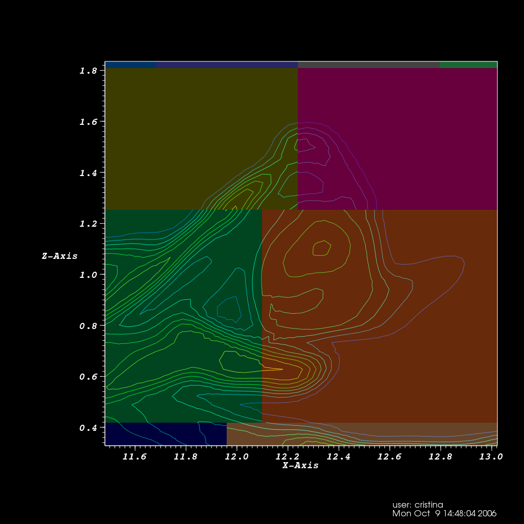
In some cases when patches do not line up or when there is a change of levels in adjacent cells some discontinuities appear. See figure 7 for some examples.

|
|
| A. | B. |
References
[1] See http://www.llnl.gov/visit for more details on VisIt.