This is an archival copy of the Visualization Group's web page 1998 to 2017. For current information, please vist our group's new web page.
Incite 3: Visualization Helps Provide Insight into 3D Fluid Turbulence and Mixing at High Reynolds Number
Table of Contents
Introduction
Scientific visualization plays a key role in the scientific process by offering the means to see abstract data. It is the modern equivalent of a microscope or oscilloscope since it provides visual depictions of scientific data in a multitude of user-controllable and -tunable forms aimed at increasing insight and understanding.
In this article, we show how the NERSC Visualization Group has worked closely with the Fluid Turbulence and Mixing at High Reynolds Number Incite Project at NERSC to create images showing never-before-seen scientific phenomena. The self-guided demonstration will walk you through some of the steps taken by the NERSC Visualization Group during the collaborative effort.
This project, led by Professor P.K.Yeung of the Georgia Institute of Technology, aims to increase scientific understanding of turbulent flows by performing at very high resolutions. They simulate rotating turbulent flow subject to Coriolis forces in the equation of motion conducted first at a grid resolution of 10243. The preliminary results indicate that the major features of the flow are similar to those previously obtained at lower grid resolutions, but at a higher Reynolds number, which implies increased relevance to actual turbulent flows in engineering applications.
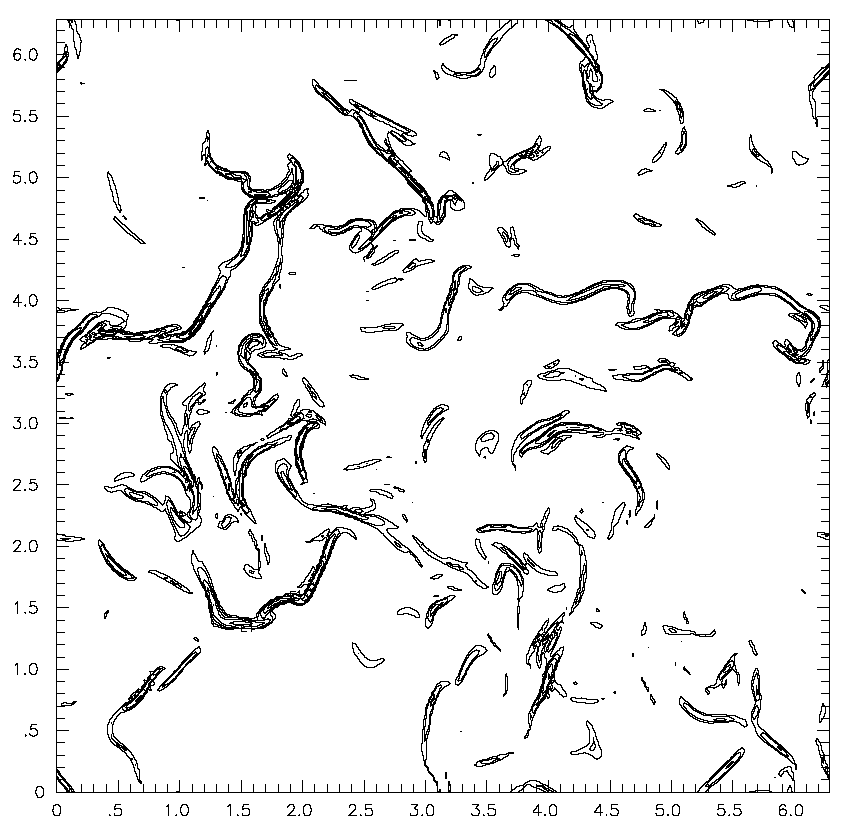
Earlier work shows the following visualizations that were computed on grids of coarse resolution (see Brethouwer, Hunt and Nieuwstandt, 2003 "Micro-structure and Lagrangian Statistics of the Scalar Field with a Mean Gradient in Isotropic Turbulence". Journal of Fluid Mechanics, vol. 474, pp. 193-225.)

|
|
| Two-dimensional stuff. | Three-dimensional stuff. |
Yeung et. al.'s first computations as part of the Incite3 project were from grids of resolution 2563. While the ultimate goal is to perform computations on grids of size 20483 to 40963, code tuning and parameter studies were first conducted on smaller grids.
|
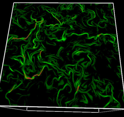
| This image shows isolated "filaments" of large values of the flow variable. These filaments exhibit what researchers call the property of "intermittency," where localized regions of intense activity are scattered among a background of small values. |
At this point, the NERSC Visualization Group became involved to explore alternative methods of visual data analysis. The primary objectives for the Visualization group were as follows:
- Explore visual display methodologies to help facilitate scientific insight. The challenge here stems from the fact that the simulation is producing large and feature-rich, time-varying 3D data.
- Provide the means to for the remotely located Incite3 researchers to make use of NERSC's high performance visualization visualization capabilities. To do so, we explored different options for pipelined/parallel high performance visualization.
As with most visualization projects, the data format produced by the simulation is not compatible with the data format expected by the visualization tools. Thus, a data conversion step is necessary. In our case, we needed to convert from raw, unformatted Fortran binary output files -- one file per slice of simulation output -- to a form more easily usable/readable by NERSC visualization applications.
First Light
The first step required in the visualization process is to transform data from the form output by the simulation into a form suitable for use by visualization tools. The simulation generated raw, unformatted Fortran binary output. After converting the data from ASCII Fortran output into a form more suitable for high performance visualization, the NERSC Visualization Group generated the following array of images. The image below shows our "first light" result, which is used as a "sanity check" to make sure we didn't do anything untoward with the data while reading it in.
|
| First Light from Incite3 |
Next, we extended the visualization into 3D to offer the first glimpse of turbulence structure. What appears as a "squiggle" in 2D is visible as a "roiled sheet" in 3D.
|
| Extending the visualization into three dimensions. |
Based upon the early part of this visualization work, we discovered that there all methods of "downsampling" data are unsuitable - a large number of interesting features in this dataset are only a cell or two wide, which means that visualization must be done at native resolution in order to present scientific features of interest. This observation is in contention with the assertion often posited about how full-resolution visualization is not required because of screen display limits and so forth.
The researchers found the 3D images difficult to interpret. In part, the difficulty stems from seeing something for the first time -- you're just not sure what to make of it. To help provide a bridge between the familiar 2D way of looking at data and feature-rich 3D displays, we created a number of images and movies showing movement of a 2D slice plane through data.
|
| MPEG movie (1.2M) |
Parallel and 3D Visualization
This image below shows visualization results produced by CEI's Ensight, which implements a pipelined-parallel architecture. A parallel visualization backend is run on NERSC's visualization server, and sends visualization results (geometry) to a client application running on a remote workstation. Once the geometry arrives at the desktop, it can be transformed at interactive rates.
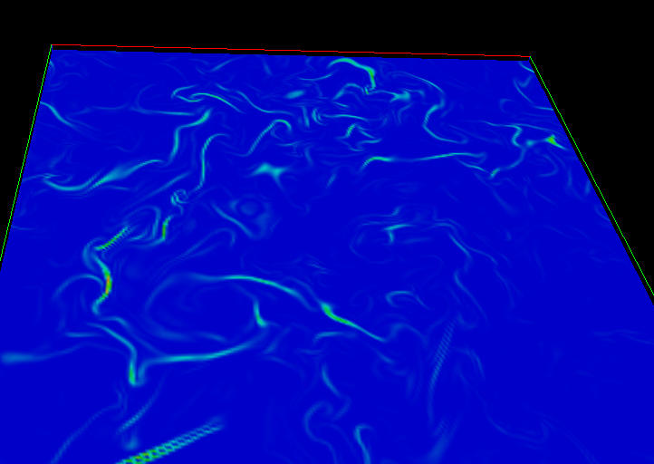
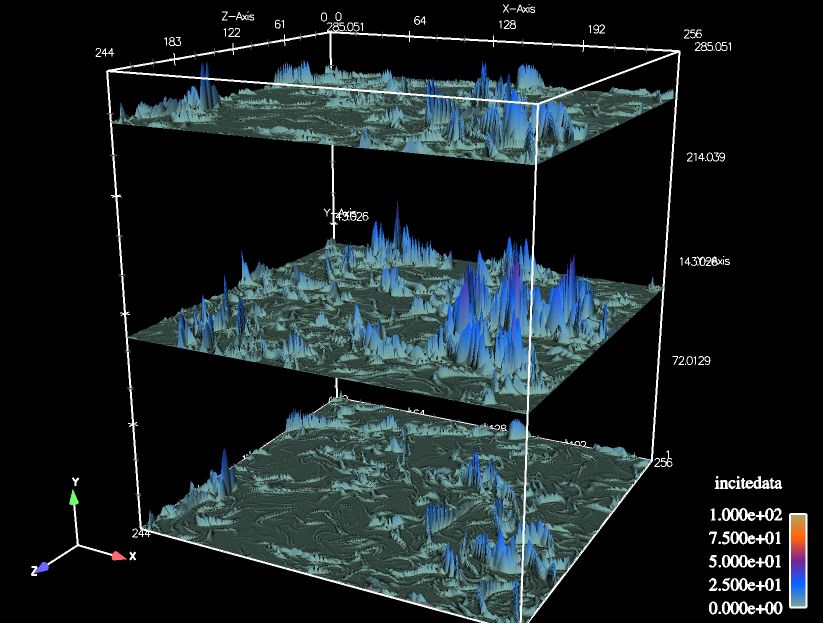
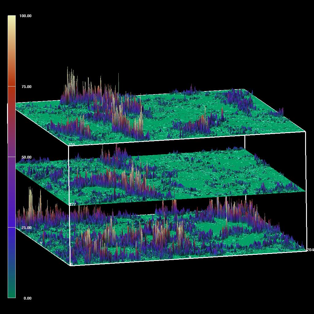
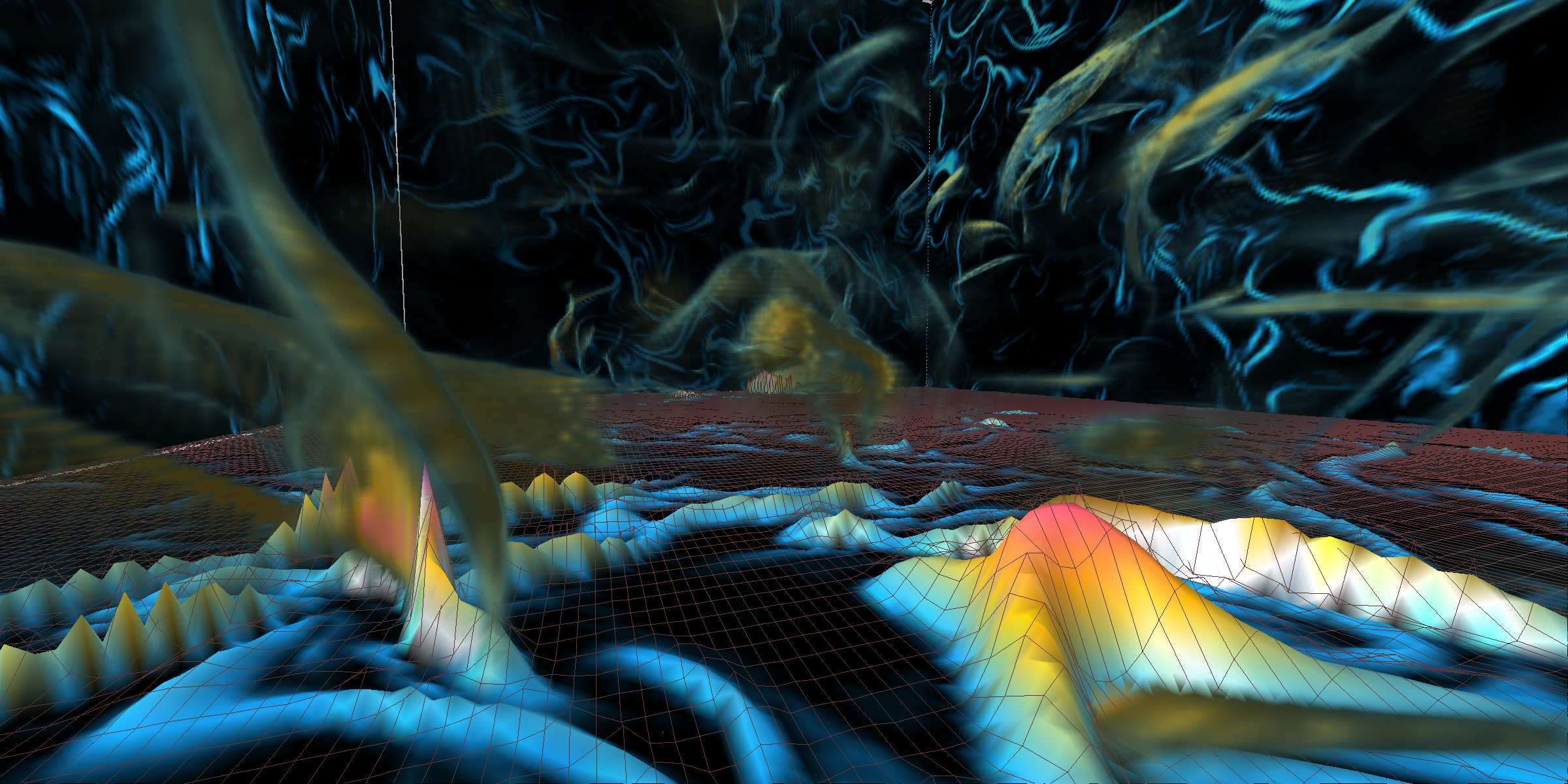
The below visualizations depicts three slices from the 2563 (top) and large 20483 dataset (bottom) where the slices are false-colored according to data magnitude. Additionally, the data magnitude is mapped to surface height to emphasize the contrast between high- and low-valued regions. The terrain-style mapping reveals qualities in the slice data not as readily visible as when using a slice plane where the boundaries between high- and low-valued data appear as "squiggles."
|
| Visualization produced from three slices of the 2563 dataset using a combination of false-color and terrain-style height mapping. |
|
| The same visualization motif using three slices from the 20483 dataset. This particular image will be included at the Incite3 presentation at SC04 in Pittsburgh. |
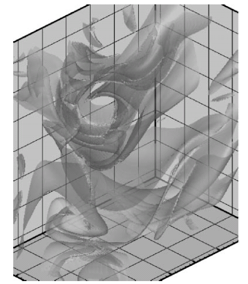
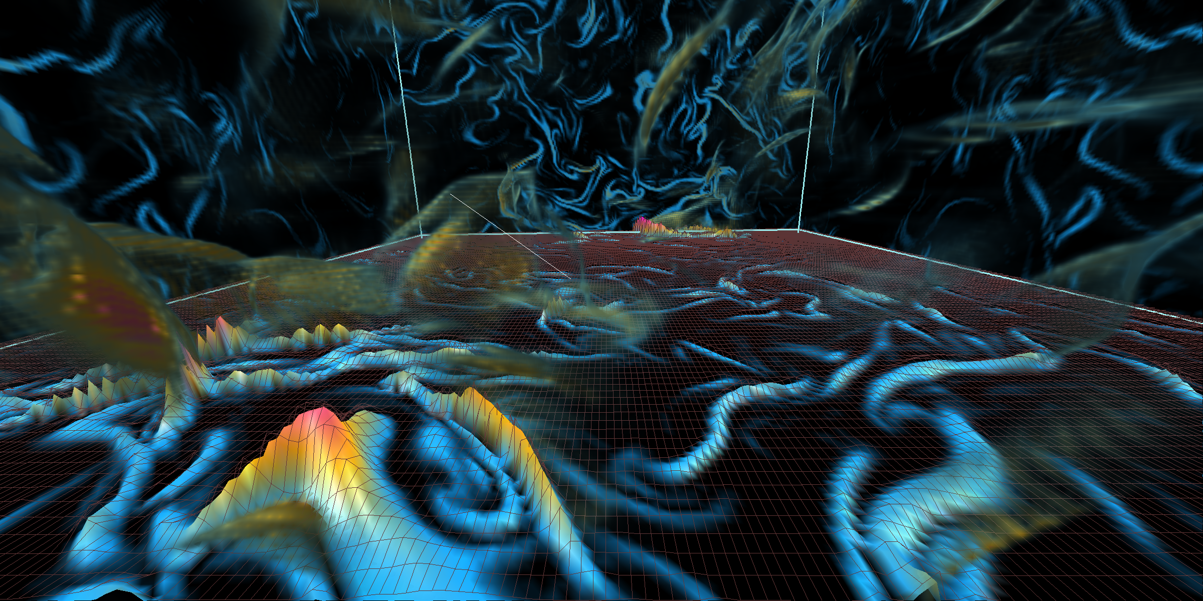
The following images use a presentation format that balances the brevity but relatively low information content in a 2D depiction with a feature-rich but difficult-to-interpret 3D view.
|
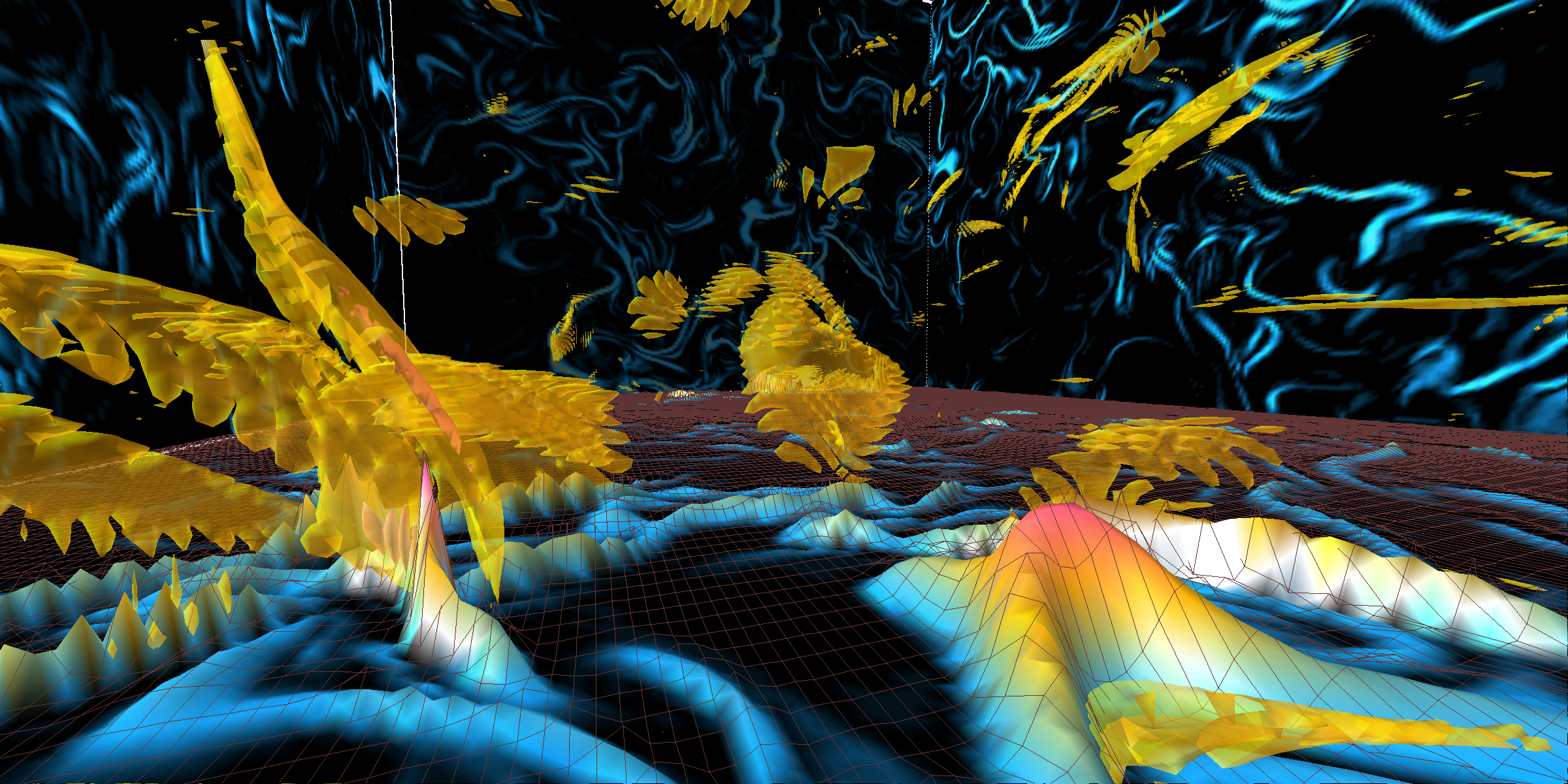
| The "base plane" shown here uses a combination of false-coloring and terrain height mapping to show high-density regions in a slice of turbulence data from the 2563 dataset. The yellow transparent regions are an isosurface of high data values. These surfaces show the "sheeting" nature of features present in the 3D data; those features appear as "squiggles" in a 2D depiction. |
|
| In this image, we use direct volume rendering instead of isosurfaces. Because volume rendering tends to produce "fuzzy" images, it is more difficult to perceive the sheet-like structure of data features in 3D. |
|
| A slightly different view using volume rendering. From this viewpoint, it is easier to perceive the sheet-like structure of some, but not all, of the 3D features. |
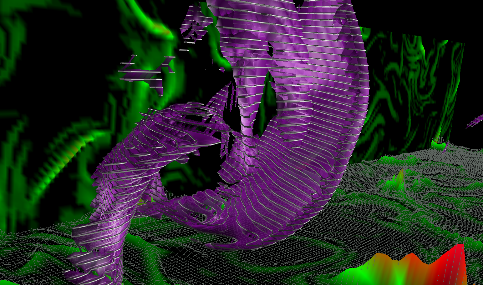
|
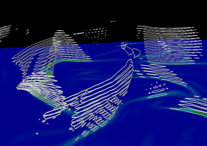
| Combining "contour lines" with the isosurface helps convey a sense of shape. |
|
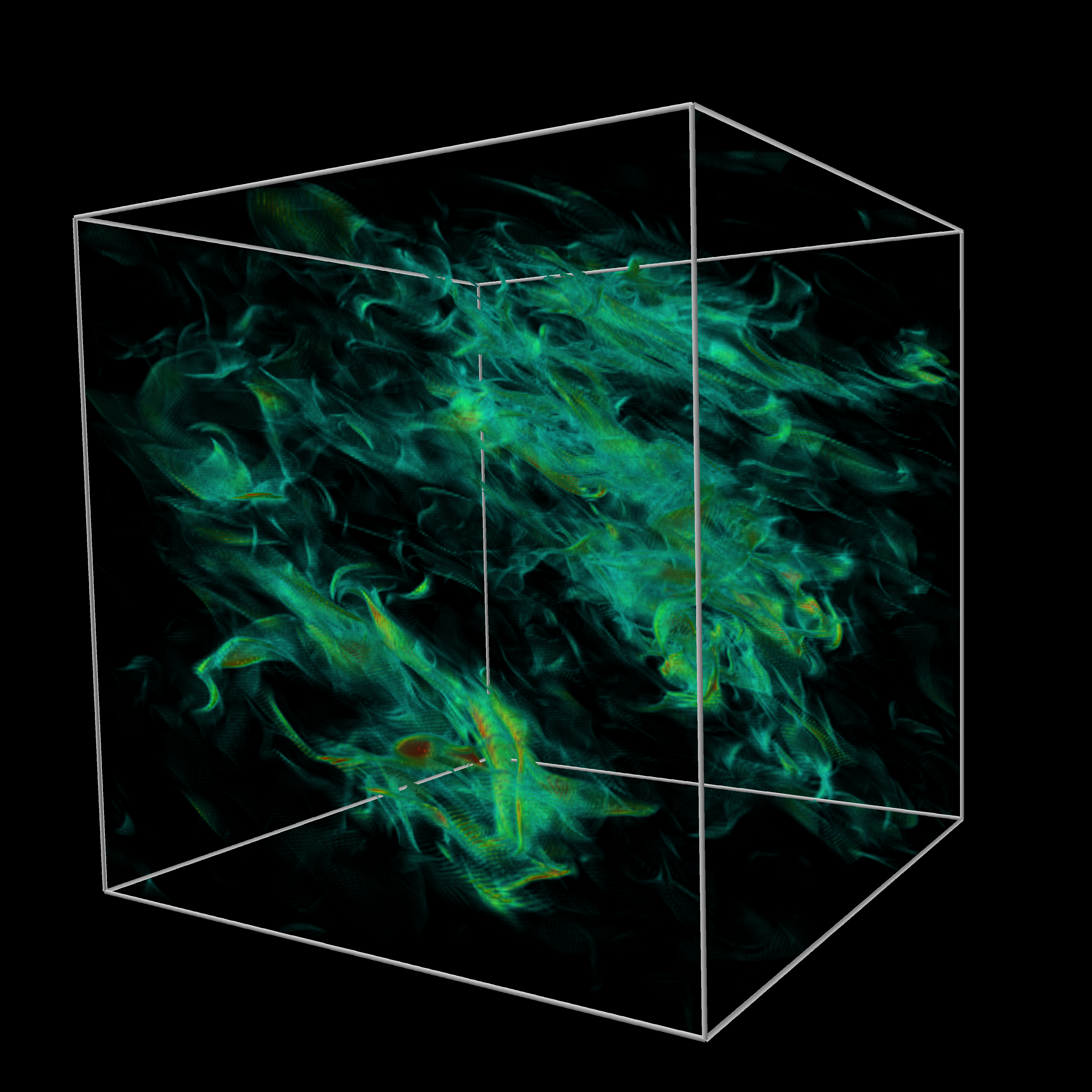
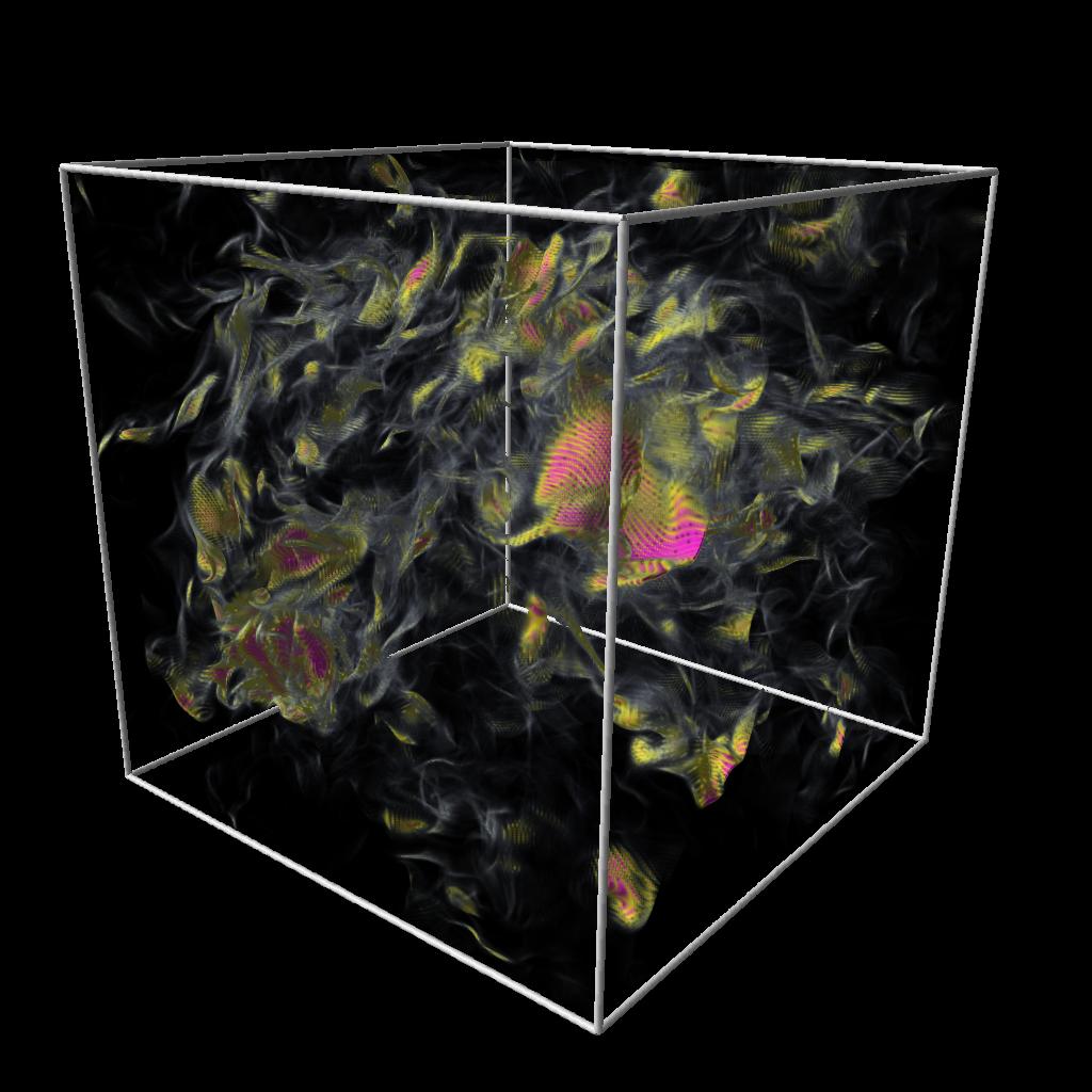
| Volume rendering is an effective method for displaying the 3D sheet-like structures in the simulation results. |
|
| The volume rendering transfer function, maps data values into color and opacity, has a dramatic impact on revealing features in data. MPEG movie (7M) |
Discussion and Next Steps
In contrast to the black-and-white 3D image shown in earlier work, the 3D structures present in the current work exhibit a "roiling" characteristic. The roiling is not an artifact of visualization, but is in fact a feature in the data. The roiling is caused by a kind of "tail" of increased high wave-number contributions to the scalar field we are visualizing. Next steps will involve visualization of alternate fields/variables that may result in surfaces that are smoother in appearance. As with many visualization projects, the images we created for Incite3 lead to a new round of questions about the science as well as additional visualization challenges.
As we move forward in collaboration with P.K. Yeung and his Incite3 collaborators, we will examine several alternative avenues of visual data analysis investigation applied to new data being generated by Incite3 at NERSC. One particular avenue of pursuit will be to explore methods that quantitatively capture topological features within the turbulence simulation data, and combine the quantitative information in conjunction with the qualitative results shown above. In addition, we must pursue alternative algorithmic implementations to overcome the substantial resource requirements that accompany visualization of time-varying, 40963 datasets. Such work will be directly applicable to future projects at NERSC that produce ever-larger amounts of feature rich, time-varying scientific simulation output.