Project Description
The Nearby Supernova Factory (SNfactory) is an international
astrophysics experiment designed to discover and measure Type Ia supernovae
in greater number and detail than has ever been done before. These
supernovae are stellar explosions that have a consistent maximum brightness,
allowing them to be used as standard candles to measure distances to other
galaxies and to trace the rate of expansion of the universe and how dark
energy affects the structure of the cosmos. The SNfactory receives 50-80 GB
of image data per night, which must be processed and examined by teams of
domain experts within 12-24 hours to obtain maximum scientific benefit from
the study of these rare and short-lived stellar events. It is the largest
data volume supernova search currently in operation. To achieve the desired science goals, the SNfactory must collect both visual
and spectroscopic data on each supernova found.
In order to analyze the spectral data, the scientists often need to compare
spectra over different dimensions. In the past, when only a handful of
supernovae were discovered each year, supernova scientists were
able to recognize spectral signatures by supernova name. However, as the
SNfactory has generated a large and growing supernova spectral database,
exploring the dataset for analysis has become more difficult.
SpectraVis is an interactive visual interface for browsing and displaying
supernova data. Implemented in Java using Piccolo, a toolkit providing
support for 2D graphics and the development of zoomable user interfaces, the
tool is designed for use by astrophysicists studying supernova spectra
in order to learn more about dark energy.
Prototype #1
The goal of this first prototype was to create a cluster
visualization of spectra based on similarity scores. The first prototype was based on work done by
Raquel
Romano, who calculated similarity scores for a gold standard dataset of
spectral data. We set various threshold cutoffs and were able to
construct an adjacency matrix based on the similarity score data. The
Prefuse toolkit was then used to visualize the data as clusters with a graph
topology.
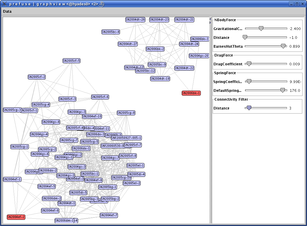
In the above screenshot, there are two selected spectra shown with
all 'similar' spectra. Selecting another spectrum would change the graph to
only show spectra 'similar' to the chosen spectrum. Double clicking on the
spectrum node opens up a window with a detailed spectral image. Dynamic
sliders could be used to make the similarity score cutoff more or less
restrictive.
One limitation of this visualization was that the edges of the graph were
unweighted. Ideally, we wanted distance in the graph to represent
similarity. The force-directed graph layout algorithm in Prefuse does not
allow for weighted edges, so if we decided to continue using Prefuse, we
would have to extend the toolkit to do so. Another limitation is that the
clusters are essentially unlabeled, making it difficult to interpret the
clusters.
Prototype #2
The next prototype was based on the understanding that Type Ia spectra of
around the same phase are very similar to one another, and scientists are
often interested in seeing spectra at the same phase. We felt that
clustering by phase would result in a meaningful topography for this
visualization. In this prototype, we also addressed the fact that, with over
a thousand spectra, there would be a need to see an overview of the entire
dataset as well as be able to focus in on a subset of the data. Again
using Prefuse, we implemented semantic zoom as a way to explore the clustered data. As a
section of the graph is zoomed in on, more detail about each spectrum
appears. Below are two screenshots of the design, the first displaying an
overview of a demo dataset, the second, zoomed in on a portion of the graph.
Zoomed out view of a demo dataset
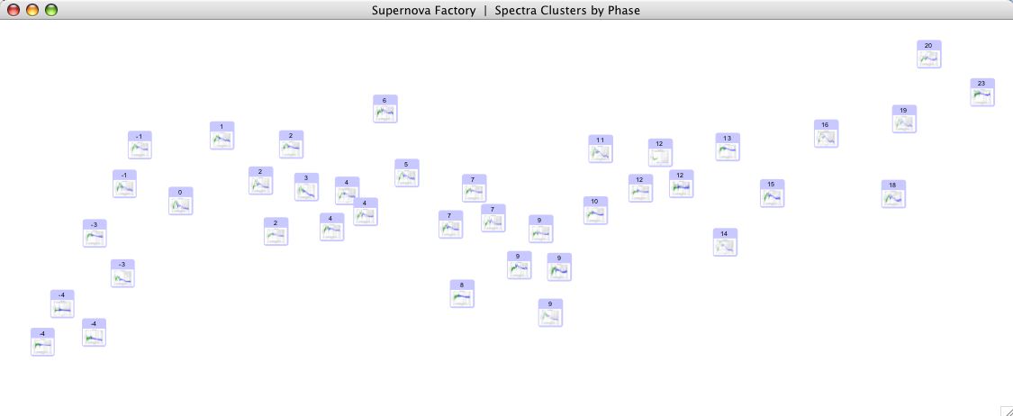
Zoomed in, displaying more information on each spectrum

One problem with this design was that, while exploring the
dataset through zooming, the user could lose context and become disoriented. As an
implementation issue, we would have to develop a layout algorithm for the
weighted cluster visualization.
Final Prototype
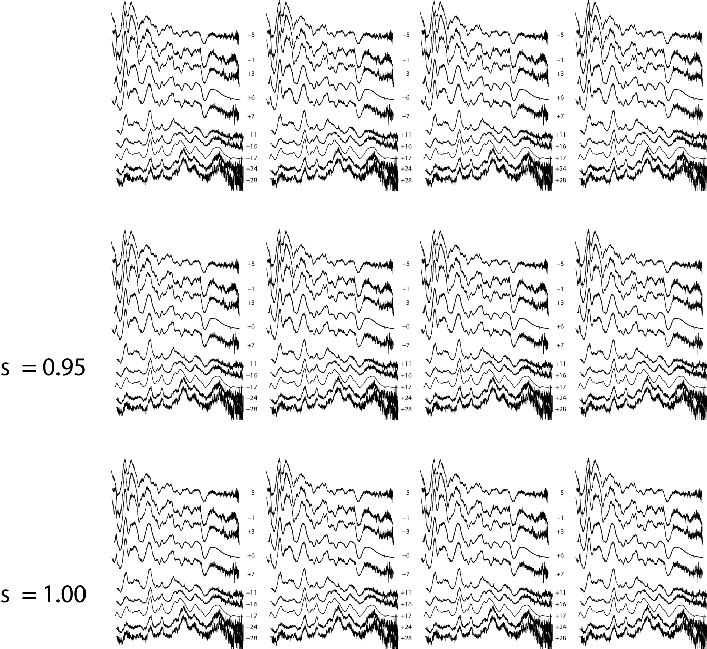
The final design was inspired by an email from Saul
Perlmutter, a co-Principal Investigator at the SNfactory,
who requested timeseries plots of several SN Ia's for a talk. This email
made it clear that scientists were interested both in seeing SN Ia's of similar
phase as well as all the spectra of one SN.
Spectral timeseries plots
For our final design, instead of clustering by some
criteria, we decided to display all the spectra on a 2D grid, SN
(specifically, target name) by phase. In order to zoom in on areas of interest, we
implemented a semantic fisheye zoom, which enlarges and provides more
detail for a specific area of the graph while retaining context.
The Piccolo Toolkit
We decided to use the Piccolo toolkit instead of Prefuse for this prototype primarily because Piccolo had several already implemented fisheye applications that we could use as starting points for our application. In addition, we felt that Piccolo was better documented and simpler to start using.
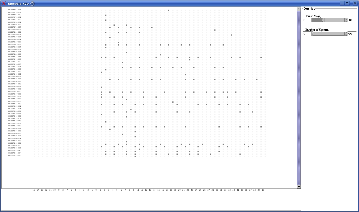
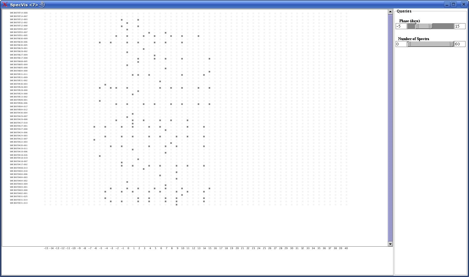
Interface Description
The fisheye browser uses a grid layout to preserve the timeseries concept
behind the study of SNe. Each dot of the grid corresponds to a supernova
spectrum. The vertical axis contains the target names of the supernovae and
on the horizontal has the age in days of the supernova or the phase. The
period of scientific interest in the study of type Ia SNe ranges between 15
days before peak brightness and 40 days after peak brightness.
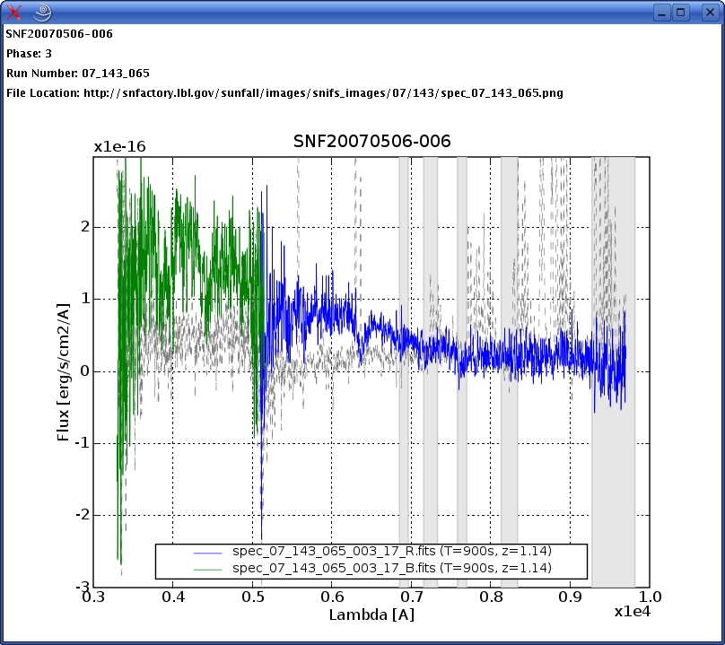
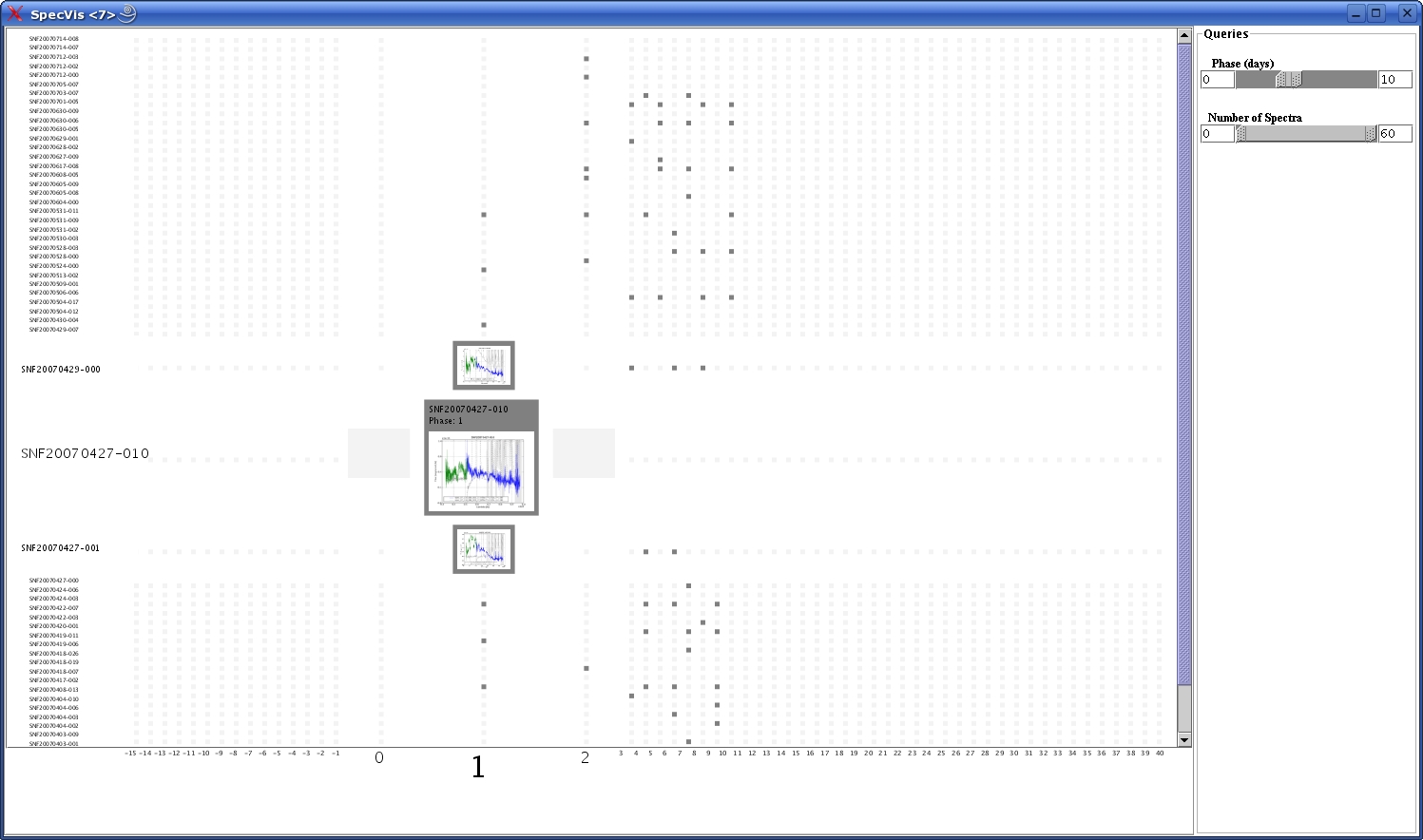
In order to see a more detailed spectrum, the user clicks on one of the spectrum
nodes and the fisheye technique makes the clicked dot and its neighbors
bigger. The user can click one more time on the spectrum of interest and the
zooming is taken at a higher level.
The semantic zooming is taking place at four levels: the initial dots, the
two small spectra of focus and neighbor size, and the enlarged graph:
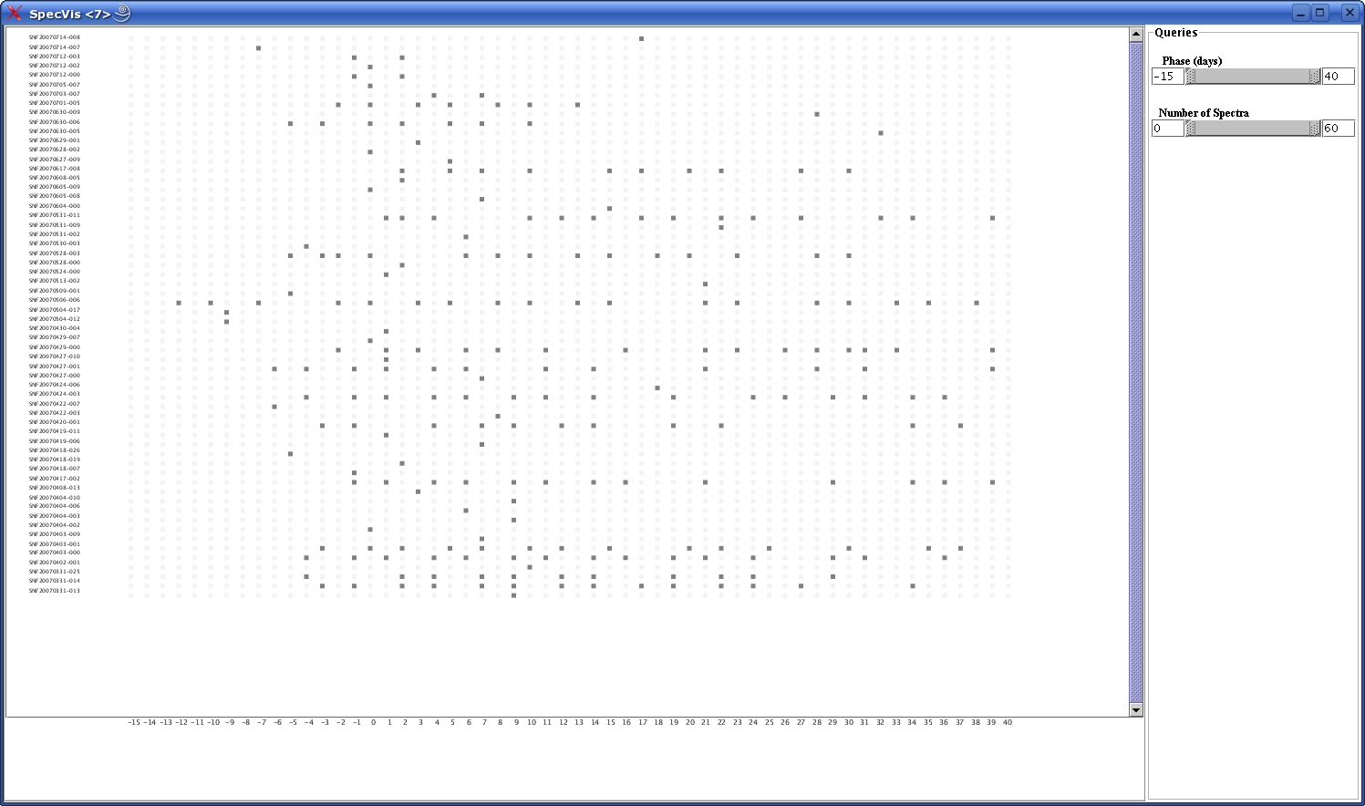
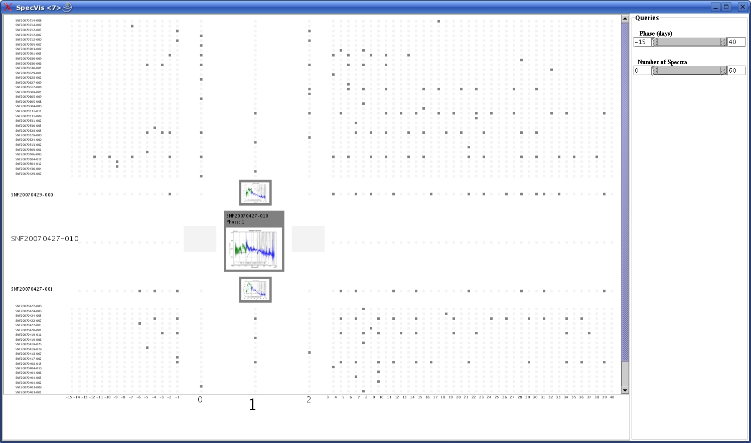
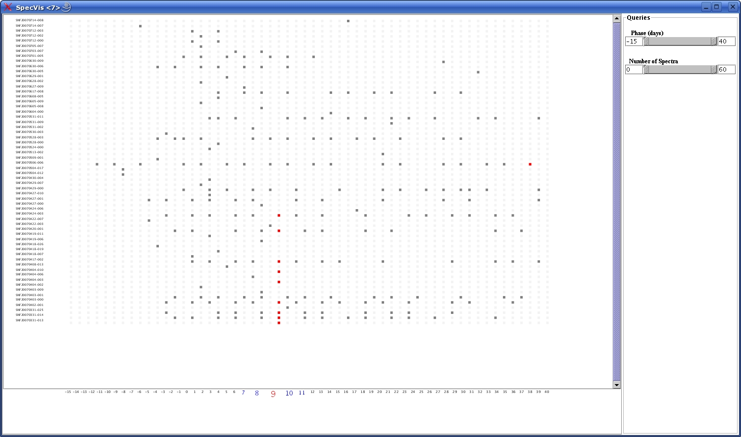
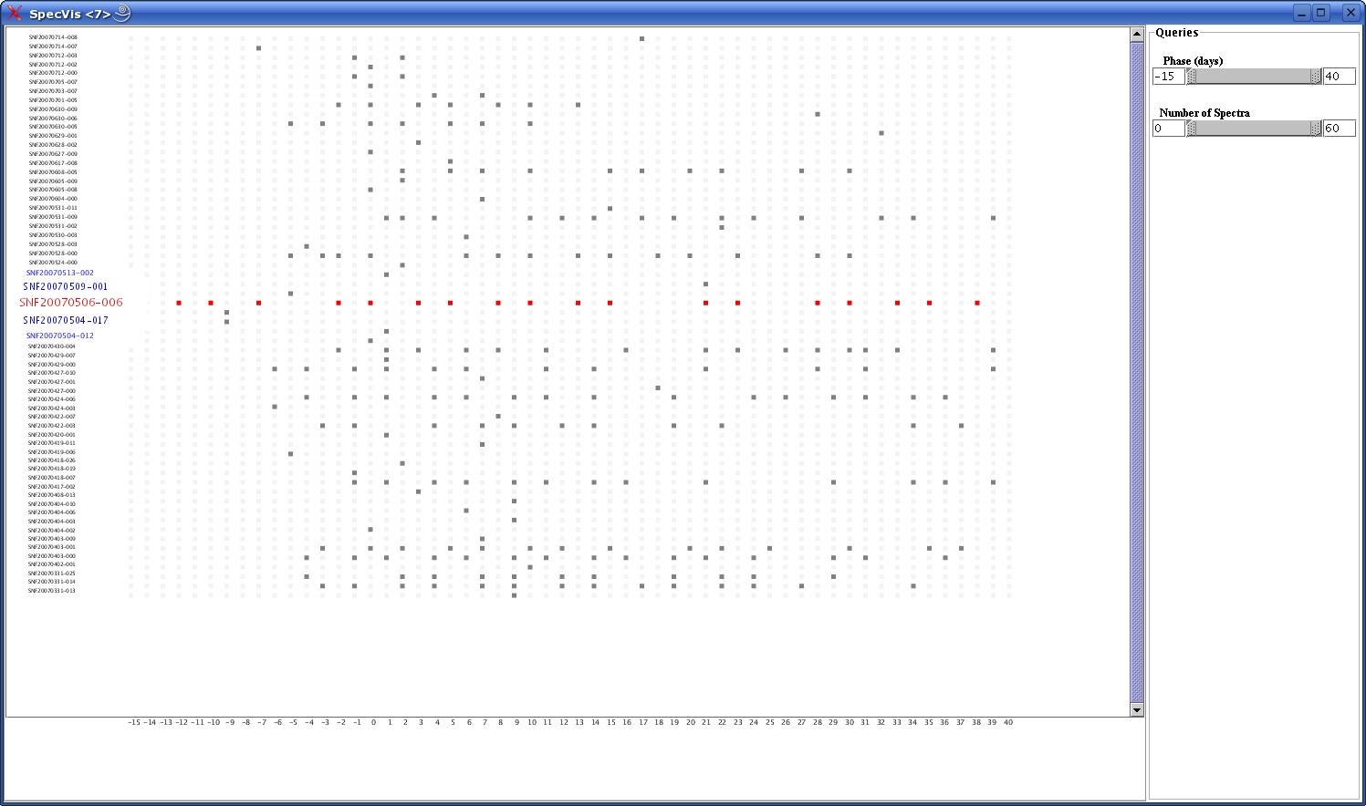
The fisheye lens approach to the visual browser was combined with standard
information visualization techniques such as highlighting and filtering.
While the fisheye changes the display size relative to focus, the
highlighting changes the display type relative to focus.
Rolling over the phase or target names, the corresponding column or row is highlighted in red. A similar highlight is activated when the user rolls over the grid.
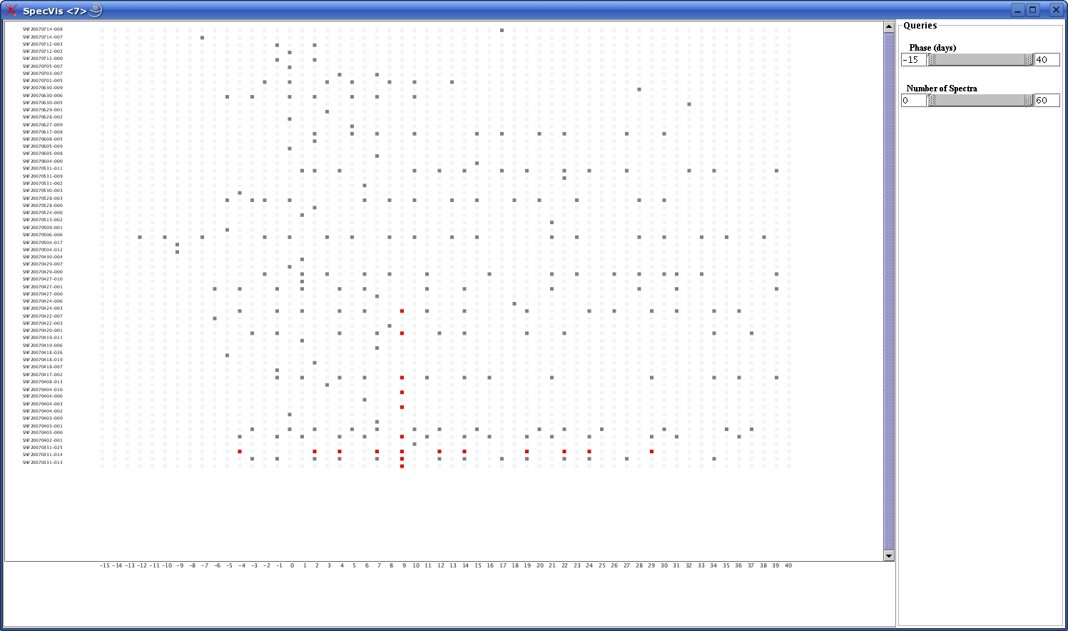
Filtering is one of the features in progress. A double range
slider was created to remove or select data for a certain phase interval.
The slider can be operated by either adjusting its length or by entering
values in the text fields and pressing return.
A similar double range slider will be implemented for the number of
targets, allowing the user to add or remove as many supernovae as s/he wants.
User Evaluation
We demoed SpectraVis to several key scientists to gather
feedback for future efforts. One scientist commented that he had never been
able to see the whole dataset of spectra before. While exploring the data,
the scientists found several cases where the data looked "weird" and worthy
of further study.
The scientists had several requests for the visual browser. They wanted to be
able to sort the target name axis based on key features such as
redshift. They also wanted to be able to color-code each spectra, based on
whether the observation was successful, marginal, or a failure. Finally, they
wanted to be able to see more points upon each zoom.
One scientist expressed the desire to select different features
for each axis. He felt that the fisheye zoom over a 2D plot was highly
useful and would like to be able to use this visualization to explore the
dataset in different ways.
Future Work
SpectraVis gives the SNfactory scientists a way to browse
a large dataset of spectra. We hope that SpectraVis will facilitate scientific
analysis. We would like to be able to add access to data analysis tools from
the visual browser, feeding in the datafiles from selected SNe into those
additional tools.
We are very interested in following up on the suggestion for
selectable axis variables. We feel that, in doing so, the visual browser
could be used by a variety of groups to aid in data exploration.
Back to top
Appendix
Useful Links
The Prefuse Toolkit websiteThe Piccolo Toolkit website
The SNfactory website
The LBNL Visualization Group website
Elena Caraba's presentation on SpectraVis
Back to top