Tutorial 2: Using Plots, Operators and some analysis tools
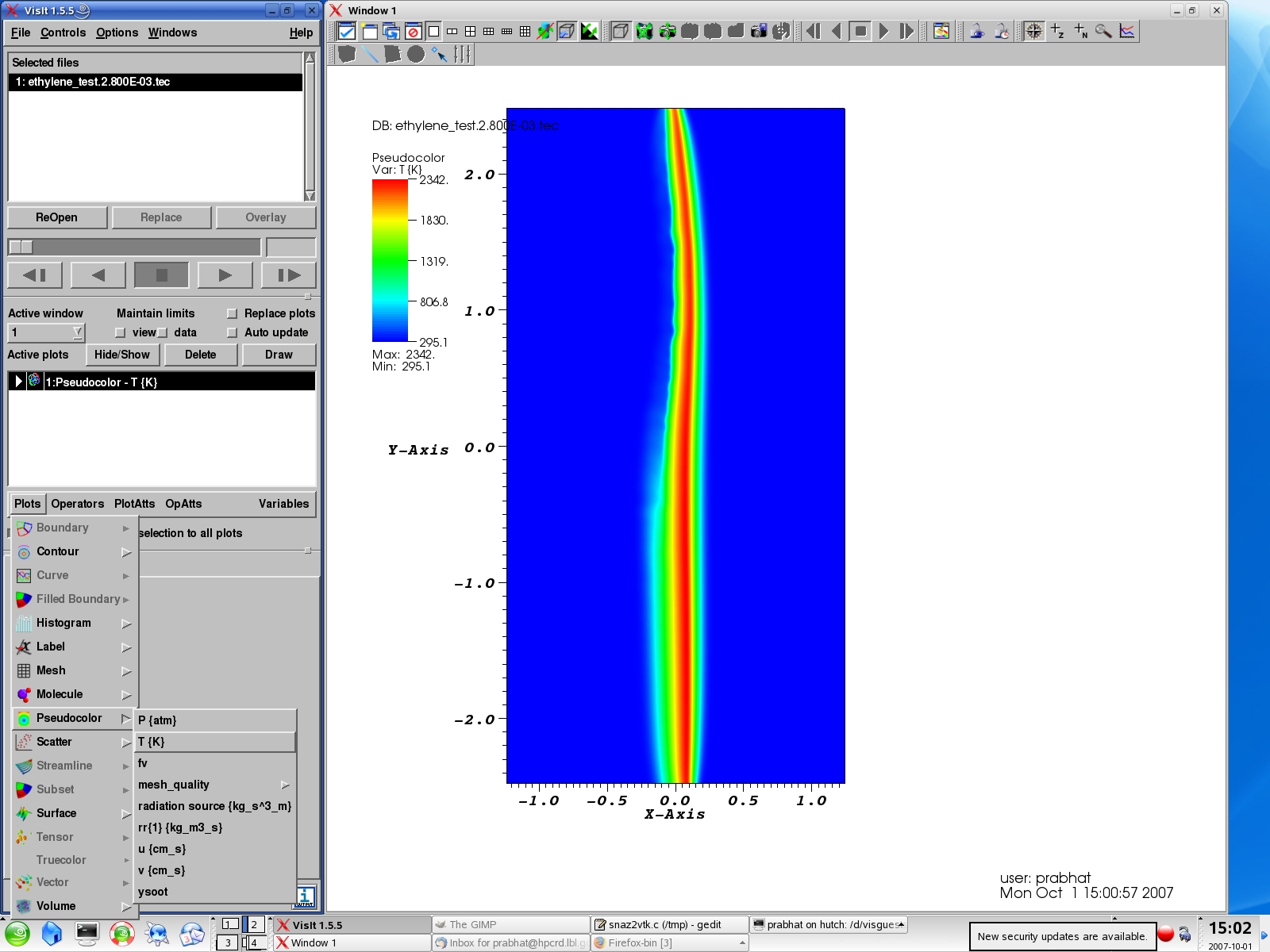
Use Plot->PseudoColor->(Variable List)->T to plot the Temperature values. Each plot can have several properties (Colormap , Opacity, etc). You can double click the plot or use the PlotAtts->Pseudocolor menu to bring up menu for changing properties. "Hide" this plot for now.
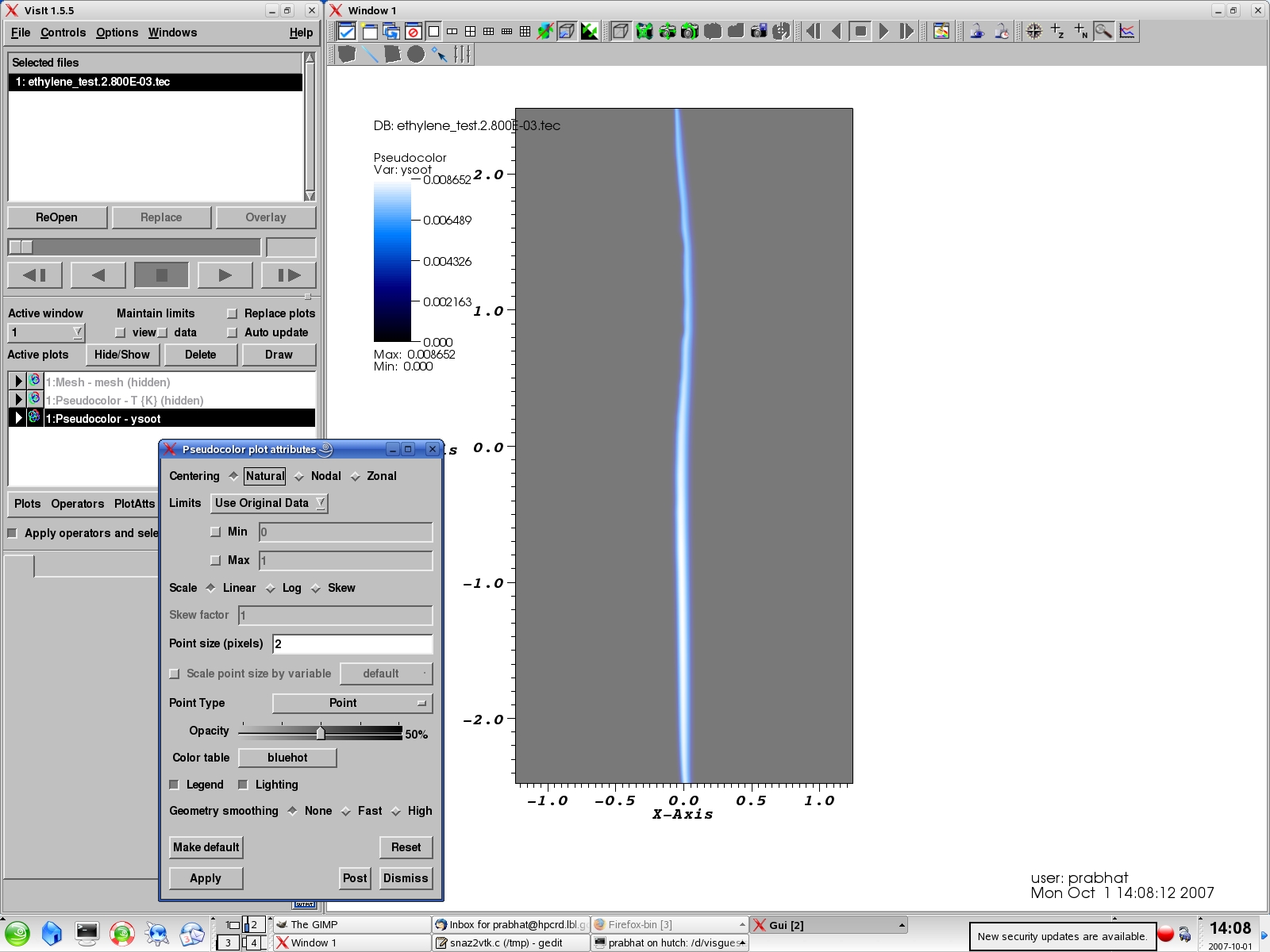
You can overlay another plot (let's say of the variable soot) by choosing another plot. You can choose a different colormap (calwhite) and opacity to give the plot a transparent look.
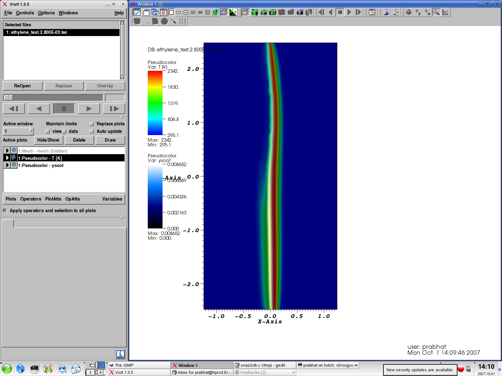
Select the Plot for T, click on Hide/Show to display the Temperature plot. You will note that both T and Soot plots are now overlaid. Note that overlaying multiple plots and using composited color to interpret values can be potentially confusing; hence you should be careful with color mappings.
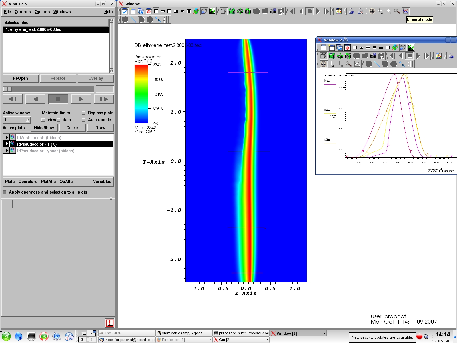
"Hide" the Soot plot for now. Use the Lineout tool (near the top-right corner of screen) to draw multiple lines on the "T" plot. This will plot numerical values (along the line) on a graph.
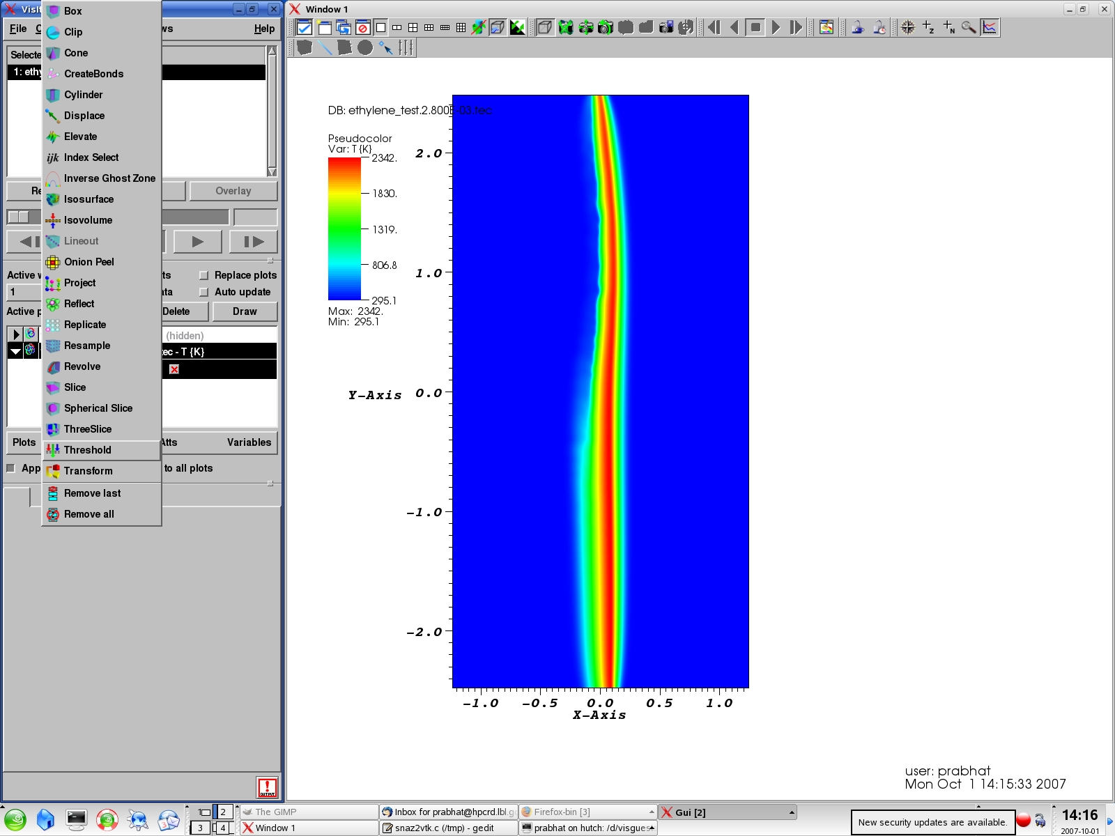
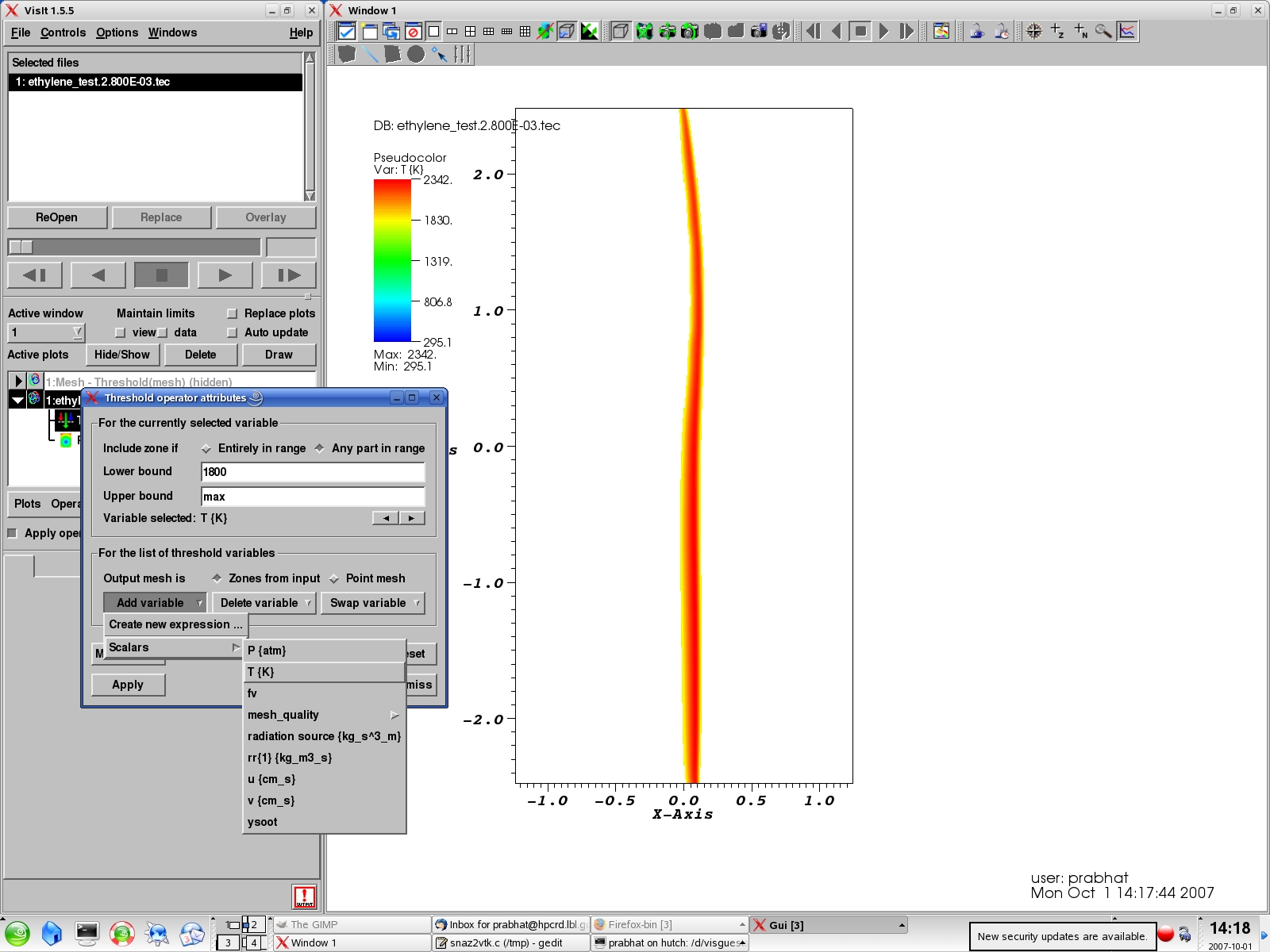
Visit has a powerful set of capabilities to select a sub-region of a dataset. Use the Operators->Threshold to bring up a menu for setting thresholds on different variables.
Add the "T" variable and set the Lower Bound to 1800 to select only those cells which are above 1800K. Note that the display now displays a smaller subset of the domain.
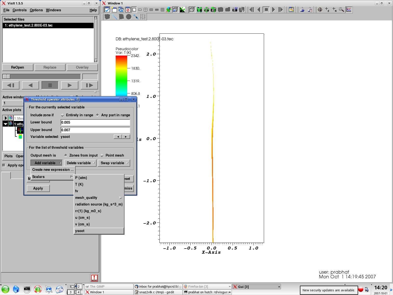
Add another variable "Soot" and set (0.005,0.007) range for the soot density. Note that only those cells are now displayed which satisy both the "T" and "Soot" constraints.
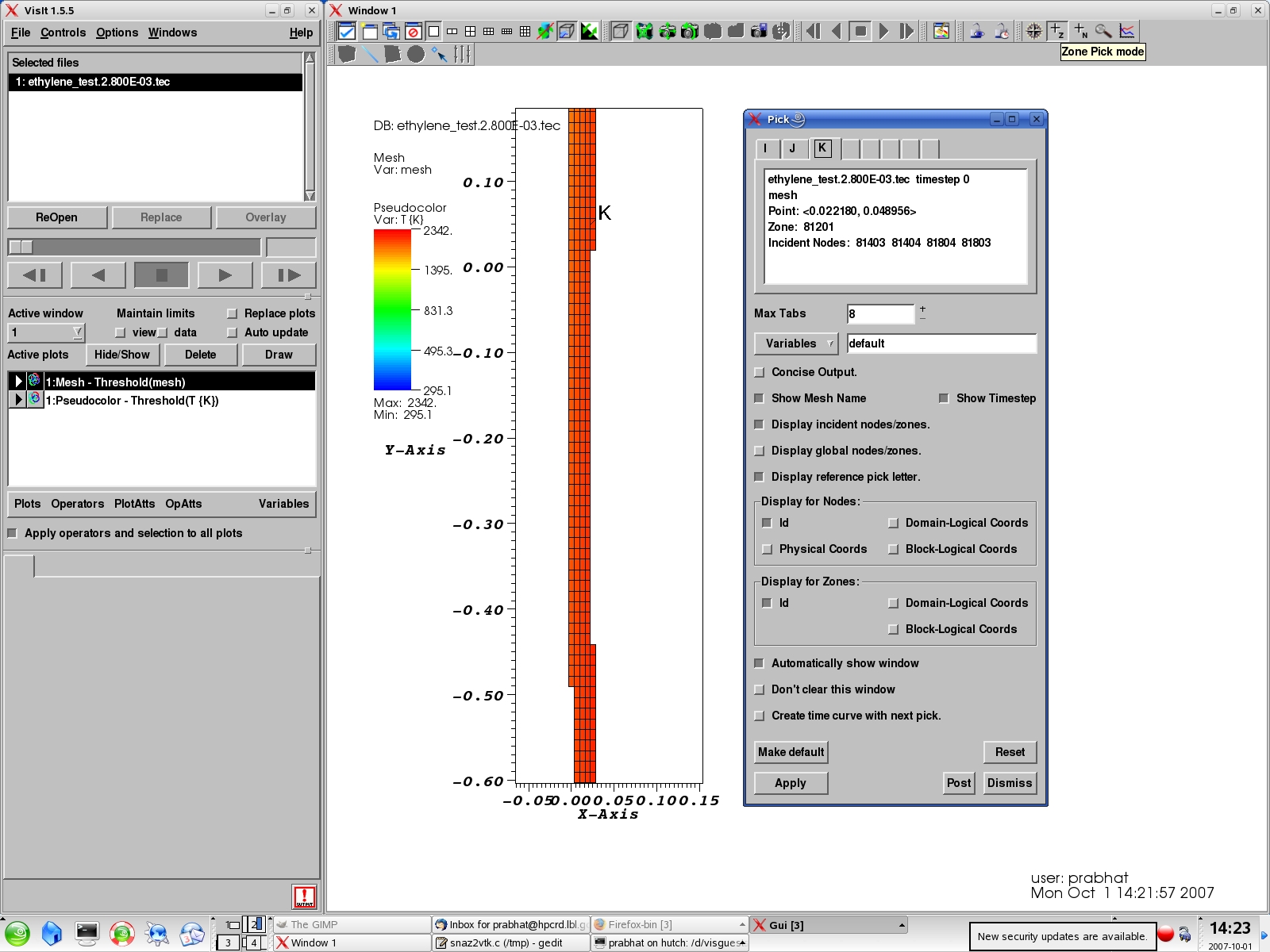
In order to examine these interesting cells in more detail, you can use the "Pick" mode near the top-right corner of the screen. Zoom in and click on individual cell in the mesh and bring up quantitative information.