Flux Visualization Techniques in AVS and Khoros
Clicking on any of the images below will get you a higher resolution version to look at. Extra high-res images, when available, can be accessed via a hyperlink in the text.
Listed below are the ideas which have been proposed, along with images
representing prototype implementations of each technique. The dataset
being used for these examples is synthetic, and the grid size is 30 by 90 by 12
grid cells.
Reproduction of Work in Other Software
Data Reduction Techniques
Visualization Techniques
Blobs
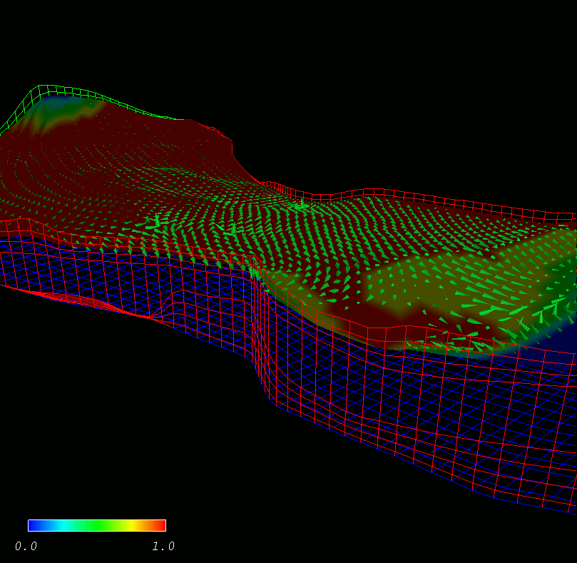 |
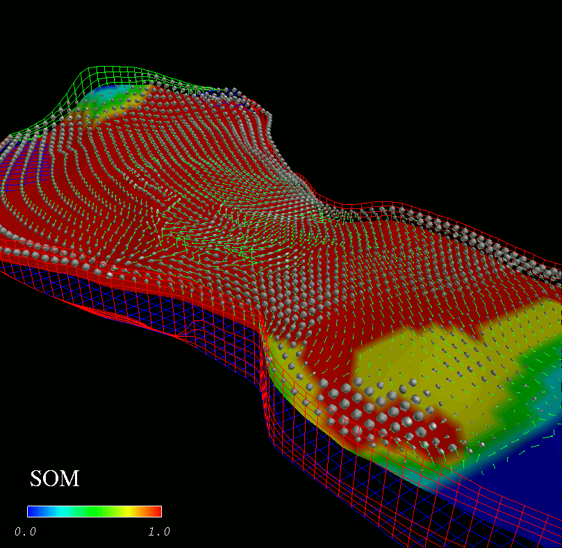
This is a twisted tale, so pay attention. ;-) This image shows the austin reservoir with flux cones for a few of the layers averaged together. Also, we've made a colored slice, where the color on the slice corresponds to SOM. The legend on the image shows the value of SOM (this is from early in the simulation run, by the way). The area I want to draw your eye to is slightly to the right/down from image center. There's an area of high SOM where there are no flux cones.
The technique which was suggested is something like this: at each grid location, create an icon who's shape is a function of two parameters. One of the parameters is SO or SOM (or some other variable to be determined). The other is the flux (for oil, I'd guess). The idea is to have what is basically a sphere (that's large enough to see) in areas where SOM or SO is HIGH and the flux value is LOW. And to have footballs or ellipsoids in areas where SOM or SO is high and flux is HIGH. And voila!
 |
Click here for an extra hi-res (1800x1500) version of this image.
You'll see that in that same area of high SOM and low flux a bunch of spheres. Elsewhere, where flux is significant in magnitude, the icons get more oblongated. The sizes of the icons don't really mean much because of a simple trick I put in to get the spheres to stand out: the major and minor axes of the footballs are scaled DOWN by a value which is the ratio of the major and minor axes. Which means that spheres stay big and ellipsoids get smaller. There are a couple of other issues which I'll leave out for now...
Here's a snapshot from a few time steps later in the simulation..
 |
Scaled Flux
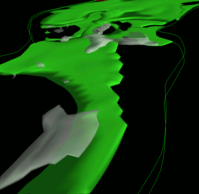
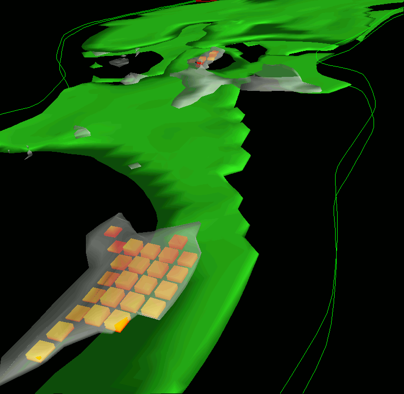
This technique creates an icon at each grid block where the oil flux is non-zero (subject to certain thresholding criteria). The color of the block is proportional to a product of the oil flux magnitude and the oil saturation. Eventually, we'll replace SO with SOM to show areas of high flow potential, but where oil is left behind. The two sets of images show isosurfaces of oil saturation (green surface) and constant oil flux velocity (white, transparent). The image with the scaled flux icons clearly shows one finger of oil left behind, as this data came from late in the simulation run.
 |
 |
Time Markers
A Streamline curve is computed by solving an integral over time as a particle moves through a grid. The time step parameter is under user control. A smaller time step value produces better fitting curves at computational expense, while a larger time step produces curves of poorer fit, but which are less computationally expensive to generate.
 |
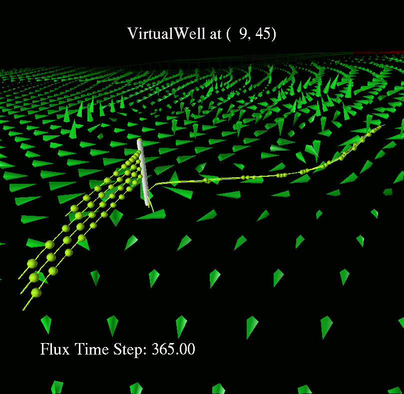
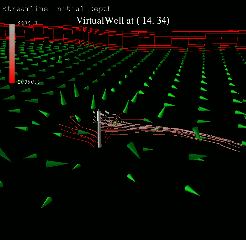
Positioning the well as in one of the other pictures, It was suggested to "drop a time marker" along the curve every so often. In this image, a sphere is dropped every 0.7 units of time. The time step used on the streamlines computation is 0.025, with 326 steps being computed for each of the twelve streamlines. Elapsed wall-clock time for a 100Mhz sparc 20 required for this calculation is about 3 seconds.
Streamlines
Using a well location as the "seed point" for streamlines computation has some potential for being useful. Flows to or from a well may be depicted visually. A streamline is a curve which is tangential to a flow field along its length.
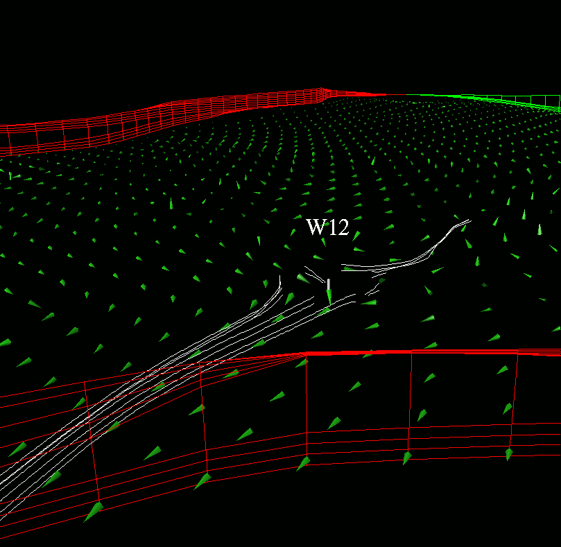 |
The first example shows using the location of well "W12" (presumably a water injector). Rather than beginning the streamlines computation at the location of the well, which would result in flow directly out of the grid to the bottom because of a strong downward flow, we seed the points at some distance away from the well. This distance is under user control.
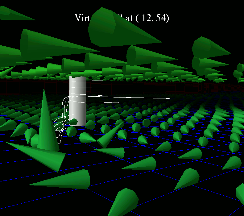 |
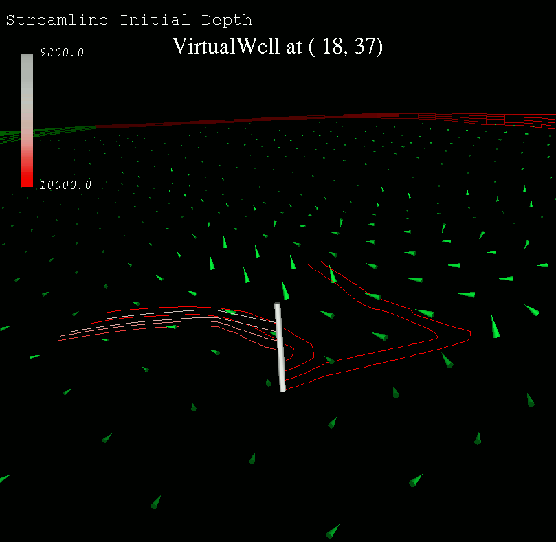
At times, it may be useful to place a virtual well somewhere in the flow field. The user is free to move the well about in the reservoir. This particular image shows depth-averaged oil-flux near the surface and at the bottom of the reservoir, as well as the paths that weightless particles would follow if released at the location of the virtual well. (These streamlines are computed using the AVS-supplied streamlines code.)
 |
 |
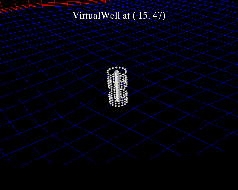
After positioning the location of a virtual well into the flow field, and decreasing the density of sample points around the well, streamlines are produced which eminate from a virtual cylinder, of a user-specifiable radius, around the virtual well. Note that these streamlines were computed using the LBL-written streamlines code. The numerical method being used is the second order Runge-Kutta form of time-velocity integration.
Backwards Streamlines
 |
By reversing the sign on the flow field, we can see where the streamlines came from rather than where they are going to.
Depth-Colorized Streamlines
 |
 |
Another suggestion involved the use of color on the streamlines themselves. Here, we specify the color for a streamline along it's entire length as being a function of it's initial depth. In this example, we're using a color ramp going from a gray to red, where more red indicates more depth at the initial point from which the streamline is "grown." The intent is to provide a hopefully quick and easy way to visually identify the origin of streamlines.
Another example using two layers of cones. One layer represents a depth- averaging of the first 3 simulation layers, the other represents a depth-averaging of the bottom four simulation layers. The seed points for the streamlines are placed at some distance radially from the virtual well to achieve better dispersion.
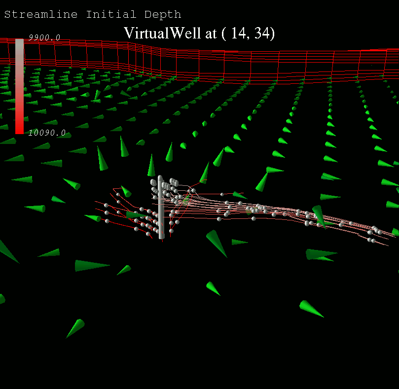 |
Same as previous picture, but added time-markers along the streamlines.
2D Icons Painted onto Boxes
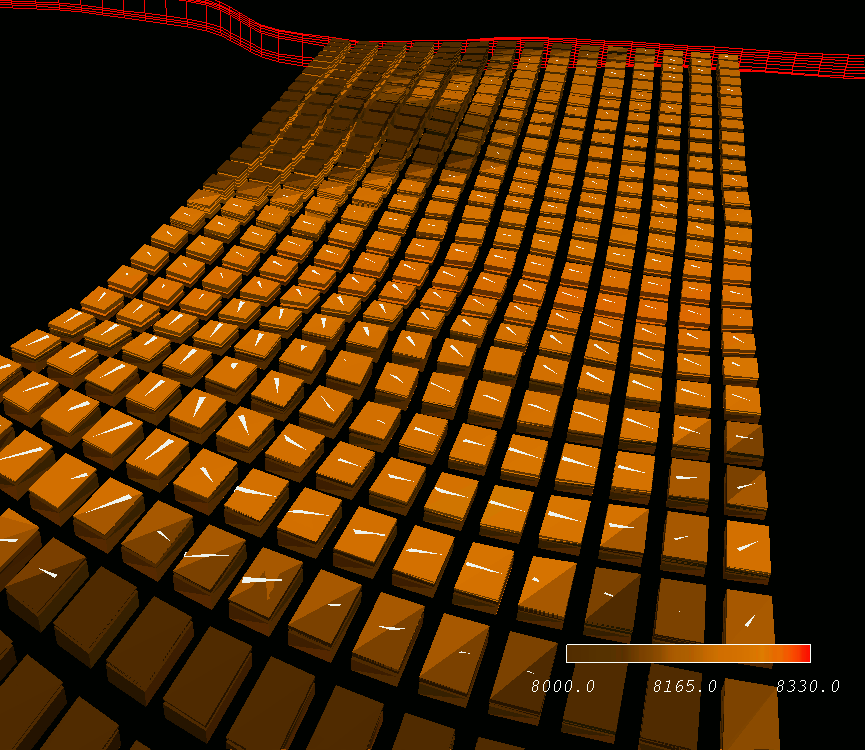 |
A first cut at putting flow TRIANGLES on the grid blocks. The triangles are oil flux, and the boxes are colored according to the pressure in the init map file. I only put barbs on one of the 8 block faces. This image uses LOG scaling on the triangles.
Depth Averaging
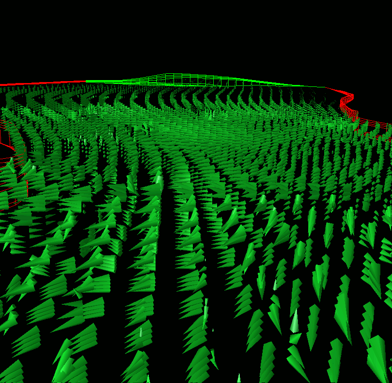 |
When cones are used at every grid cell, the result is an image which has too much information. The sheer amount of detail in the image overwhelms the viewer, and conclusions are not easily drawn.
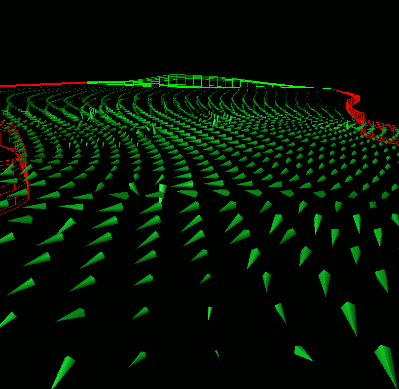 |
However, when "similar" simulation layers are combined, the amount of data to visualize and interpret is reduced by an order of magnitude. In this image, the top few simulation layers are combined into a single layer of flux; similarly with the bottom few simulation layers. The general trend in each of the top few and bottom few layers is much more obvious in this image than in the image containing a geometric icon at every node.
Combined Flux Representation
The idea is to combine the three phases of flux (oil, water and gas) into either a one- or two-phase representation. This work is in progress, and as such, no images are available yet.
Cones for Flux
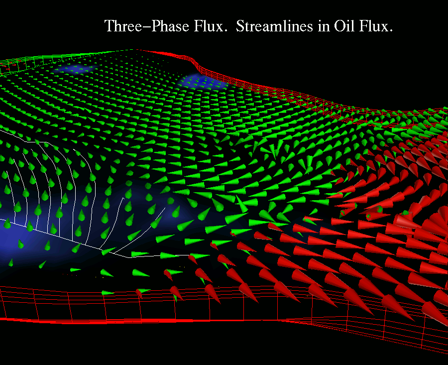 |
The Cereal Picture: Here we have all the flux phases; green oil cones, red gas cones, yellow moons, orange stars, pink hearts.... Note the use of log scaling on the cones.