Visual Cues Case Study
Wes Bethel
Information and Computing Sciences Division
Lawrence Berkeley Laboratory
The University of California
Berkeley, California 94270
ewbethel@lbl.gov
September 1991
In this example, we will illustrate the development of a complex visualization example. This example employs techniques, not only for traditional imaging and visualization tasks, but also data conversion which is required to allow the use of several "standard" visualization techniques. Several images are shown, each illustrating a different step in the visualization process. Of particular interest are those images which provide significant scientific insight into the underlying model, as well as those images that simply "don't work." The scientist from the Earth Sciences division approached our group for help in applying visualization techniques to produce images of this data.
The data for these images comes from a variety sources. The seismic data is velocity information constructed from over 46,000 seismic events (earthquakes) occuring during the 25 year span from 1962-1987. The events are registered at a number of different depths for each latitude, longitude sampling location. A list of earthquake epicenters is used, as well as the location of the 8000-odd seismic sensing stations around the earth. Continental boundaries, as well as continental plate boundaries, are useful in providing points of reference in the velocity data.
The scientist in this example was studying a "subduction zone" in the area north northeast of New Zealand. Subduction zones are those areas that occur where continental plates abut, and one plate is "pushed down" into the earth into the mantle (is subducted). Of particular interest in this region were characteristics such as size, depth of the subduction zone and shape.
 |
 |
 |
| Figures 1a, 1b and 1c show the types of plots familiar to the user, ie, the types of images produce prior to approaching our group. These are simple two-dimensional plots. To "visualize" the three dimensional dataset, that is, to conceptualize the data in three dimensions so as to draw inferences, the user was required to sequentially view such two-dimensional cross sections. | ||
 |
| Figure 2. |
The initial leap-off point for us was to make images of the raw velocity data, which is shown in Figure 2. In making this image, we represent each velocity sample, from a single depth, an represent this value with a sphere in three-space, the color of which is proportional to the velocity value. The continental outlines are provided for a contextural reference.

|
| Figure 3. |
In Figure 3 we add the locations of the 46,000 seismic events, represented as green dots (looks like a green "fog"), along with the location of the seismic summary stations which are represented using small yellow spheres. The continental plate boundaries are also displayed, thus adding another contextual cue to the image. It should be apparent that these images are already becoming quite busy and cluttered -- not a good sign since we haven't really started "doing anything" yet with the data. We realized that one of the formidible tasks at hand was to "reduce" the complexity of the images so that specific features could be easily recognized. In other words, we wanted the images to speak for themselves, without requiring an accompanying paragraph of text to indicate items of interest in the image.

|
| Figure 4. |
Next, it was necessary for us to perform three variable resampling of the velocity data, which was essentially scatter data in three dimensions. The three variable resampling was required to allow us to use more conventional "slicing" tools, as these tools operate on gridded data. We also changed the colormap to make use of principles outlined in Tufte's books. Figure 4 shows the results of the resampling process.
|
| Figure 5. |
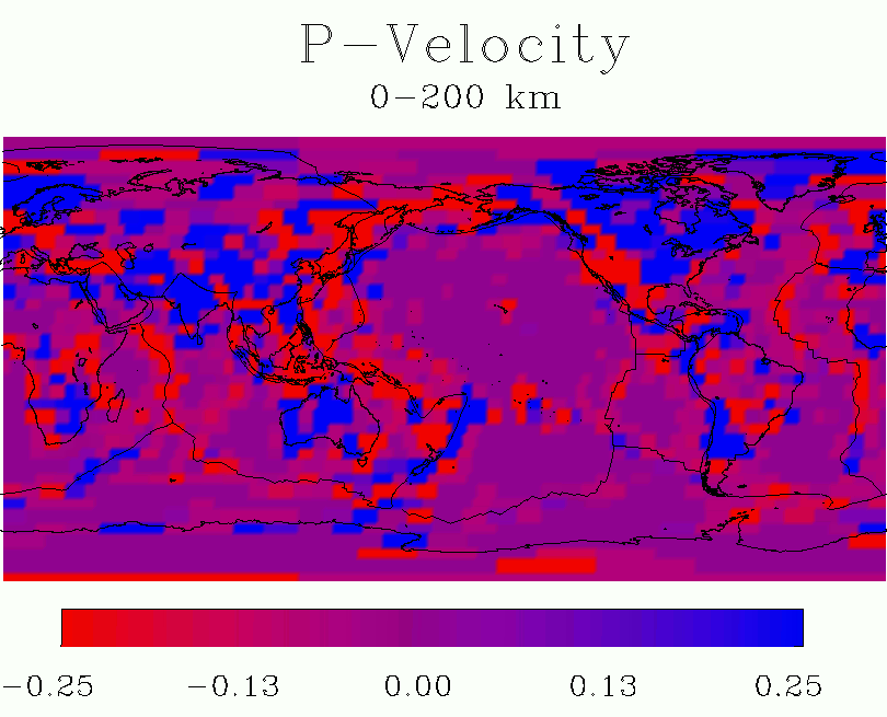
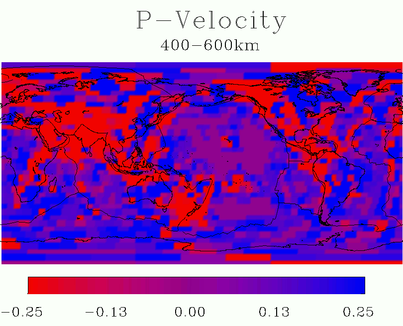
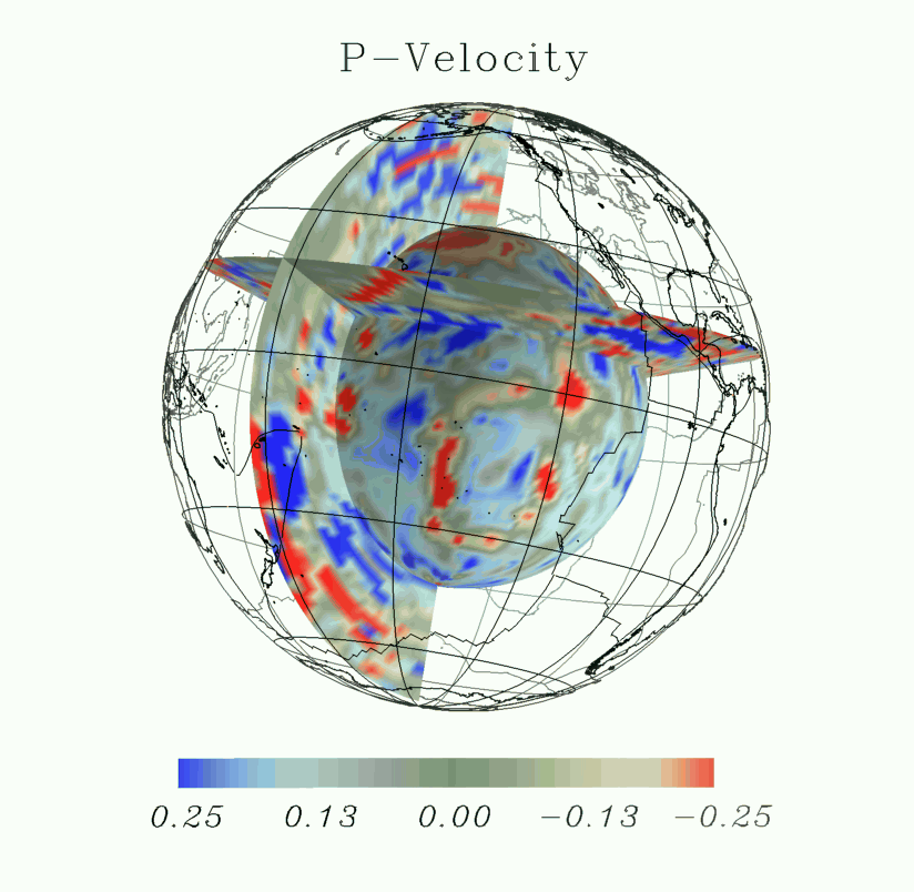
To achieve the reduction in image complexity, we experimented with various mapping projections. In Figure 5 we use a spherical projection and display several orthogonal slices (slices of constant latitude, longitude and radius). The spherical projection was remarkably successful in reducing the amount of data presented to the viewer from any desired viewing position in three-space. In each of these images, we show "slices" of the resampled velocity data, along with the contextual information. In Figure 6, we show a single slice of data from a constant depth, along with the same contextual information, using a molleweide map projection.
|
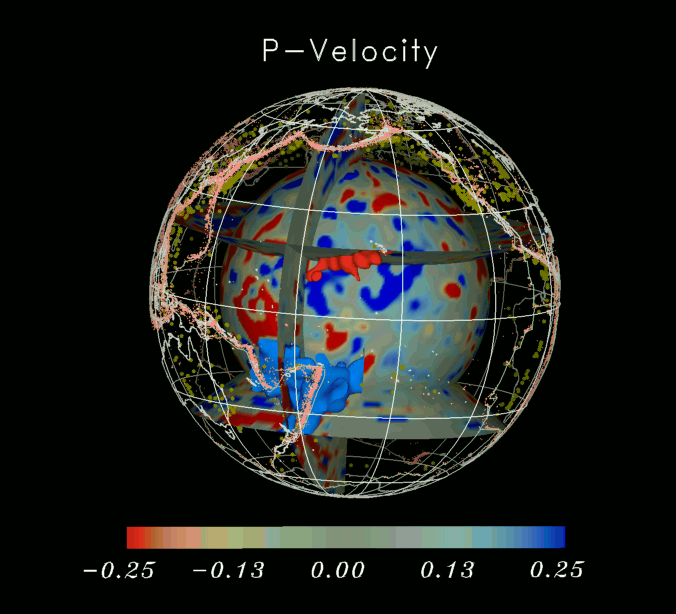
| Figure 7. |
The scientist was particularly interested in investigating a previously undiscovered geologic subduction zone near the Tonga-New Hebrides area (north of New Zealand). After cropping away data not in this area, we computed isovelocity surfaces corresponding to the subduction zone. Rendering this information into the images we already had produced Figure 7. In Figure 7, we also include the siesmic "summary" stations, represented as yellow spheres, and the seismic epicenters, represented as light red dots.
Acknowledgement.
Thanks to Jay Pulliam, a former Post-doc in the Earth Sciences Division at LBL, for the use of his data in making these images.